Bring your own
Designing for Dark vs Light Shirts
How the same artwork behaves differently on dark versus light shirts, and what to check before you offer both colorways.
By Influxer · Published 2026-08-16 · Updated 2026-08-16 · 4 min read
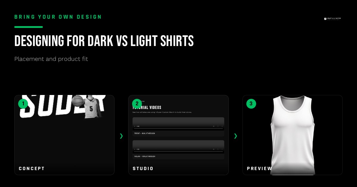
A design that looks perfect on your screen sits on a white background by default. The moment you place it on a Pepper or Blue Spruce garment instead of Ivory, everything about how it reads can change. Dark shirts and light shirts are not the same canvas, and a design built without considering both often fails on one of them.
This is a common surprise for anyone uploading their own artwork for the first time: the file was never wrong, it just was never tested against the actual garment colors it needed to work on.
Why contrast, not color, is the real variable
The question is not "does this look good" in isolation, it is "does this hold enough contrast against this specific garment." A navy wordmark on a white tee has strong contrast and reads clearly. The same navy wordmark on a Blue Jean tee loses most of that contrast and can look muddy or half-invisible depending on the exact shades involved.
Before locking in a design for multiple colorways, look at each garment and ask whether the artwork's darkest and lightest elements are still clearly distinct from the fabric. If they are close in value, contrast is the problem to fix, not the whole design.
Dark shirts favor light, bold artwork
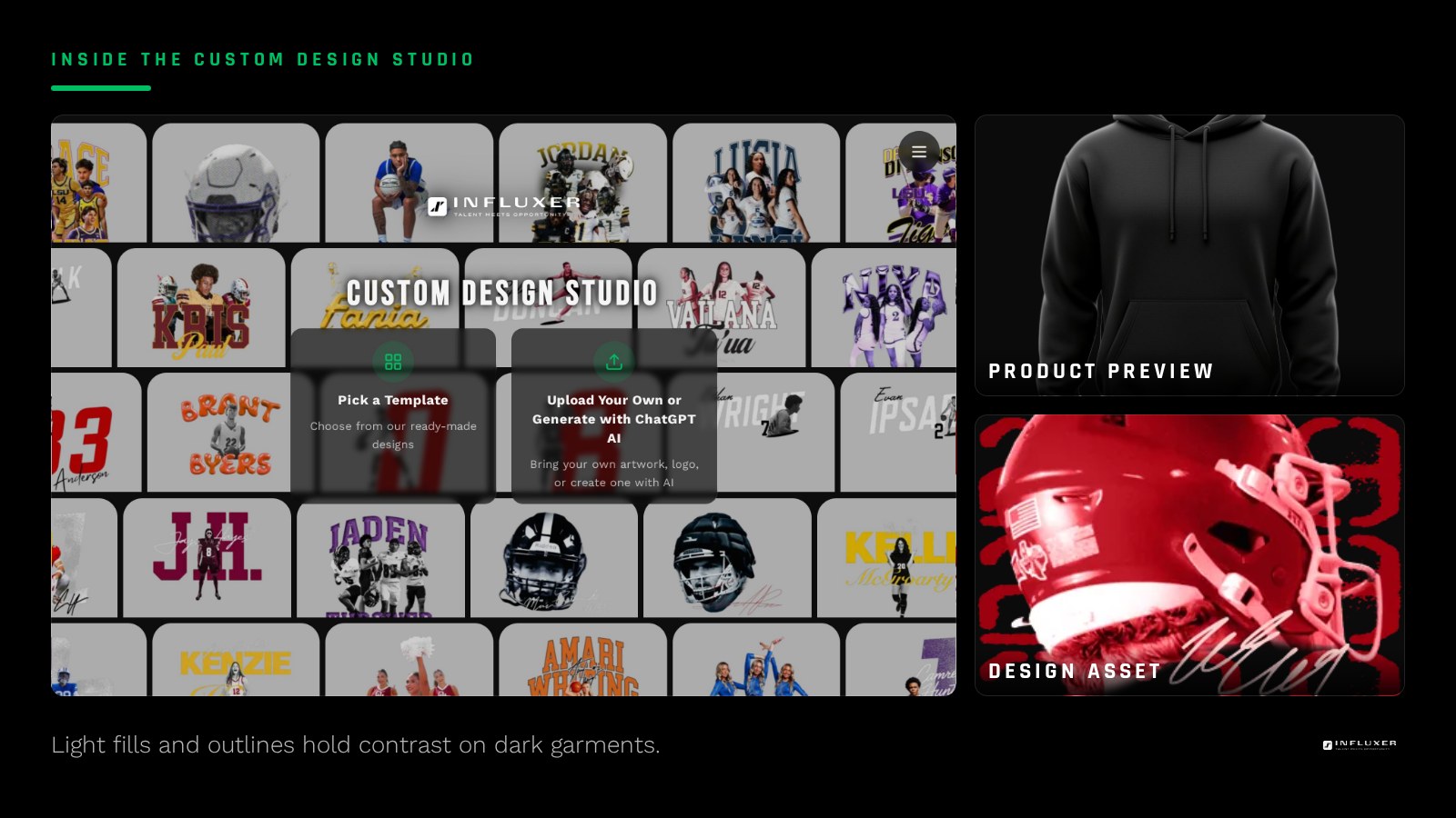
On dark garments like Pepper or navy, artwork with light fills, white outlines, or bright accent colors reads clean and confident. Thin dark strokes or subtle shading tend to disappear because there is nothing behind them to separate from the fabric.
If your original design was built in dark ink for a white background, you likely need a genuinely different color version for dark shirts, not just the same file placed on a different garment. An inverted or outlined variant of the same artwork is the usual fix.
- Favor light fills or white outlines on dark garments.
- Avoid dark-on-dark elements that only worked because of a white background.
- Build an inverted or outlined variant rather than forcing one file to do both jobs.
Light shirts favor darker, saturated artwork
On light garments like Ivory or a pale heather, the opposite risk shows up: pale or pastel design elements that read fine on a screen can wash out against light fabric. Saturated, darker colors and confident outlines hold contrast much better here.
If you built your primary design in light colors for a dark mockup preview, expect it to need adjustment before it works on a light garment, for the same reason in reverse.
Transparency problems show up differently on each
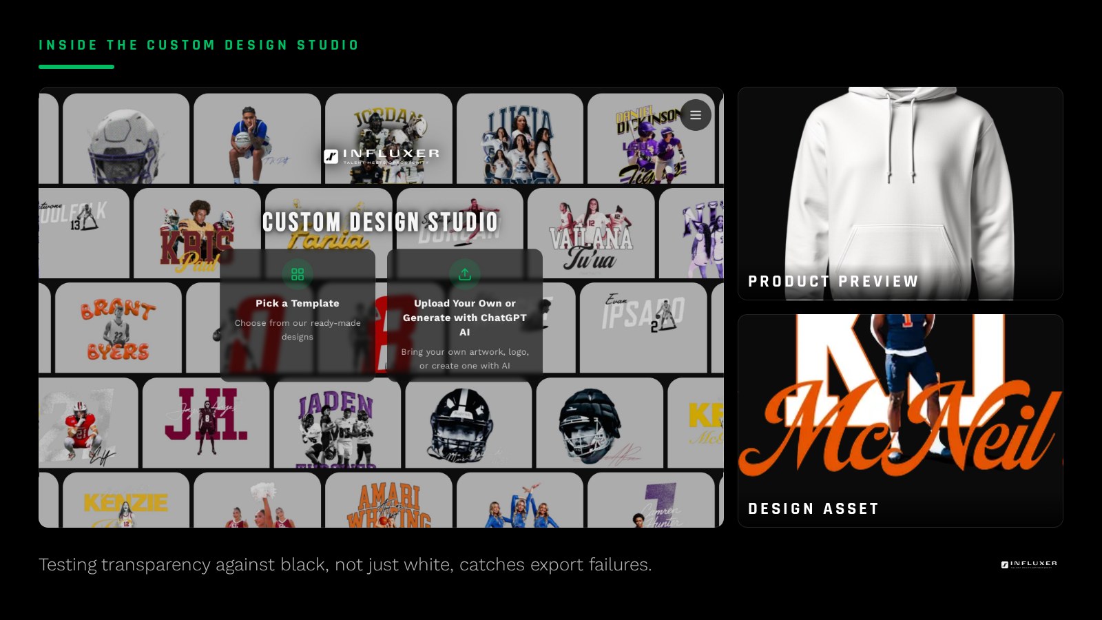
A failed transparent background, where a faint white box or gray fringe survived the export, is nearly invisible on a white or light shirt because the box blends into the garment. Put the same file on a dark shirt and that box becomes an obvious rectangle around your design.
This is why checking transparency only on a white background is not enough. Always test your exported file against a solid black background as well, since that is where a bad export becomes visible.
One design, multiple garment colors: plan for it up front
If your drop includes both dark and light garments, decide early whether you are running one universal design or two color variants. Trying to force a single-color file to work everywhere usually means it looks slightly wrong on at least one option.
A practical approach: build the design with its outline or key shape as a shared structure, then swap fill colors between a dark-garment version and a light-garment version. The Influxer studio previews each garment color independently, so you can check both before deciding.
Testing it before you commit to a full colorway lineup
Upload your design and preview it against every color you are considering offering, not just the one you designed it against. If a color fails the contrast test, either drop that garment color from the lineup or build a variant for it. Deciding this before submission is much easier than realizing it after the drop is live.
Dark vs light shirt design checklist
- Check the darkest and lightest elements of your design against each garment color.
- Build a light-fill or outlined variant for dark garments if your original was dark ink on white.
- Build a darker, more saturated variant for light garments if your original was light on dark.
- Test the exported PNG against both a white and a black background for transparency errors.
- Preview every garment color you plan to offer, not just the one you designed against.
- Drop a garment color from the lineup rather than force a design that fails contrast on it.
- Keep a shared outline or shape structure if you are building two color variants.
Frequently asked questions
Do I need two versions of my design for dark and light shirts?
Often, yes, if the design was built with strong contrast against only one background. A light-fill variant for dark garments and a darker, saturated variant for light garments usually reads better than one file forced onto both.
Why does my transparent PNG look fine on white but show a box on black?
A failed transparency export often blends into a white background but becomes an obvious rectangle on a dark garment. Always check your file against a black background, not just white, before uploading.
What colors work best on a dark garment?
Light fills, white outlines, and bright accent colors generally hold the strongest contrast on dark garments like Pepper or navy. Thin dark strokes tend to disappear.
Can the studio preview my design on multiple garment colors?
Yes. The studio's mockup preview lets you check your artwork against each garment color you are considering, which is the fastest way to catch a contrast problem before ordering.
Preview your design on every color — Upload your artwork and check it against dark and light garment colors.
See ready-made color pairings — Start from a design with contrast already worked out.