Design it for me
Senior Night Shirt Ideas That Come Together Fast
Senior night shirts have a short window and a lot of sentiment attached. Here are design directions that hold up and how to get one made.
By Influxer · Published 2026-08-16 · Updated 2026-08-16 · 4 min read

Senior night carries a different weight than a regular game shirt. It marks a last season, a last home game, sometimes a last time playing at all, and the design usually needs to say something more specific than a generic team shirt would. It also tends to come together on a short window, which is exactly where a template starting point helps.
The strongest senior night designs are not the busiest ones. They lean on a handful of details that actually mean something — the athlete's name, their number, the season or year, maybe a phrase specific to them — rather than trying to cram in everything at once.
Below are directions that consistently work, along with how to build one through the template path without starting from a blank page.
Name, number, and year is the reliable core
A senior night shirt built around the athlete's name, jersey number, and graduation year covers the essentials without needing anything else. This layout reads clearly at a distance, which matters when the shirt is being worn by family and friends in the stands, not just the athlete.
A template built for this in the studio already knows how to balance those three elements — name up top, number as the visual anchor, year as a smaller detail line — so you are filling in specifics rather than deciding layout from scratch.
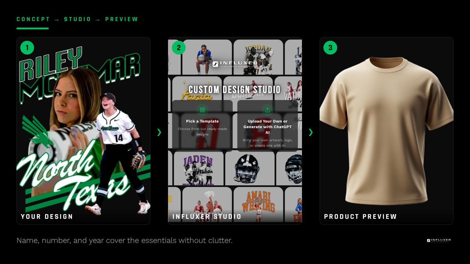
A phrase that is actually theirs
Adding a line like "Last Ride" or "Final Season" works when it is paired with something specific to the athlete — their number, their position, or their sport spelled out. A phrase with no name or number attached could belong to anyone; the goal is a shirt that is unmistakably about this one senior.
Designs built for the family and the stands
Senior night shirts often get worn by parents, siblings, and grandparents, not just the athlete. A design with high contrast between the text and the shirt color reads better from a distance in a gym or on a field. A dark, detailed design on a dark shirt looks great up close and disappears from ten rows back.
The Comfort Colors 1717 tee in a lighter color like Ivory pairs well with darker ink for exactly this reason, while a darker tee like Pepper works if the design uses a lighter, higher-contrast ink color.
Team colors without needing the team logo
You do not need the official school or team logo to make a senior night shirt feel connected to the program. Using the team's actual colors in the design carries that connection without requiring the licensing that an official mark would need. Save the logo route only for cases where you already have permission to use it.
A sport-specific detail beats a generic athletic graphic
A generic ball-and-star graphic does not say much about a specific senior. A detail that is actually true to their sport and role — a position name, a specific stat they are known for on the team, or their real number — carries more weight and looks more considered.
Think about the small facts that only make sense for this athlete: a shared jersey number across multiple seasons, a nickname teammates actually use, or the specific position they played rather than the sport in general. Those details are what turn a shirt from something generic into something a family will actually keep.
Ordering ahead for the whole family
Once the design is set, it is worth deciding upfront who else wants one. Parents, grandparents, and younger siblings often want a matching shirt, and it is far easier to place one combined order through the same template than to circle back later with a second, smaller order that may not use the exact same print run.
If the family wants a mix of garments — a tee for some, a hoodie for others — the same design carries across both without any extra design work, since the studio scales the print to each garment's print area automatically.
Building one through the template path
Start at /onboarding?mode=templates and choose a layout built for your sport. From there you are filling in the athlete's name, number, year, and any phrase, then choosing a garment and color. The Review step, the last of the five studio steps, is where you check the design against a real garment mockup before it moves any further — worth a close look given how sentimental this particular shirt tends to be.

Put a senior night shirt together
- Confirm the athlete's name spelling, number, and graduation year.
- Pick one phrase that is specific to this senior, not generic.
- Choose a garment color with real contrast for stands-distance readability.
- Use team colors instead of the official logo unless you already have permission for the mark.
- Pick a sport-specific detail over a generic athletic graphic.
- Start from a template built for the athlete's sport.
- Check the Review step closely for spelling and number accuracy.
Frequently asked questions
Do I need the school logo for a senior night shirt to feel official?
No. Team colors and specific details like name, number, and year carry that connection without requiring the licensing that an official school or team mark needs.
What should be the focal point of the design?
The athlete's name and number work best as the visual anchor, with the year and any phrase as supporting detail rather than competing for attention.
What color shirt reads best from the stands?
Pick a garment and ink combination with real contrast, like an Ivory Comfort Colors 1717 tee with darker ink, or a dark tee with lighter ink. Low-contrast combinations are hard to read at distance.
Can I use a graduation year even if the athlete plays more than one sport?
Yes. The year and name work independent of sport, so the same layout can pair with any sport-specific detail you add alongside it.
Start with a template — Build a senior night design around a name, number, and year.
Upload your own artwork instead — Already have a design in mind? Bring your own file.