Bring your own
Front vs Back Print: Choosing Placement for Your Design
A straightforward comparison of front and back placement, including when one design needs both and when it needs a second, simpler version.
By Influxer · Published 2026-08-16 · Updated 2026-08-16 · 4 min read
A design does not automatically know where it belongs. The same artwork that works as a bold back print can feel oversized on the front, and a subtle front mark can disappear if you move it to the back without changing its scale. Front and back are read differently by the people who see them, and the studio treats them as separate print areas for exactly that reason.
This is a decision worth making deliberately rather than defaulting to the front because that is where placement tools open first. Below is how each option actually behaves, plus what to do if you want to use both.
Front placement is read up close
A front print, whether centered full-front or a smaller left-chest mark, is mostly seen at conversation distance: someone standing near the wearer, or the wearer looking down at their own shirt. That means detail holds up better on the front than on the back. Finer type, a secondary line of text, or a more intricate mark can work here in a way it would not at a distance.
Front placement is also the default the studio opens to when you upload, which makes it the natural home for a design meant to be the single statement on the shirt.
Back placement is read from a distance
A back print is seen across a room, down a hallway, or as someone walks away. That distance changes what actually works: bigger, simpler, higher-contrast marks hold up, while fine detail and small type blur into an unreadable smudge.
If your artwork has small text or fine linework, a back print is the wrong home for it as-is. Either simplify the design specifically for the back, or reserve the detailed version for the front and put something bolder on the back.
- Back prints generally run larger than front prints in the studio's print area.
- Bold, high-contrast shapes and short type read best at distance.
- Fine detail and multi-line text are the first things to disappear at range.
When one design should go on both
Some designs genuinely work at both scales: a simple wordmark, a number, a single icon. If yours is one of those, you can place the same file on the front as a smaller chest mark and on the back at a larger scale, giving the shirt a front-and-back identity without needing two separate pieces of art.
The studio lets you place uploaded artwork independently in each print area, so the scale and position on the front do not have to match the back. Treat them as two placement decisions even when the file is the same.
When you actually need two versions of the design
If your artwork is detailed, full of small type, or built around fine linework, do not just shrink it for the front and enlarge it for the back and expect both to work. Build or request a simplified variant: fewer words, thicker strokes, a single focal shape.
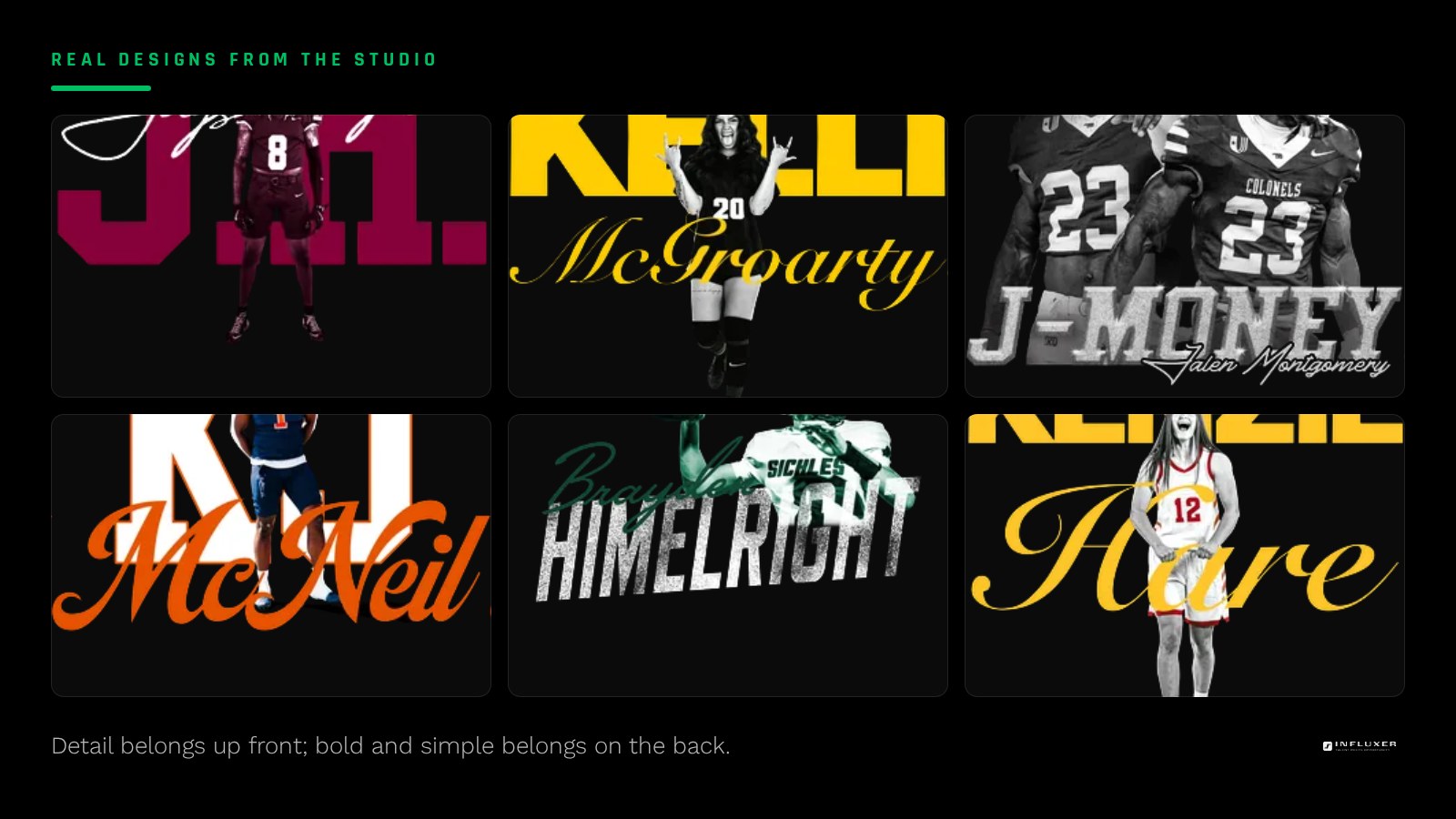
A common pattern is a detailed logo or crest on the front, paired with just a name or number, larger and bolder, on the back. That keeps the front intimate and the back legible at range, using two treatments of the same idea rather than one file stretched to do both jobs.
Preview both sides before deciding
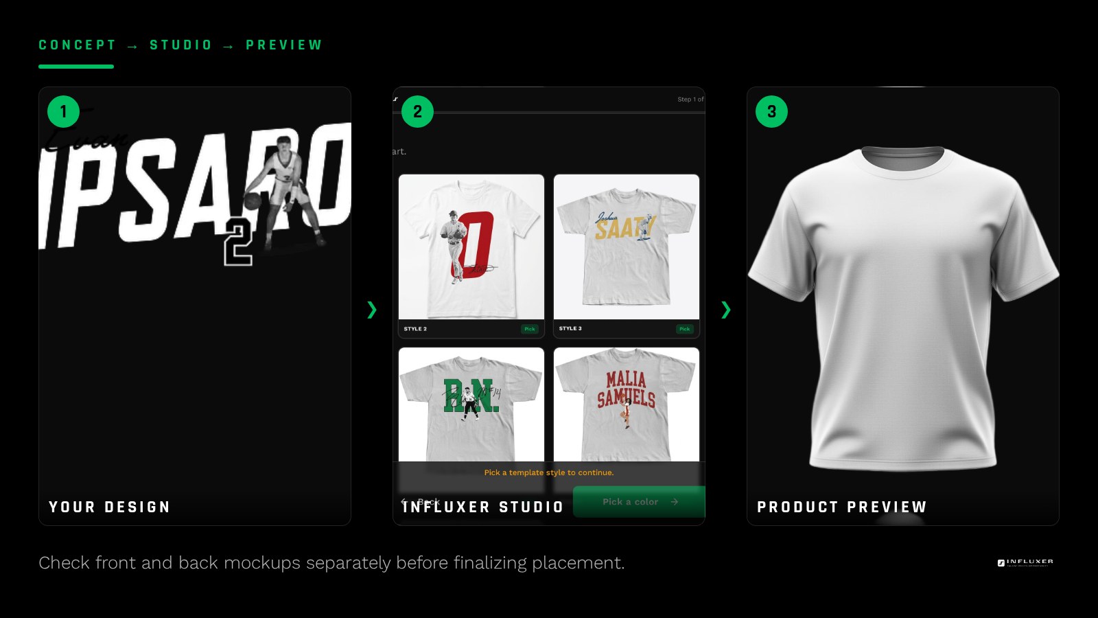
The mockup preview in the studio shows front and back separately. Do not judge the back placement from the front-facing thumbnail; actually switch the view and look at the back mockup at the scale you have chosen.
If you are choosing between front-only, back-only, or both, place a first version in each print area and compare them side by side in the preview before committing. It takes a minute and it is the only way to see how the same decision plays out on both sides of the actual garment.
A simple way to decide if you are stuck
If you can only pick one, ask which distance matters more for how the shirt will actually be seen: close-up, in photos and in-person conversation, or across a room at an event. Photos and casual wear tend to favor front placement since that is what shows in most shots. Team or event merch worn in a crowd tends to favor a strong back print, since that is the angle most people will actually see.
Front vs back placement checklist
- Decide whether the design will mostly be seen up close or from a distance.
- Reserve fine detail and small type for front placement, not the back.
- Size back prints larger and bolder than you would size the same design on the front.
- If using one file on both sides, place and scale each independently.
- Build a simplified back variant if the original design has small type or fine linework.
- Preview the front and back mockups separately, not just the front thumbnail.
- Pick a lead placement if you can only afford one print location.
Frequently asked questions
Can I put the same design on the front and the back?
Yes. The studio lets you place the same uploaded file independently in the front and back print areas, so you can scale it differently for each: smaller on the front, larger on the back, for example.
Should a detailed logo go on the back?
Usually not without simplifying it. Back prints are read from a distance, so fine detail and small type tend to blur. A bolder, simplified variant of a detailed logo works better on the back.
Is a back print always bigger than a front print?
The back print area generally allows a larger design, and it usually should be larger since it is read from farther away. That said, always confirm the actual size in the mockup preview rather than assuming.
What if I can only choose one placement?
Think about where the shirt will most often be seen. Front placement suits photos and close conversation. Back placement suits crowds and distance, like at a game or event.
Try your design front and back — Upload your artwork and preview it separately on the front and back print areas.
Browse ready-made layouts — See designs that already have front and back placement worked out.