Bring your own
How Big Should a Chest Print Be? A Size Guide With Real Numbers
A working range for chest print sizing, from a full-front statement piece down to a small left-chest mark, with guidance on how to check your own.
By Influxer · Published 2026-08-16 · Updated 2026-08-16 · 5 min read
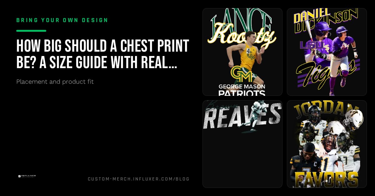
"How big should my design be" is one of the most common questions from anyone uploading their own artwork, and it does not have one universal answer. A wordmark meant to anchor the whole shirt needs a different scale than a small mark meant to sit quietly on the chest. What matters is picking a size range on purpose, then confirming it on the actual garment.
This guide gives you working ranges for the two most common chest placements in the Influxer studio, plus a way to judge scale that does not depend on memorizing exact numbers.
Full-front chest print: filling the space with intent
A full-front print is meant to be the main event on the shirt. As a working range, this print typically spans somewhere around 10 to 12 inches wide on an adult tee, starting a few inches below the collar and leaving room above the hem. That is a large share of the available front print area, which is the point: it should read clearly across a room.
Artwork that is much smaller than this range starts to look accidental, like it landed in the wrong spot rather than being placed on purpose. If your design is meant to be the statement piece, size it to actually use the space the print area gives you rather than leaving a wide margin around it out of caution.
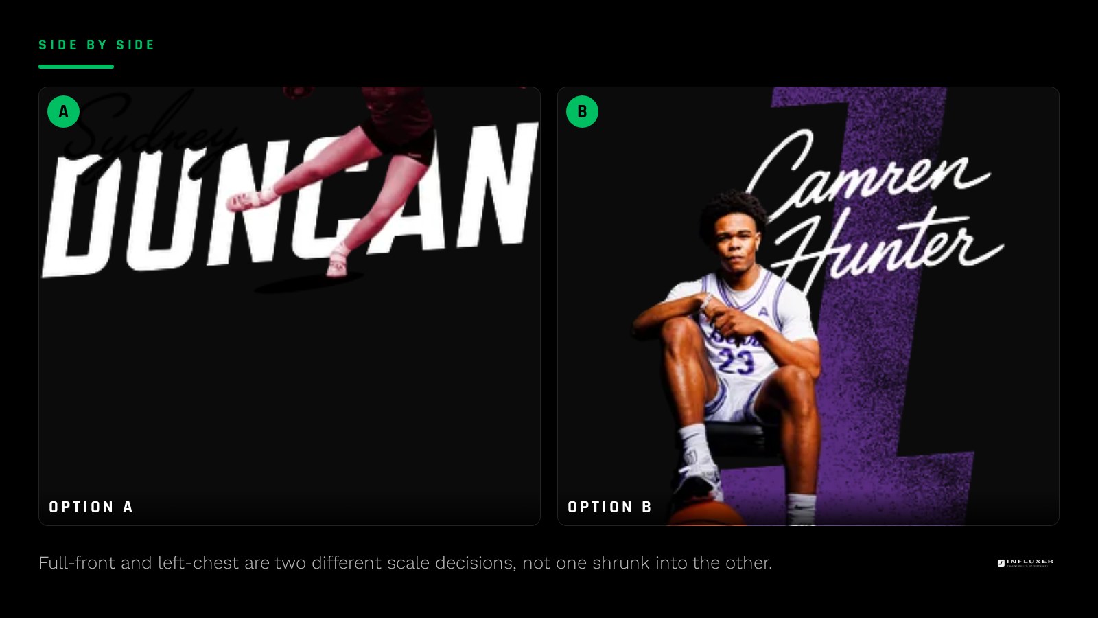
Left-chest mark: a smaller, quieter placement
A left-chest mark sits higher on the garment and is meant to be a detail rather than a headline, closer to the scale of a polo logo. This placement usually works well in a noticeably smaller range than a full-front print, small enough to feel like an accent and not a shrunken version of a bigger design.
A common mistake is taking a design built for full-front scale and simply shrinking it for the left chest. Detail that reads fine at 11 inches wide often turns into a blur at left-chest scale. If you want a left-chest version of a detailed design, simplify it rather than just resizing it: fewer elements, thicker lines, less small type.
- Full-front: sized to fill most of the available front print area.
- Left chest: noticeably smaller, closer to a logo scale than a statement scale.
- Simplify detailed art before shrinking it, do not just scale the same file down.
Back prints run larger than either chest option
If you are also placing a back print, know that it typically has more usable width than the front and is read from a greater distance, so it can and usually should be sized larger than either chest placement. Treat chest and back as different scale decisions rather than assuming one size works everywhere on the shirt.
Why the exact inch number matters less than the ratio
Precise measurements are useful as a starting point, but the number that actually matters is how much of the print area your design fills relative to the garment, since that ratio is what a viewer perceives. A design sized correctly in inches can still look small if the print area itself runs larger on a bigger size garment, which is why the studio's mockup preview, not a ruler, should be your final check.
Think in terms of proportion: does the design command the chest the way you intend, or does it look like it is floating in unused space? If the answer is the latter, scale up before worrying about matching an exact inch figure.
How garment color affects perceived size
A design at the same physical size can look smaller or larger depending on contrast against the garment. A light, high-contrast mark on a dark tee reads as more prominent at a given size than the same mark in a muted color on a similar-toned garment. If you are working with lower contrast, size up slightly to compensate, since the print area will not do that work for you.
Checking your size decision in the studio
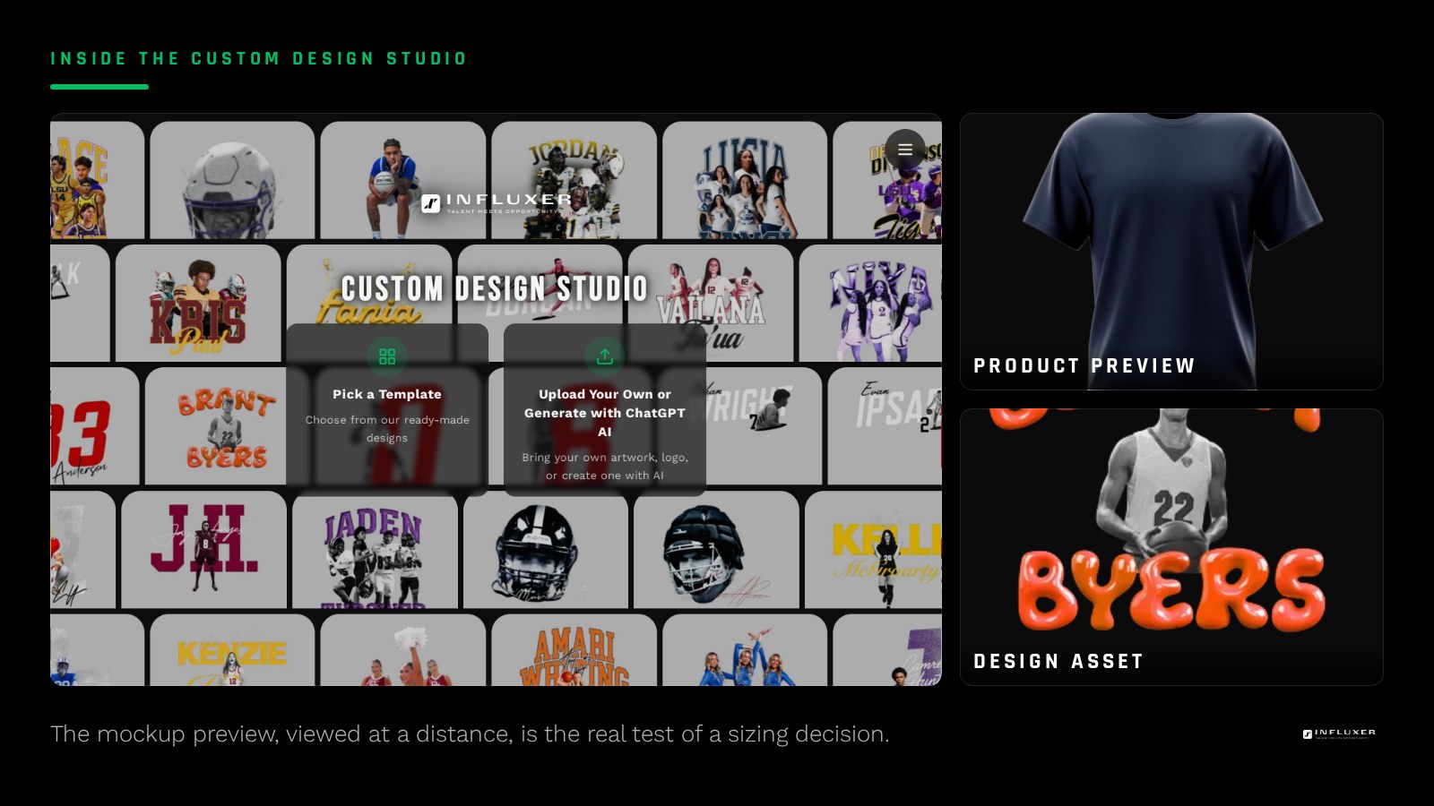
Upload your artwork, place it in the chest print area, and use the scale handle to size it. Rather than trying to hit an exact number, size it until it fills a proportion of the print area that matches its intended role, then preview the mockup and step back from your screen or shrink the browser window to see it the way it will actually be seen.
If it looks tentative or lost in the print area at that distance, scale up. If it looks like it is crowding the collar or spilling toward the edges, scale down. The mockup preview, not a formula, is the tool that tells you when the size is right.
Chest print sizing checklist
- Decide the print's role: statement full-front piece or quiet left-chest accent.
- Size a full-front print to fill most of the available front print area, not a fraction of it.
- Simplify detailed artwork before shrinking it to left-chest scale, rather than resizing as-is.
- Size back prints independently and typically larger than chest placements.
- Account for low contrast by sizing slightly larger to compensate.
- Check the design at a distance in the mockup preview, not just up close on your screen.
- Re-check sizing whenever you switch garments, since print areas differ by product.
Frequently asked questions
How big should a full-front print be?
As a working range, expect roughly 10 to 12 inches wide on an adult tee, filling most of the available front print area. The exact fit depends on your design and the garment, so confirm it in the mockup preview rather than targeting an exact number.
How much smaller should a left-chest logo be?
Noticeably smaller than a full-front print, closer to the scale of a polo logo. It should read as an accent, not a shrunken version of a bigger design, so simplify detailed artwork rather than just scaling it down.
Can I use the same file for a full-front and a left-chest version?
You can place the same file at different scales, but detailed designs often lose clarity when shrunk that far. Consider a simplified variant for the left-chest placement if the full-front version has fine detail or small type.
Why does my correctly-sized design still look small in the preview?
Low contrast against the garment color can make a design look smaller than its actual measurements suggest. If that is the case, size it up slightly rather than relying on the exact inch figure alone.
Size your design on a real mockup — Upload your artwork and scale it inside the actual chest print area.
Start from a ready-made layout — Pick a design with sizing already worked out.