Design it for me
The Best Hoodie Colors for Athlete Merch
Which colors from the Independent Trading Co. SS4500 lineup work best for printed designs, and why the pocket and fleece surface change the math.
By Influxer · Published 2026-08-16 · Updated 2026-08-16 · 4 min read
A hoodie is a bigger canvas than a tee, but it comes with a few things a tee does not: a kangaroo pocket, a hood seam, and a heavier 80/20 cotton/poly fleece that takes ink a little differently than the garment-dyed Comfort Colors tee. Picking the right hoodie color is not the same exercise as picking a tee color, even if your design is identical.
This is a practical shortlist from the Independent Trading Co. SS4500 lineup, built around how each color behaves with a printed chest design, not just how it looks on a swatch.
Why hoodie color choice is a different problem than tee color choice
The SS4500 fleece is a flatter, more uniform surface than the garment-dyed 1717 tee, so colors read closer to true and hold contrast more predictably. That is good news for consistency but means there is less natural texture doing you favors, so contrast between ink and garment has to be intentional.
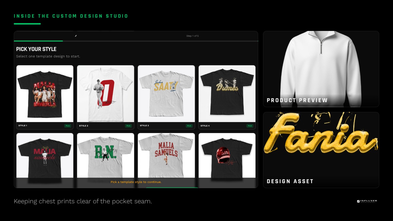
The kangaroo pocket also changes where a chest design can sit. A design centered low on a tee can land right on the pocket seam on a hoodie, so many designs need to shift a little higher or shrink slightly to clear it cleanly. The Influxer studio previews this on the real hoodie mockup so you can see the pocket line before deciding.
The reliable neutrals
Black, Navy, and Charcoal are the hoodie colors that work with almost any ink combination and any level of design detail. White ink on any of the three reads clean and holds up at distance, which matters for a garment people wear from across a parking lot, not just up close.
Sport Gray and Ash Heather are the light-side equivalent: they carry dark ink well and photograph better than pure White, since a flat white hoodie can wash out in phone photos under bright light.
- Black: safest all-around choice, holds any ink color.
- Navy: reads athletic without being a bold statement.
- Charcoal: a softer dark than Black, good with muted ink colors.
- Sport Gray or Ash Heather: light option that photographs better than White.
Colors with more personality
Forest Green, Maroon, and Alpine Green give a hoodie a team-color feel without needing an actual team logo. These deeper, saturated tones pair especially well with White or Gold ink, since both colors separate cleanly from a dark, saturated background.
Storm Blue and Dusty Sage are quieter options that work if the drop is going for a relaxed, streetwear feel rather than a sport-team feel. They ask more of your ink contrast since both are mid-value colors, so test light and dark ink options against them before deciding.
What is not available: camo
If your tee lineup includes a camo colorway, know upfront that camo is not offered on the SS4500 hoodie. Rather than trying to force a match, pick a solid hoodie color that echoes one dominant tone from the camo pattern, such as Forest Green or Army, so the pieces feel related without needing to be identical.
Matching a hoodie to a tee in the same drop
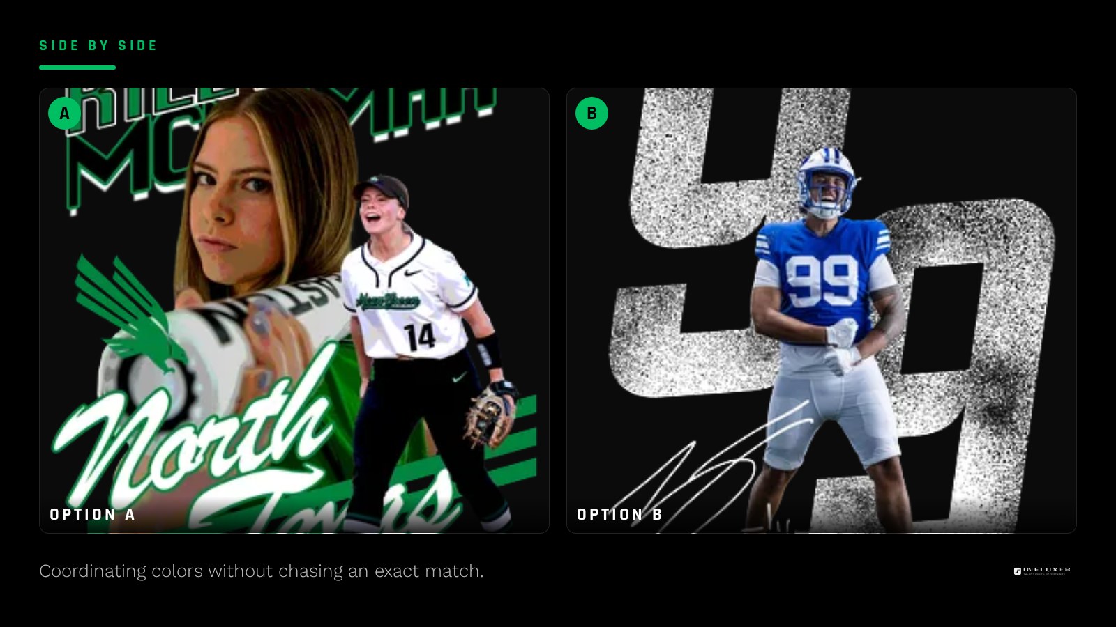
If you want tee and hoodie colors to feel coordinated rather than identical, pick one anchor color that exists reasonably close in both lineups, like Navy or Black, and let the second piece use a complementary color instead of an exact match. Because the two fabrics take dye differently, chasing an exact match across garment-dyed cotton and fleece is harder than it looks and rarely worth the effort.
Testing before you commit
Always preview your specific design on the actual hoodie mockup before finalizing a color, especially checking where the print sits relative to the pocket. A design that looks fine as a flat graphic can look off-center once you see it against the real seam lines.
Picking a hoodie color
- Preview your design on the real SS4500 mockup to check placement against the pocket seam.
- Start with Black, Navy, or Charcoal if you want the safest option.
- Try Sport Gray or Ash Heather if you want a lighter option that still photographs well.
- Consider Forest Green, Maroon, or Alpine Green for a team-color feel without a logo.
- Skip trying to match a camo tee exactly, since camo is not offered on the hoodie.
- Pick one shared anchor color if coordinating tee and hoodie in the same drop.
- Test both light and dark ink options on any mid-value hoodie color before deciding.
Frequently asked questions
What is the most versatile hoodie color for a logo?
Black holds up with nearly any ink color and any level of design detail, which makes it the safest starting point. Navy is a close second if you want something slightly softer than pure black.
Can I order a camo hoodie to match a camo tee?
No, camo colorways are not offered on the SS4500 hoodie. Choose a solid color that pulls from the camo pattern, like Forest Green or Army, to keep the pieces feeling connected.
Does the hoodie pocket affect where my design can sit?
Yes. A chest design centered low can land on the pocket seam, so many designs need to sit slightly higher on a hoodie than they would on a tee. Check this on the real mockup before finalizing placement.
Do hoodie colors look the same as the matching tee color?
Not always. The SS4500 hoodie fleece is not garment-dyed like the 1717 tee, so a color with the same name can read a shade more saturated or flatter on the hoodie. Preview both side by side before assuming they match.
Start from a template — Preview a ready-made design on the real SS4500 hoodie mockup.
Watch the studio walkthrough — See how hoodie placement and pocket lines look in the preview.