Design it for me
A Practical Guide to the Comfort Colors 1717 Tee
What the Comfort Colors 1717 actually is, how garment dyeing changes its colors, and how to choose a shade that suits your design.
By Influxer · Published 2026-08-16 · Updated 2026-08-16 · 4 min read
The Comfort Colors 1717 is the default tee in the Influxer studio for a reason: it is a 100 percent ring-spun cotton, 6.1 ounce shirt that is garment-dyed and preshrunk, and it wears in immediately instead of after ten washes. But "garment-dyed" is not just a marketing word, it changes how color and ink behave on the shirt in ways worth understanding before you order.
This guide walks through what garment dyeing actually means for your design, which colors in the 68-shade lineup tend to work best for different kinds of artwork, and where the fabric has real limits worth planning around.
What garment-dyed actually means
Most shirts are cut and sewn from fabric that was already dyed on the roll. The 1717 is dyed as a finished garment, after the pieces are cut and stitched together. That process softens the hand of the fabric and gives the color a slightly broken-in, not-quite-uniform look, which is part of why the shirt feels worn-in on day one.
The tradeoff is color consistency. Because dye is applied to the whole garment at once, you can see minor shade variation between batches or even between panels of the same shirt. A color like Blue Spruce might read a shade greener in one production run than another. That is normal for this fabric and not a defect, but it means you should not treat any single hex code as a promise.
Reading the color lineup by category
The 1717 lineup breaks roughly into neutrals, earth tones, brights, and a set of tie-dye Colorblast colors. Neutrals like White, Black, Ivory, and Khaki are the safest starting point for any design because they put all the attention on the ink. Earth tones such as Blue Spruce, Sage, Sandstone, and Terracotta give a design a worn, outdoorsy feel that plain neutrals do not.
Brights like Watermelon, Yam, Neon Pink, and Flo Blue are where garment dyeing shows its personality: the color has a slightly heathered, lived-in quality even at full saturation, which reads warmer than a flat printed bright. If your design leans playful or youth-focused, this category is worth a real look instead of defaulting to black.
- Neutral: White, Black, Ivory, Khaki, Pepper.
- Earth tone: Blue Spruce, Sage, Sandstone, Terracotta, Hemp.
- Bright: Watermelon, Yam, Neon Pink, Flo Blue, Bright Orange.
- Tie-dye: Amethyst, Fiji Blue, Ocean, Seaglass, and other Colorblast colors.
Ink choices that respect the fabric
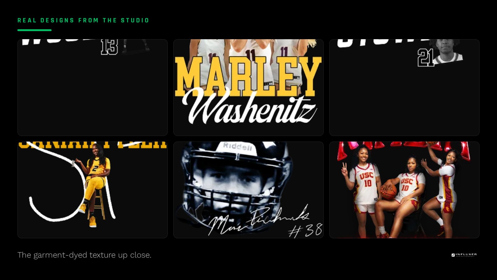
Because the base fabric already has texture and slight variation, a design with very fine, thin linework can look inconsistent from shirt to shirt more than it would on a flat-dyed tee. Bolder strokes and simplified shapes tend to hold their line better across a full production run.
White ink on a mid-tone earth color like Sage or Blue Jean is one of the more forgiving combinations on this fabric, since the softness of the dye and the softness of a clean white print pair naturally. Reserve your finest detail work for Black, Pepper, or White shirts, where contrast is highest and small shifts in dye tone matter least.
Where the tie-dye options fit
The Colorblast tie-dye colors, like Amethyst, Fiji Blue, and Hibiscus, are a different animal from the solid 1717 shades: no two shirts in a tie-dye run look identical. That is the appeal, but it means a busy, multi-color logo can get visually lost in the pattern. A single-color, high-contrast mark tends to survive tie-dye best, since the shirt itself is already doing the visual work.
Pairing the tee with the SS4500 hoodie
If your drop includes both a tee and the SS4500 hoodie, know that the hoodie fabric is not garment-dyed, so its colors read flatter and a shade more saturated than the equivalent-named 1717 color. Do not assume Navy on the tee and Navy on the hoodie will look identical side by side; preview both before finalizing a matched set.

A short buying framework
If you only remember one thing: pick the shirt color for contrast against your ink first, then decide if you want a neutral, earth tone, bright, or tie-dye look based on the mood of the drop. The fabric will make any of those choices feel intentional rather than arbitrary.
Choosing a 1717 color with confidence
- Accept that garment-dyed color can shift slightly batch to batch, and design accordingly.
- Default to Black, White, Ivory, or Khaki for designs with fine detail.
- Consider an earth tone like Blue Spruce or Sage for a worn-in, outdoorsy feel.
- Try a bright like Watermelon or Yam for a playful, youth-leaning drop.
- Keep tie-dye designs to a single bold ink color so the fabric pattern does not compete.
- Preview the tee and any matching SS4500 hoodie color side by side before finalizing.
- Simplify thin linework since bold strokes hold up more consistently on this fabric.
Frequently asked questions
Why do Comfort Colors shirts feel softer than other tees?
They are garment-dyed, meaning the whole shirt is dyed after it is already cut and sewn, which relaxes the cotton fibers. That process gives the fabric a broken-in feel right out of the package instead of after repeated washing.
Will every shirt in my order be exactly the same color?
Expect minor shade variation from batch to batch since dye is applied to finished garments rather than fabric rolls. It is normal for this product and part of the garment-dyed look, not a printing error.
Is the 1717 a good match for a hoodie in the same color?
The SS4500 hoodie is not garment-dyed, so a color with the same name can read a shade more saturated or flatter on the hoodie than on the tee. Preview both together before assuming they will match exactly.
Should I avoid fine detail on this fabric?
Not entirely, but bold strokes and simplified shapes hold their line more reliably across a production run than very thin linework. If your logo has hairline detail, consider thickening it before you order.
Start from a template — Preview a ready-made design across the full Comfort Colors 1717 lineup.
Compare paths first — Not sure where to begin? Get pointed to the right starting step.