Design it for me
Tie-Dye Merch for Athletes: When It Works
Tie-dye can make athlete merch feel like an event instead of a plain shirt, but only if the design is built to survive a busy pattern.
By Influxer · Published 2026-08-16 · Updated 2026-08-16 · 4 min read
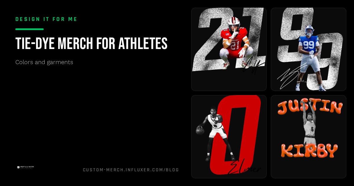
Tie-dye shows up on merch tables at exactly the moments people want a shirt to feel like a keepsake rather than a uniform: senior night, a summer camp, a fun run, a one-off team event. It stands out on a table of solid colors and nobody's shirt looks exactly like anyone else's, which is part of the appeal.
It is also the color choice most likely to fight your design if you treat it like a solid shirt with a pattern on top. This piece covers when tie-dye earns its spot in a merch lineup and what your artwork needs to look like for it to actually work.
What tie-dye actually is in this catalogue
The Comfort Colors 1717 lineup includes a set of Colorblast tie-dye colors on the same garment-dyed tee, such as Amethyst, Citrine, Fiji Blue, Hibiscus, Ocean, and Seaglass. Each one is a genuine dye process, not a printed pattern, so no two shirts in a production run look identical. That is a feature, not an inconsistency to fix.
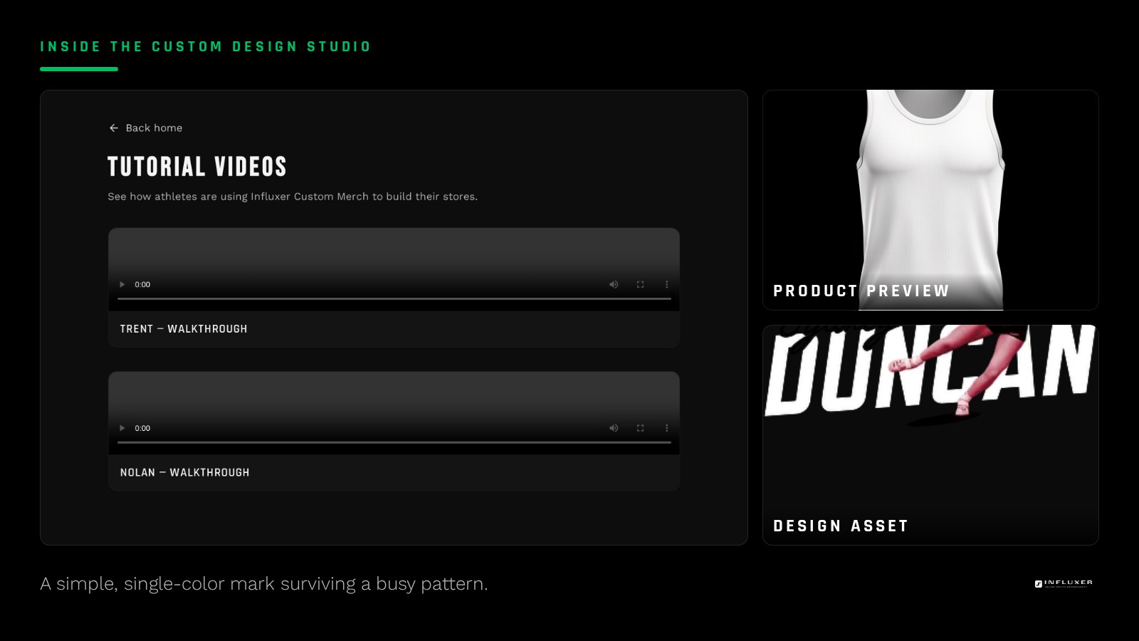
Because the pattern itself carries so much visual weight, tie-dye competes directly with anything busy in your design. A logo with three or four ink colors and fine detail will often get lost, while a bold, single-color mark tends to survive and even benefits from the contrast against a shifting background.
When tie-dye is the right call
Reach for a tie-dye colorway when the shirt itself is meant to be the memory, not just the delivery vehicle for a logo. Senior night, a one-time camp, a fun run, or any event where "everyone gets a slightly different shirt" is part of the charm are strong fits.
It also works well when your design is intentionally minimal: a small wordmark, a single number, or initials. Those elements read as a label on top of the pattern rather than competing with it.
- One-off events where a unique shirt feels appropriate.
- Minimal designs: a single number, initials, or a short wordmark.
- Single-color ink in black or white, which separates cleanly from any pattern color.
When to skip it
Skip tie-dye if your design carries a multi-color logo with fine detail, like a mascot illustration with shading or a wordmark with a drop shadow. The pattern will compete with every one of those elements at once, and the finished shirt reads busy rather than intentional.
It is also the wrong call for anything meant to look uniform across a full roster, since batch and shirt-to-shirt variation is the whole point of tie-dye and works against a matched-set look.
Picking a tie-dye colorway for your ink
Cooler colorways like Ocean and Fiji Blue pair well with black or white ink and read calm rather than chaotic. Warmer ones like Hibiscus and Citrine bring more energy and suit a bold, single-color mark in a contrasting shade like navy or black.
Preview your actual artwork on the specific tie-dye color in the Influxer studio rather than guessing from a name. Tie-dye colors vary enough shirt to shirt that what you see in the preview is a representative example, not an exact promise.
Pairing tie-dye with a hoodie
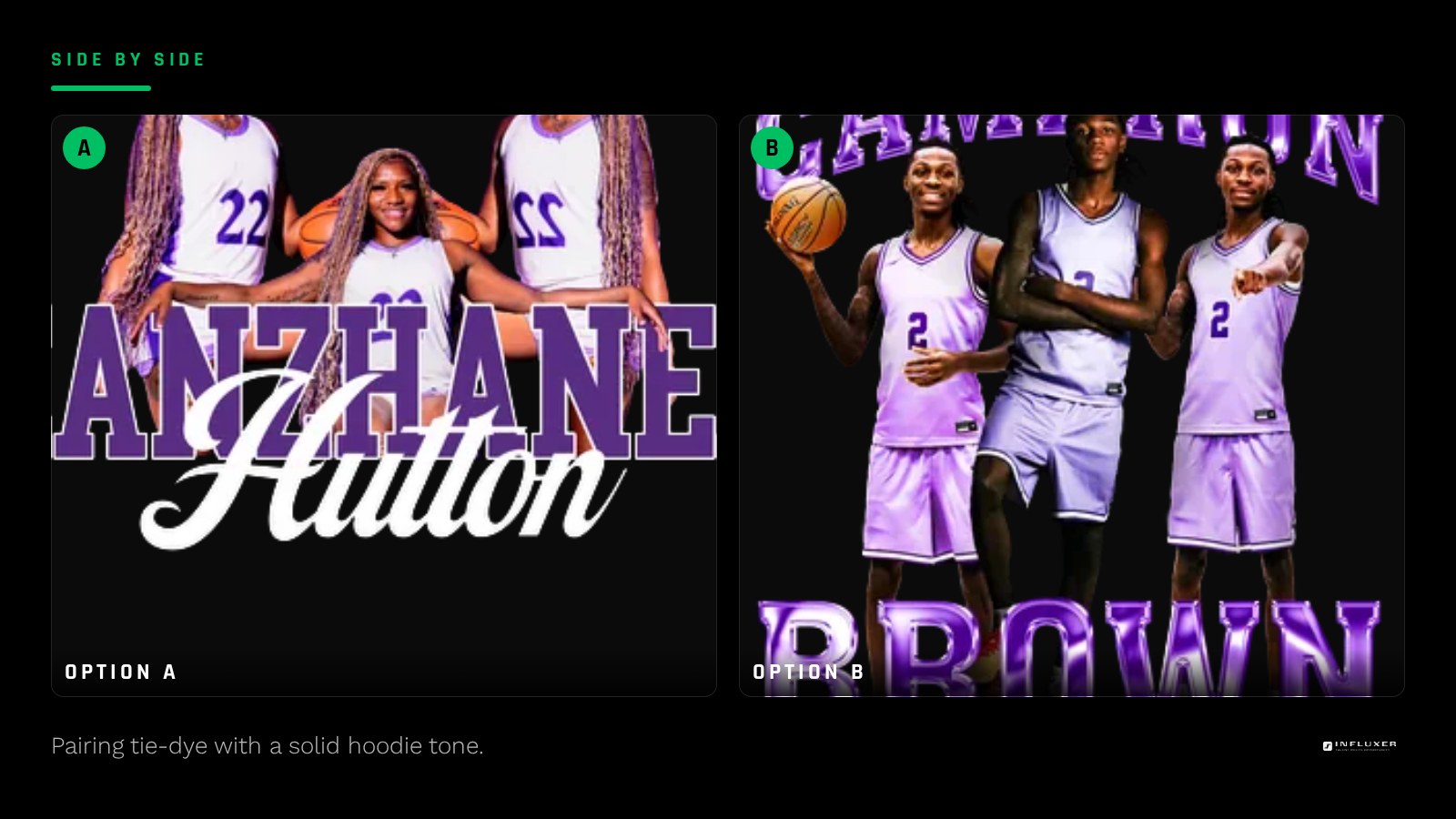
Tie-dye is a tee-only option in this catalogue, so if your drop includes an SS4500 hoodie, pick a solid hoodie color that pulls one tone out of the tie-dye pattern rather than trying to find a tie-dye hoodie that does not exist. A cool-toned tie-dye pairs naturally with a Storm Blue or Navy hoodie, while a warm one pairs with Maroon or Orange.
Keeping the rest of the drop simple
If tie-dye is one option in a larger lineup, keep the other colorways solid and simple so the tie-dye option reads as a special addition rather than one more choice among many similar ones. A short, clear lineup makes the tie-dye piece feel like the standout it is meant to be.
Deciding on a tie-dye colorway
- Confirm the occasion is a good fit: a one-off event rather than a matched team look.
- Simplify your design to a single ink color if possible.
- Avoid fine detail or multi-color logos on a tie-dye colorway.
- Preview the actual tie-dye color you are considering, since patterns vary shirt to shirt.
- Choose a solid hoodie color that echoes a tone from the tie-dye pattern, since tie-dye hoodies are not available.
- Keep the rest of your color lineup simple so tie-dye stands out as the special option.
Frequently asked questions
Is tie-dye a good choice for a full team order?
It works better for one-off events than for a matched team look, since every tie-dye shirt varies slightly. If you want a consistent roster look, a solid color is the more predictable choice.
What kind of design works best on tie-dye?
A single-color, simple mark like initials, a number, or a short wordmark holds up best. Multi-color or highly detailed designs tend to compete with the pattern and get visually lost.
Can I get a tie-dye hoodie to match a tie-dye tee?
Tie-dye is offered on the Comfort Colors 1717 tee, not on the SS4500 hoodie. Pick a solid hoodie color that pulls a tone from your tie-dye pattern to keep the pieces feeling coordinated.
Will every tie-dye shirt in my order look the same?
No, and that variation is expected with a genuine dye process rather than a printed pattern. Each shirt will be a little different, which is part of what makes tie-dye feel special for a one-off event.
Start from a template — Preview a simple, bold design on a real tie-dye colorway.
Watch the studio tutorial — See how tie-dye colorways look on real garment mockups.