Design it for me
Choosing Shirt Colors for Your Merch: A Decision Guide
A decision guide for picking shirt colors that make a design look intentional instead of accidental, built around the real Comfort Colors 1717 lineup.
By Influxer · Published 2026-08-16 · Updated 2026-08-16 · 5 min read
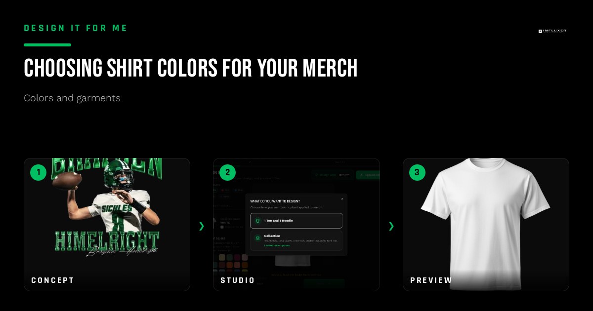
Picking a shirt color feels like the easy part of a merch order, right up until you see your design sitting flat and lifeless on a color that looked great in your head. Color choice is not decoration. It is the thing that decides whether ink reads crisp from across a gym or disappears into the fabric.
This guide is the pillar for every color decision on the site: how to think about contrast, which garments are involved, and how to narrow a huge color list down to two or three that actually serve your design. Everything below is built around the real catalogue in the Influxer studio, the Comfort Colors 1717 garment-dyed tee and the Independent Trading Co. SS4500 hoodie, not a generic color wheel.
By the end you should be able to look at your artwork and name the shirt colors worth testing, and just as important, the ones to skip.
Start from your ink, not the shirt rack
Most people pick a shirt color first and then hope the design works on it. Flip the order. Look at your artwork's darkest and lightest values and ask what they need to separate from. A white wordmark needs a mid-to-dark shirt behind it. A design that is mostly navy and gold needs a background that is neither navy nor gold, or the shirt eats half your palette.
This matters more on the Comfort Colors 1717 because it is garment-dyed: the fabric is dyed after the shirt is already sewn, which gives it a softer, slightly irregular color that can shift a little batch to batch. That softness is part of the appeal, but it also means a color like Blue Spruce or Sage reads a touch muted compared to a flat printed reference, so a light logo needs a bit more contrast margin than it would on a stark, uniform fabric.
The three-color shortlist method
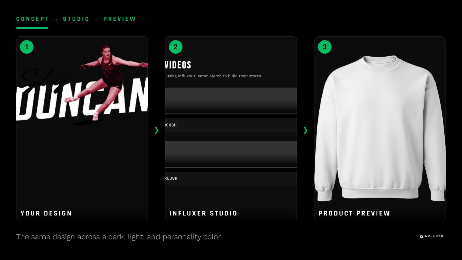
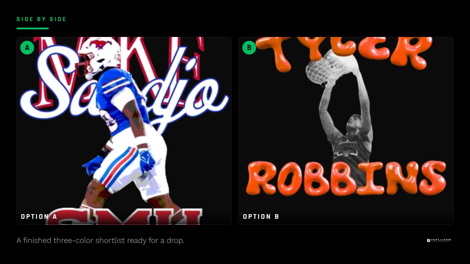
Instead of scrolling every option, force yourself to a shortlist of three: one dark, one light, one with personality. Dark covers Black, Pepper, or True Navy. Light covers White or Ivory. The personality slot is where a color like Yam, Watermelon, or Blue Jean earns its spot, something that says more about the team or athlete than a plain neutral does.
Preview your actual design on all three in the Influxer studio before deciding. The mockup will show you things a swatch chip never will, like whether a two-color logo needs a fourth color of shirt because two of your ink colors are both mid-tone and neither separates from the fabric.
- Dark anchor: Black, Pepper, or True Navy for a design with light or white ink.
- Light anchor: White or Ivory for a design with dark, saturated ink.
- Personality pick: Yam, Watermelon, Blue Jean, or Sage when the shirt itself is part of the message.
Contrast rules that hold up in practice
White ink on Khaki or Sandstone looks fine on screen and flat in person, because both are light, low-saturation colors. Push the shirt darker or push the ink to a color, and the same design gets a pulse it did not have before.
The opposite mistake happens with black ink on a busy color like Berry or Crunchberry-adjacent tones: black holds up fine on saturated colors, but thin linework can look harsh rather than clean. If your art has fine detail, a mid-value color like Blue Jean or Sage gives the black room to read without turning into a block.
Hoodies behave differently than tees
The SS4500 hoodie is a midweight cotton/poly fleece, not a garment-dyed tee, so its colors sit flatter and more uniform than the 1717 lineup. A color that looks slightly washed on the tee, like Blue Spruce, tends to look more saturated on the hoodie fabric.
One real constraint: camo colorways are not offered on the hoodie at all. If a camo tee is part of your plan, do not build the matching piece around a camo hoodie, because it is not in the lineup. Pick a solid hoodie color that pulls one tone out of the camo pattern instead, like Forest Green or Army.
When to just pick the neutral
If you are unsure, a neutral wins more often than a bold color. Black, White, Navy, and Ash Heather-style tones sell better across a wider range of tastes because they are not making a statement on their own, your design is. Save the bold colorway for a second or third option once you know the design works.
Building out a small color lineup
A drop rarely needs more than three or four shirt colors. Offer one dark, one light, and one or two colors that carry personality. More than that and you are asking buyers to make a harder decision, not giving them more choice; see the companion piece on exactly how many colorways to offer for the reasoning behind that number.
Before you lock in a shirt color
- Identify your design's darkest and lightest ink values before picking a shirt.
- Shortlist one dark, one light, and one personality color.
- Preview the real design on all three in the studio, not a swatch chip.
- Remember the 1717 tee is garment-dyed and reads slightly softer than a flat color reference.
- Check any camo tee plan against the hoodie lineup, since camo is not offered on hoodies.
- Favor a neutral if you are unsure the bold option will hold up.
- Cap your color lineup at three or four so buyers can decide quickly.
Frequently asked questions
What is the safest shirt color for a two-color logo?
Black or True Navy is the safest dark option, and White or Ivory is the safest light option, because both give strong separation for most ink combinations. Preview both before committing since some logos read better dark-on-light than light-on-dark.
Does garment-dyed fabric change how colors look?
Yes. The Comfort Colors 1717 is dyed after the shirt is sewn, which gives colors a softer, slightly irregular look and some batch-to-batch variation. It is a feature of the fabric, not a flaw, but it means you should expect colors like Sage or Blue Spruce to read a touch more muted than a flat swatch.
Can I get a camo hoodie to match a camo tee?
No. Camo colorways are offered on the tee but not on the SS4500 hoodie. If you want a matching pair, pick a solid hoodie color that echoes one tone from the camo pattern instead.
How many shirt colors should a first drop include?
Two to four is usually enough: a dark neutral, a light neutral, and one or two colors with more personality. Offering too many colors up front slows buyers down more than it helps them.
Start from a template — Pick a ready-made design and preview it across real shirt and hoodie colors.
See the studio in action — Watch how the color preview works before you commit.