Design it for me
Neutral vs Bold Merch Colors: Picking a Lane
A simple way to decide between a neutral and a bold shirt color, using real examples so the choice stops feeling like a coin flip.
By Influxer · Published 2026-08-16 · Updated 2026-08-16 · 4 min read
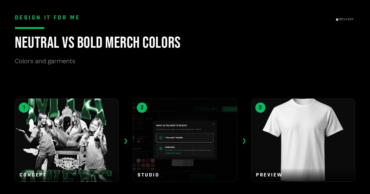
Every color decision on a merch order eventually comes down to this fork: play it safe with a neutral, or commit to something bold. Both are legitimate choices, but they solve different problems, and picking one for the wrong reason is how a drop ends up looking indecisive instead of intentional.
This is a practical way to decide, using the real neutral and bold options in the Comfort Colors 1717 and Independent Trading Co. SS4500 lineups rather than an abstract color theory lesson.
What "neutral" is actually doing for you
A neutral shirt color like Black, White, Ivory, Khaki, or Pepper is not boring, it is quiet on purpose. It puts every bit of visual weight on your ink, which is the right call when the design itself is the star: a detailed mascot, a multi-color logo, or a wordmark with a lot of personality already baked in.
Neutrals also sell more consistently across a wider range of people, since they are not asking anyone to commit to a color preference. If you are ordering for a broad group, like an entire roster or a general fan base, a neutral is the lower-risk default.
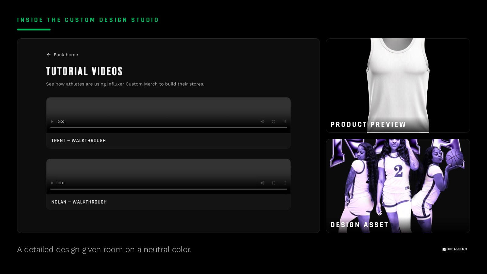
What "bold" is actually doing for you
A bold color like Watermelon, Yam, Flo Blue, or Neon Pink puts the shirt itself in the conversation. It works when the design is deliberately simple, so the color carries part of the message the artwork does not need to. A single number or initials on Yam reads differently than the same mark on Black, more personal, less like a uniform.
Bold colors are also the right move when you want a drop to stand out physically in a crowd, like a student section or a sideline, where a sea of black shirts blends together but a block of Watermelon does not.
- Bold works best with simple, single or two-color designs.
- Bold reads well when the goal is visibility in a crowd.
- Neutral works best with detailed, multi-color designs.
- Neutral is the lower-risk default for a broad audience.
A test to break the tie
Cover your design with your hand and look at just the shirt color. If it still feels like it says something about the team or athlete on its own, a bold color is earning its place. If a plain block of that color says nothing, you are choosing it for excitement alone, which is a fine reason but worth knowing.
Then do the opposite: cover the shirt and look at just the design. If the design alone is detailed enough to carry the shirt, lean neutral so nothing competes with it.
Hoodies tilt the decision slightly
On the SS4500 hoodie, bold options like Neon Pink, Safety Orange, and Gold read more saturated than their tee equivalents because the fleece is not garment-dyed. A bold hoodie color is a bigger visual commitment than the same bold color on a tee, so it is worth previewing on the actual hoodie mockup before deciding it is the right call for outerwear rather than just a tee.
Combining both in one drop
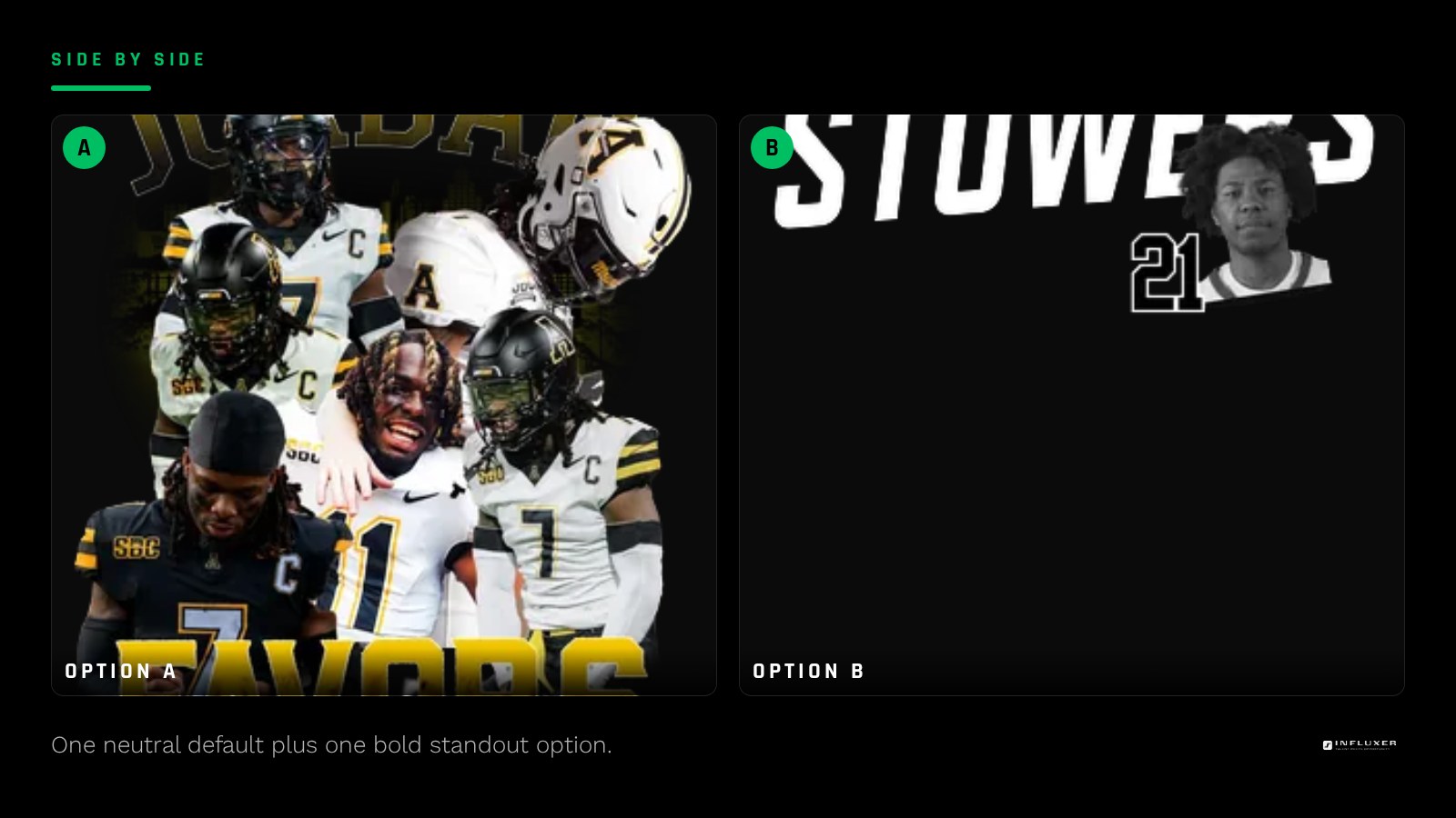
You do not have to choose only one lane for an entire drop. A common, effective structure is one neutral as the default option and one bold color as the limited or "fun" option. That gives buyers who want the safe choice a home and gives buyers who want to stand out a reason to pick the drop over a plain team shirt.
Avoiding the middle ground
The riskiest zone is a mid-saturation color that is neither clearly neutral nor clearly bold, like a muted Grape or Dusk. These can look like an indecisive compromise rather than a deliberate choice. If you are drawn to a mid-tone color, make sure it is genuinely earning its place against your specific ink rather than being a hedge between two better options.
Choosing neutral or bold
- Decide whether your design or the shirt color should carry the visual weight.
- Default to neutral for detailed, multi-color, or broad-audience designs.
- Choose bold for simple, single-color designs meant to stand out in a crowd.
- Cover the design and judge the shirt color alone, then reverse the test.
- Preview any bold color on the actual SS4500 hoodie mockup before ordering outerwear.
- Consider offering one neutral and one bold option in the same drop.
- Avoid mid-saturation colors that read as an indecisive compromise.
Frequently asked questions
Is a neutral shirt always the safer choice?
It is the lower-risk choice for a broad audience or a detailed design, since it puts attention on the artwork. It is not automatically better; a bold color can outperform a neutral when the design is simple and the goal is visibility.
Do bold colors look the same on a hoodie as on a tee?
Not exactly. The SS4500 hoodie fleece is not garment-dyed like the Comfort Colors tee, so bold colors like Neon Pink or Gold read more saturated on the hoodie. Preview the specific hoodie color before committing.
Can I offer both a neutral and a bold color in the same drop?
Yes, and it is a common approach: one neutral as the default and one bold color as a limited or standout option. This gives cautious buyers and bold buyers each a good reason to order.
What is the risk of picking a mid-tone color?
Mid-saturation colors like Grape or Dusk can look like an indecisive middle ground rather than a deliberate choice. They can still work, but they need to be tested against your specific ink rather than picked as a hedge.
Start from a template — Preview a ready-made design in both neutral and bold colorways.
Compare paths first — Get pointed to the right starting step for your drop.