Design it for me
Black Shirt Design Ideas That Keep Detail
Design ideas for black shirts that keep fine detail from disappearing into the fabric, with real ink and contrast guidance.
By Influxer · Published 2026-08-16 · Updated 2026-08-16 · 4 min read
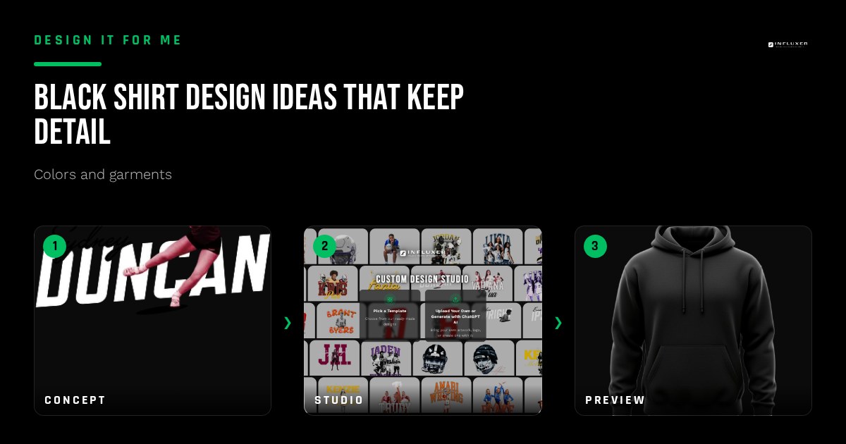
Black is a reliable, popular shirt color, but it hides detail more easily than any other color in the lineup. Thin lines, subtle shading, and low-contrast ink colors can disappear into the fabric in a way they never would on a lighter shirt, so black shirts reward a slightly different design approach than the rest of the lineup.
These ideas are built around keeping your design legible and intentional on black, rather than discovering after the fact that half your detail vanished into the shirt.
Why detail disappears on black
Black absorbs light rather than reflecting it, so any ink color that is itself dark or low-saturation loses most of its visible contrast against the fabric. A charcoal gray or a muted navy ink that reads clearly on White can nearly vanish on Black. This is the single biggest thing to plan around when designing for a dark shirt.
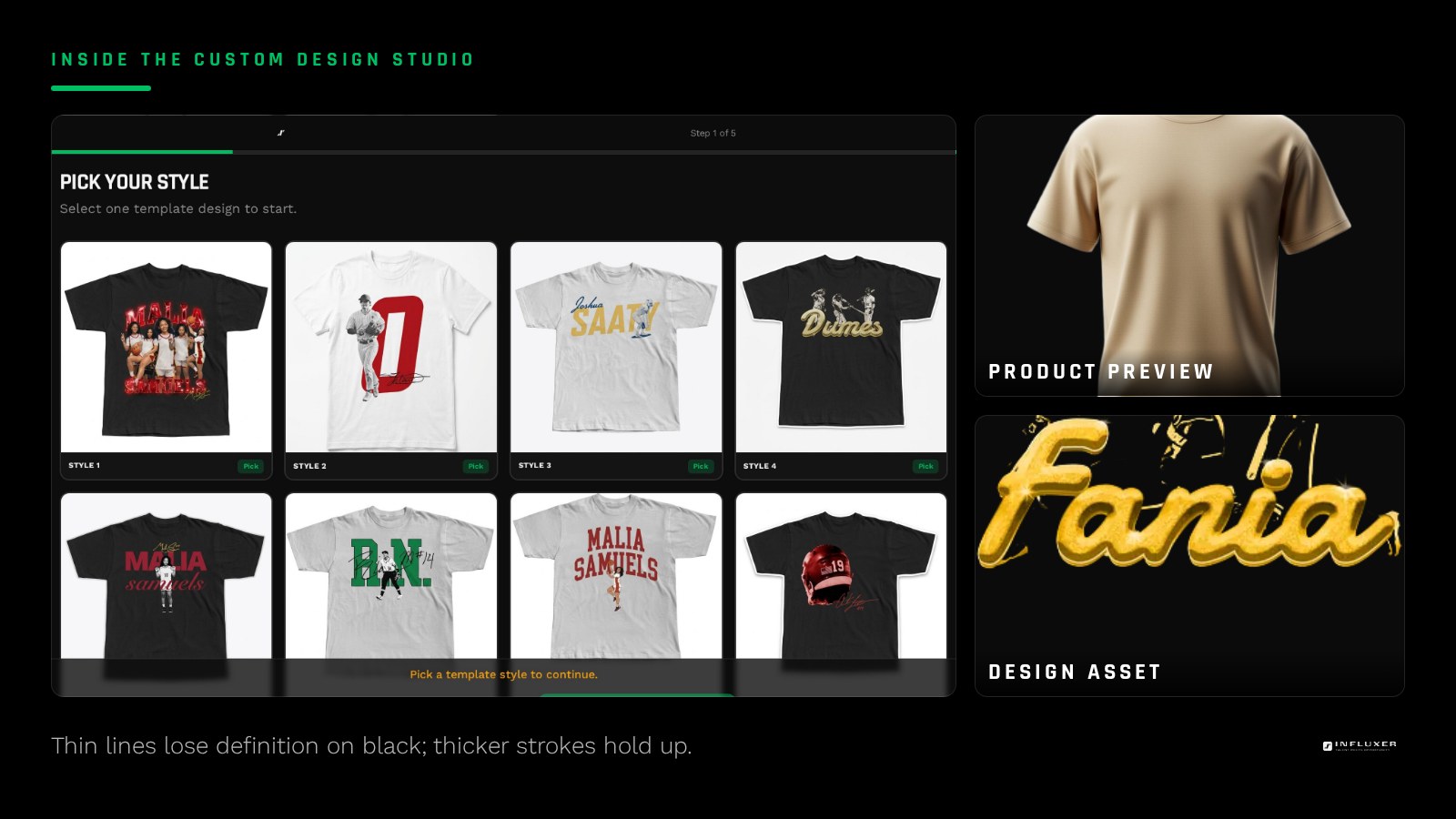
Fine linework compounds the problem: a thin one-point line in a mid-tone ink color can lose definition on black even when the same line would read fine on a lighter shirt. Bold strokes and simplified shapes hold up far better.
Ink colors that hold up on black
White ink is the most reliable choice on black because it gives maximum contrast and reads clearly at any distance. Bright, saturated colors like Yam, Bright Orange, or Flo Blue also hold up well since their saturation cuts through the dark background.
Avoid pairing black shirts with muted or low-saturation ink colors, like a dusty gray or a pale pastel, since those tend to blend into the fabric rather than stand out against it.
- White ink for maximum, reliable contrast.
- Bright saturated colors like Yam or Flo Blue for a bolder look.
- Avoid muted, low-saturation ink colors that blend into black.
Adjusting line weight and detail for dark fabric
If your design has fine detail, thicken the thinnest lines before printing on black rather than after seeing them disappear on the mockup. A line that reads fine at one point weight on white often needs to move up a notch to read cleanly on black.
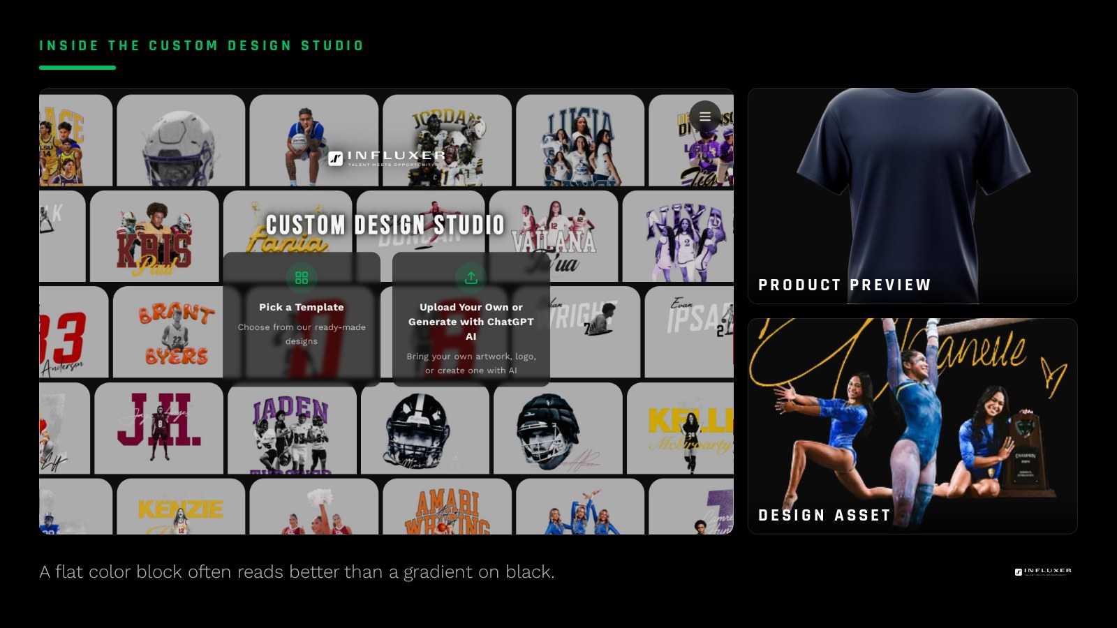
Simplify shading, too. A gradient or soft shadow effect that reads subtly on a light shirt can lose most of its visible range on black, since the darkest part of the gradient blends straight into the fabric. A flat color block often communicates the same idea more reliably.
Two-color designs on black
A white-and-one-accent-color combination is a strong, reliable formula on black: white carries most of the design for contrast, and a single bold accent color, like Watermelon or Bright Orange, highlights a name, number, or key detail. This keeps the design legible while still giving it personality beyond plain white-on-black.
Placement considerations
Black hides seams and shadows more than lighter colors, which can actually work in your favor for placement, since minor mockup imperfections are less visible. That said, keep your design centered and proportioned to the print area the same way you would on any other color; black does not change the actual placement rules, only how forgiving the fabric is of small shadows.
Testing your black shirt design before you submit
The mockup preview is the fastest reality check you have. Load your design on Black and look at it small, the way someone scrolling a storefront will see it first. If the name, number, or wordmark stops being readable when the image is thumbnail sized, the detail is too fine or the ink color is too close to the fabric, and that is a five-minute fix now rather than a reprint conversation later.
It also helps to compare the same artwork on one lighter color in the lineup. Seeing your design on Black next to the same design on Sandstone or White makes it obvious which parts of the art depend on contrast to work and which parts hold their shape on any fabric. Anything that only reads on the light shirt is the piece to thicken, brighten, or simplify before you submit.
Finally, decide what the design has to communicate at a distance. On black, one strong idea, delivered in high-contrast ink at a generous size, almost always outperforms three smaller ideas competing for the same print area.
Pairing with the hoodie
Black is available on both the Comfort Colors 1717 tee and the SS4500 hoodie, and it is one of the most consistent color matches between the two garments since black renders similarly on both fabrics. If you want the safest, most predictable coordinated pair across a tee and hoodie, Black is a strong default.
Black shirt design checklist
- Favor white or bright saturated ink over muted, low-contrast colors.
- Thicken thin linework before it disappears against the dark fabric.
- Simplify gradients into flat color blocks where possible.
- Use a white-plus-one-accent formula for a design with personality.
- Keep placement centered and proportioned as you would on any color.
- Treat Black as a safe, consistent match between tee and hoodie.
Frequently asked questions
What ink color is safest on a black shirt?
White gives the most reliable contrast on black. Bright, saturated colors also hold up well; muted or pastel colors tend to blend into the dark fabric and lose legibility.
Why does fine detail disappear on black shirts?
Black absorbs light rather than reflecting it, so thin lines and low-contrast ink colors lose the visual separation they would have on a lighter shirt. Thickening lines and simplifying detail helps them hold up.
Can I still use a gradient design on black?
You can, but expect the darkest part of the gradient to lose most of its visible range against the fabric. A flat color block often communicates the same idea more reliably on black.
Is Black a good pairing between a tee and hoodie?
Yes, Black is one of the most consistent color matches across the Comfort Colors 1717 tee and the SS4500 hoodie, since it renders similarly on both fabrics.
Start from a template — Preview a ready-made design on black before you decide on ink colors.
Upload your own design — Have your own artwork? Upload it and check contrast on black.