Design it for me
White Shirt Design Ideas That Do Not Look Plain
Design ideas for turning a white tee from the default safe choice into something with real character on the printed side.
By Influxer · Published 2026-08-16 · Updated 2026-08-16 · 4 min read
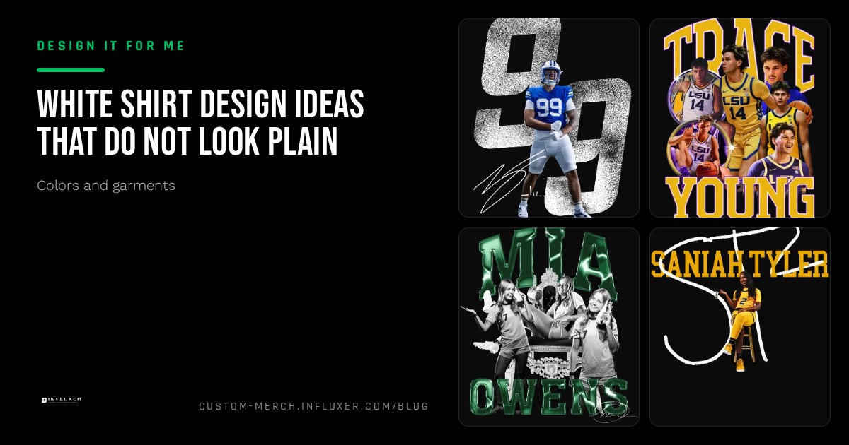
White is the most common shirt color because it works with almost any ink color, but that flexibility is also why white shirts sometimes end up looking generic. There is no fabric color doing any of the visual work, so the design itself has to carry the entire look.
These ideas are built around that constraint: instead of treating white as the safe, boring option, use it as a clean canvas that lets ink color, contrast, and layout choices do more of the talking than they would on a darker or busier shirt.
Lean into full-saturation ink colors
On a white shirt, ink color reads at full strength since there is no competing background tone. A bold, saturated ink like a deep navy, a bright red, or a strong forest green pops on white in a way it would not on a mid-tone shirt. Use this to your advantage instead of defaulting to plain black ink.
If your school or personal colors include a bright accent, white is one of the best backgrounds to show it off at full intensity.
Play with line weight and negative space
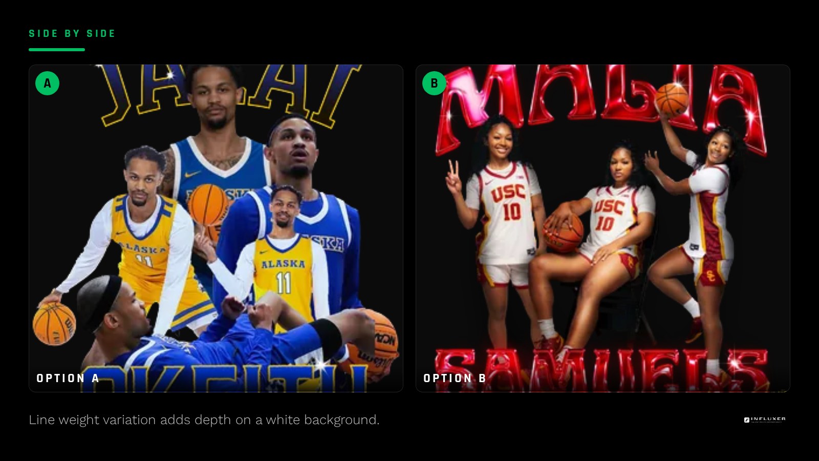
Because white offers no texture of its own, a design with varied line weight, some thick strokes and some thin detail lines, reads with more depth on white than it would on a garment-dyed color where the fabric already adds visual texture. Use this contrast deliberately: a bold outline with a few fine interior details can look considered rather than plain.
Negative space also works harder on white. A design that uses the shirt itself as part of the shape, letting white "cut out" sections of a graphic, reads as more sophisticated than a fully filled-in graphic would.
- Use a bold outline with select fine interior detail lines.
- Let the shirt color act as negative space inside the graphic.
- Choose one dominant ink color rather than spreading attention across many.
Two-color combinations that avoid the flat look
A single ink color is clean but can feel one-note on white. Adding a second, secondary ink color, used sparingly for an outline, a small accent detail, or a drop shadow effect, gives the design more depth without overloading it. Keep the ratio heavily weighted toward the primary color so the secondary stays an accent.
Placement choices that matter more on white
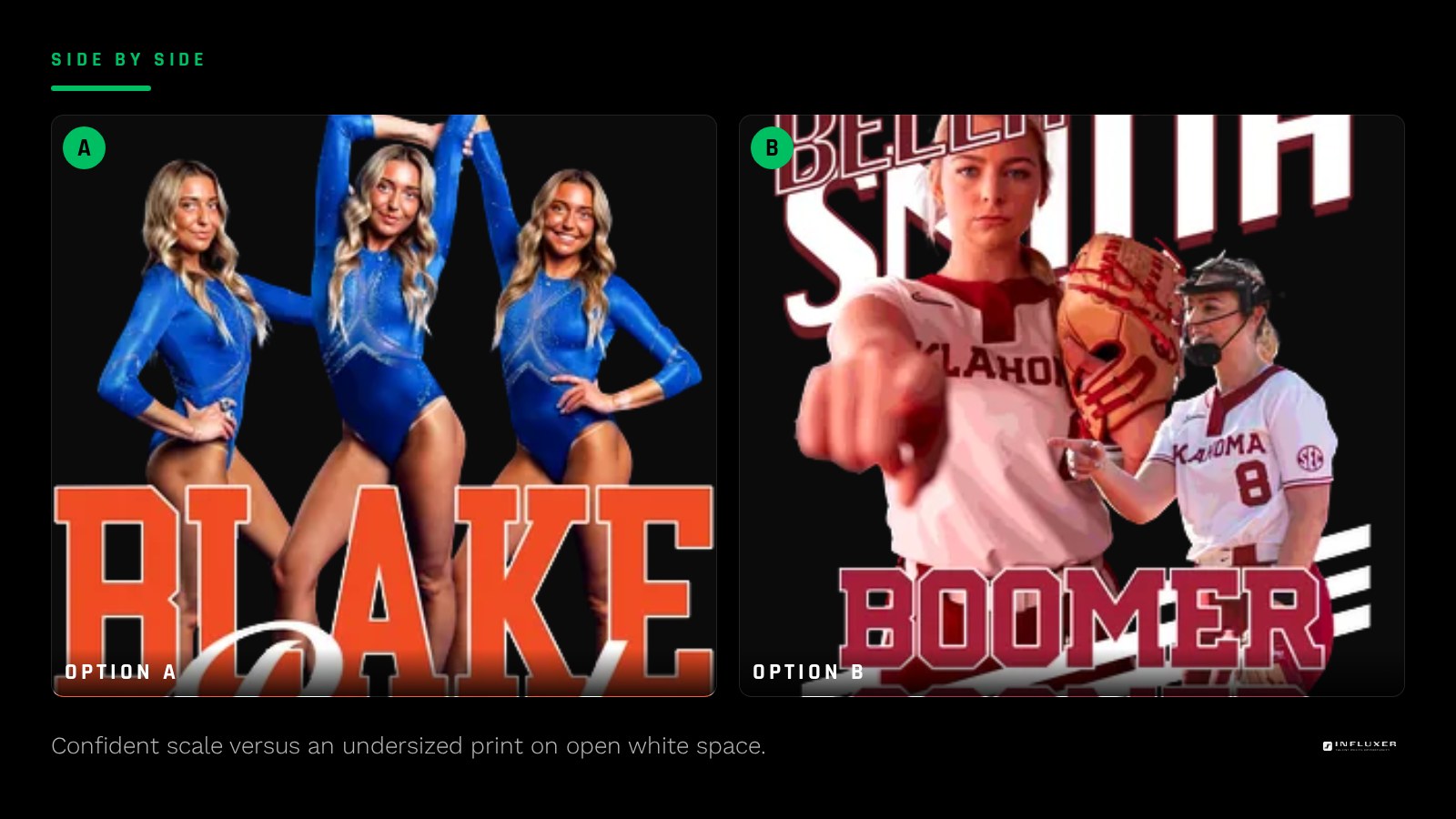
Because there is no color drawing the eye, placement and scale matter more on a white shirt. A design that is slightly undersized can look lost on all that open white space, where the same design might feel fine on a shirt with more visual weight of its own. Err toward a confident, well-proportioned scale for the chest print area rather than a small, timid version.
When white is not the right call
A photo-based design or one with subtle, low-contrast gradients can wash out on white in a way it would not on a shirt with more visual weight of its own. If your artwork depends on soft tonal shifts rather than hard color separation, test it on Ivory or a light neutral like Sandstone as well before committing to pure white.
Pairing a white tee with the hoodie
If you are pairing a white tee with the SS4500 hoodie, White is available on both, but the hoodie fabric renders more neutral and slightly less bright than the garment-dyed tee. This is a fine pairing for a clean, minimal look across both pieces, as long as your design translates well to the hoodie's slightly different white tone.
Checking your design before you order
Before finalizing, preview the design on the actual white garment mockup in the studio rather than judging it from a flat digital file. Colors and contrast that look right on a screen against a neutral background can read differently once placed on the real print area, so this step is worth the extra minute.
Pay attention to how the ink sits at the edges of the design, especially if you are using fine detail lines. A line that looks crisp at full zoom on your monitor can lose definition at actual print size, so it helps to check the mockup at something closer to how it will actually be seen: from a few feet away, not up close on a screen.
White shirt design checklist
- Choose one dominant, fully saturated ink color for the main design.
- Vary line weight so the design has depth rather than a flat look.
- Use the shirt itself as negative space where it strengthens the shape.
- Add a secondary ink color sparingly, not as a competing color.
- Scale the design confidently rather than undersizing it on open white space.
- Test photo-based or soft-gradient art on Ivory as a backup if it washes out.
Frequently asked questions
Why do white shirt designs sometimes look plain?
The fabric has no color or texture of its own, so if the design is undersized or uses only flat, low-contrast ink, there is nothing else on the shirt to add visual interest. The design itself has to carry the whole look.
What ink colors work best on white?
Fully saturated colors like deep navy, bright red, or forest green read at full strength on white since there is no competing shirt color. Avoid pale, low-contrast ink colors that can wash out.
Is a two-color design better than one color on white?
A single strong ink color is clean and reliable, but a small secondary accent color can add depth as long as it stays clearly secondary rather than competing for attention.
Should I use Ivory instead of pure white?
Consider it if your design leans on subtle gradients or photo-based art, since pure white can wash those out more than a slightly warmer neutral like Ivory would.
Start from a template — Preview a ready-made design on a white tee before you decide.
Upload your own design — Have your own artwork? Upload it and test it on white.