Bring your own
How to Build a Color Palette for Athlete Merch
A step-by-step process for building a small, consistent color palette for your merch, starting from one anchor color instead of picking hues at random.
By Influxer · Published 2026-08-16 · Updated 2026-08-16 · 5 min read
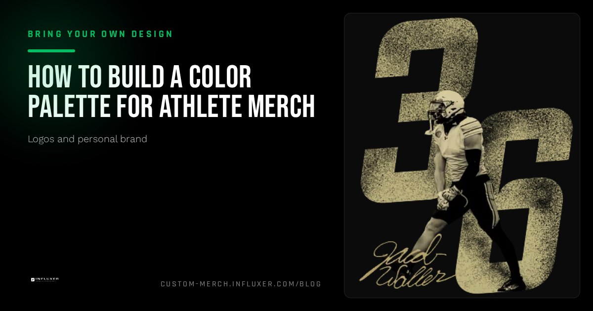
A merch drop looks unplanned when every product uses a different color combination chosen in the moment. It looks intentional when a small, consistent palette carries across every piece, even if the garment colors themselves change from item to item.
You do not need more than two or three core colors. What matters is picking them for a reason, contrast, association with your program or personal brand, and printability, rather than choosing whatever looks nice in a single design file.
This guide walks through building that palette from one anchor color outward, checking contrast against real garment options, and avoiding the color choices that look fine in a design tool but fall apart once printed on fabric.
Start with one anchor color, not a full palette
Pick a single color first, the one that will represent you most consistently, whether that is a team color, a color tied to your personal brand, or simply a color you want associated with your name. Every other decision builds outward from this one choice.
Resist the urge to lock in three or four colors before you have tested how the anchor color actually looks printed. It is much easier to add a second color once you know the first one works than to untangle a four-color palette where half the choices do not hold up.
Add a high-contrast pairing color
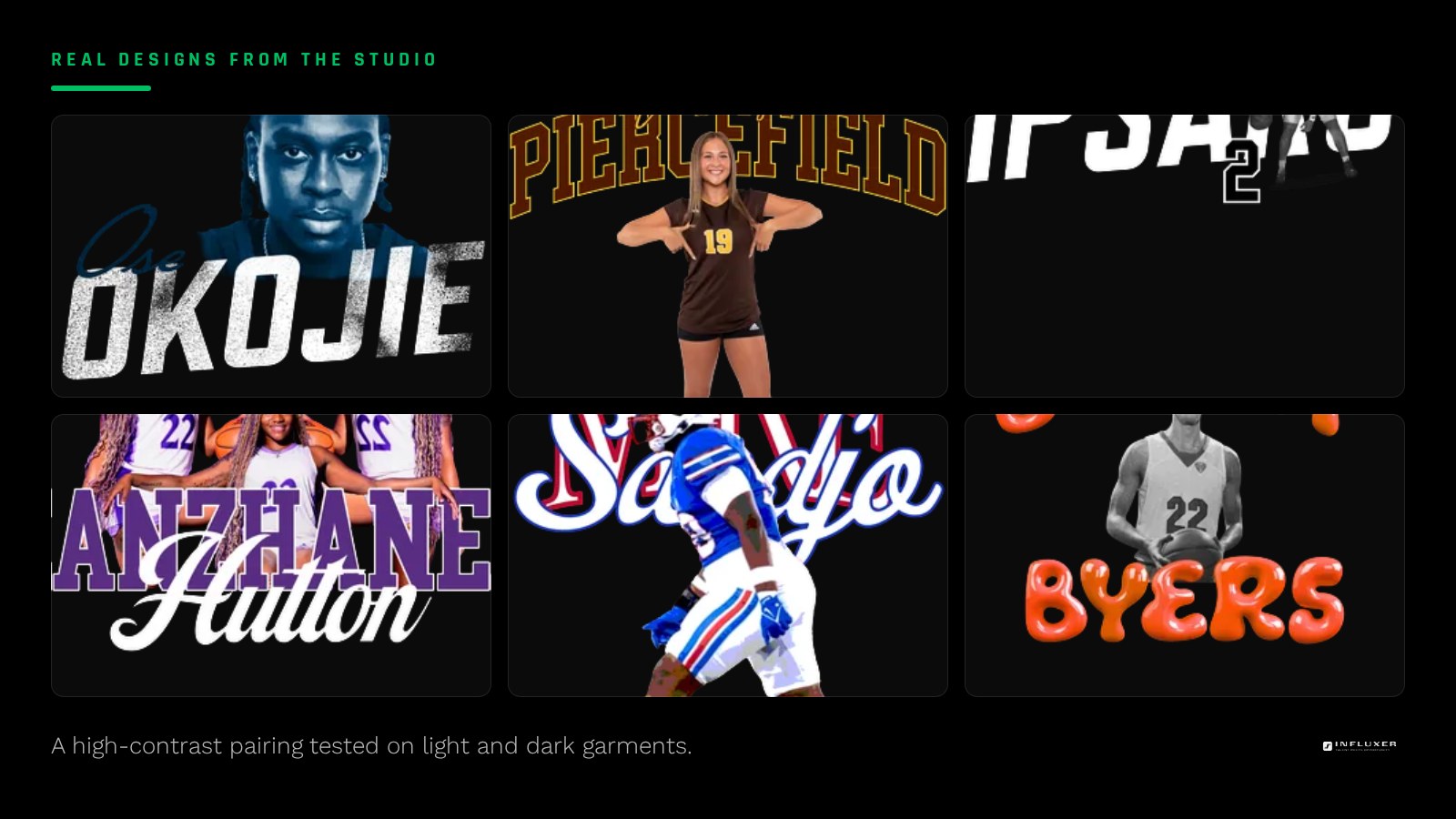
Your second color should exist specifically to create contrast against garments, not to add variety for its own sake. If your anchor color is dark, like a deep navy or black, your pairing color should be light: white, Ivory, or a bright accent. If your anchor color is already light or bright, your pairing color should be dark enough to sit clearly on a light garment too.
This pairing is what lets your design work across both dark and light garments without a full redesign. A design built only in one dark color has no path onto a dark shirt without becoming invisible.
Consider a third accent color sparingly
A third color can add energy, but treat it strictly as an accent used in small amounts, an outline, a small detail, a secondary graphic, never as a large fill competing with your first two colors. Merch with three colors evenly balanced across the design usually reads as busier and less intentional than merch with a clear primary and secondary color plus one small accent touch.
If you cannot describe in one sentence why the third color is there, it probably should not be. "It matches our program colors" is a real reason. "I liked it" usually means it needs more thought.
Check every color choice against real garment options
A color that reads perfectly on a white digital canvas can look completely different against a garment. The Comfort Colors 1717 tee is garment-dyed, which gives its colors a slightly muted, worn character compared to a standard tee, so a bright saturated design element can look more subdued once printed on it than it did in your design file.
Before finalizing your palette, preview your design against two or three real garment color options, not just the one you assumed you would use. A palette that only works on one specific garment color is fragile; a palette that holds up across a couple of different options gives you more flexibility for future products.
Understand the printing cost of more colors
Every additional color in a design generally adds complexity to how it is separated and printed. This does not mean you should design in one color out of caution, but it is worth being deliberate: a design that achieves the same visual impact with two colors instead of four is usually a stronger, cleaner design, not just a cheaper one.
If you are torn between a full-color version and a simplified two-color version of the same design, try building both and comparing them at actual print size. Many designs that feel like they need four colors on screen read just as strongly, sometimes more strongly, with two.
Keep the palette consistent across the whole drop
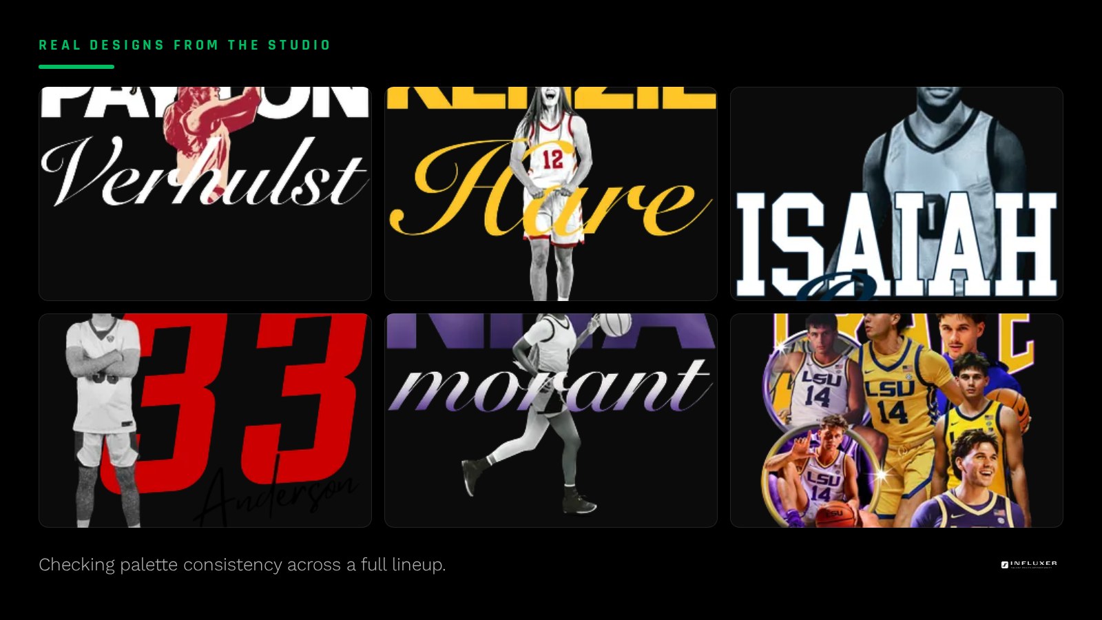
Once you land on your two or three colors, apply them consistently across every piece in a merch drop: the same accent color on a hoodie zipper detail as on a tee’s small back print, the same anchor color for your main wordmark everywhere it appears. This consistency is what makes a merch line feel like a real, planned collection instead of a handful of unrelated shirts.
The Influxer studio lets you preview your uploaded design across different garment colors in one place, which makes this consistency check easy. Look at your full planned lineup together, not one product at a time, before finalizing colors.
Before you finalize your palette
- Choose one anchor color first and confirm it before adding others.
- Add a high-contrast pairing color that works on both light and dark garments.
- Limit any third color to a small accent role, not an equal fill.
- Preview the palette against at least two real garment color options.
- Check how saturated colors look on a garment-dyed tee versus a standard tee.
- Compare a full-color version against a simplified two-color version at print size.
- Apply the same colors consistently across every product in the drop.
Frequently asked questions
How many colors should my merch palette have?
Two core colors plus, optionally, one small accent color is a strong working limit. This keeps the design flexible across garment colors and avoids the busy, unplanned look that comes from balancing several colors equally.
Can I use my school or team colors without using their logo?
Yes. Color itself is not a protected mark, so you can build a personal palette around your program colors as long as you are not reproducing the actual school or team logo, wordmark, or mascot artwork.
Why does my design look different on the garment than in my design file?
Screens display color with backlighting, which makes colors look more vivid than they will on fabric. Garment-dyed fabrics especially, like the Comfort Colors 1717 tee, add a muted, worn character that a standard digital canvas does not show.
Should every product in my drop use the same garment color?
No, the garment color can vary, but your design’s own colors, your wordmark color, your accent color, should stay consistent across products so the drop reads as one cohesive collection rather than several unrelated designs.
Upload your design — Preview your color palette across real garment options.
See garment options — Browse ready-made layouts if you want a starting point for colors.