Bring your own
How to Build a Personal Athlete Logo You Can Put on Merch
A concrete process for building your own athlete logo, from choosing a form to testing it at merch scale, before you ever touch a garment.
By Influxer · Published 2026-08-16 · Updated 2026-08-16 · 6 min read
Most athletes who try to build a personal logo start with software instead of a decision. They open a design tool, try fonts, undo, try another font, and end up with a folder of near-misses. The fix is to decide what kind of mark you are making before you touch letterforms at all.
A personal athlete logo is really one of four things: a wordmark (your name or nickname set in type), a monogram (your initials built into a shape), a number mark (your jersey number treated as the whole identity), or a combination mark (a small symbol paired with type). Picking one of these first turns an open-ended design problem into a much smaller one.
This guide walks through that choice, then through the handful of decisions that make a mark actually work on fabric: contrast, line weight, and size. Once you have a flat file you like, the Influxer studio previews it directly on a garment so you can judge it the way a stranger across a gym will see it, not the way you see it zoomed in on a laptop.
Pick one form before you pick a font
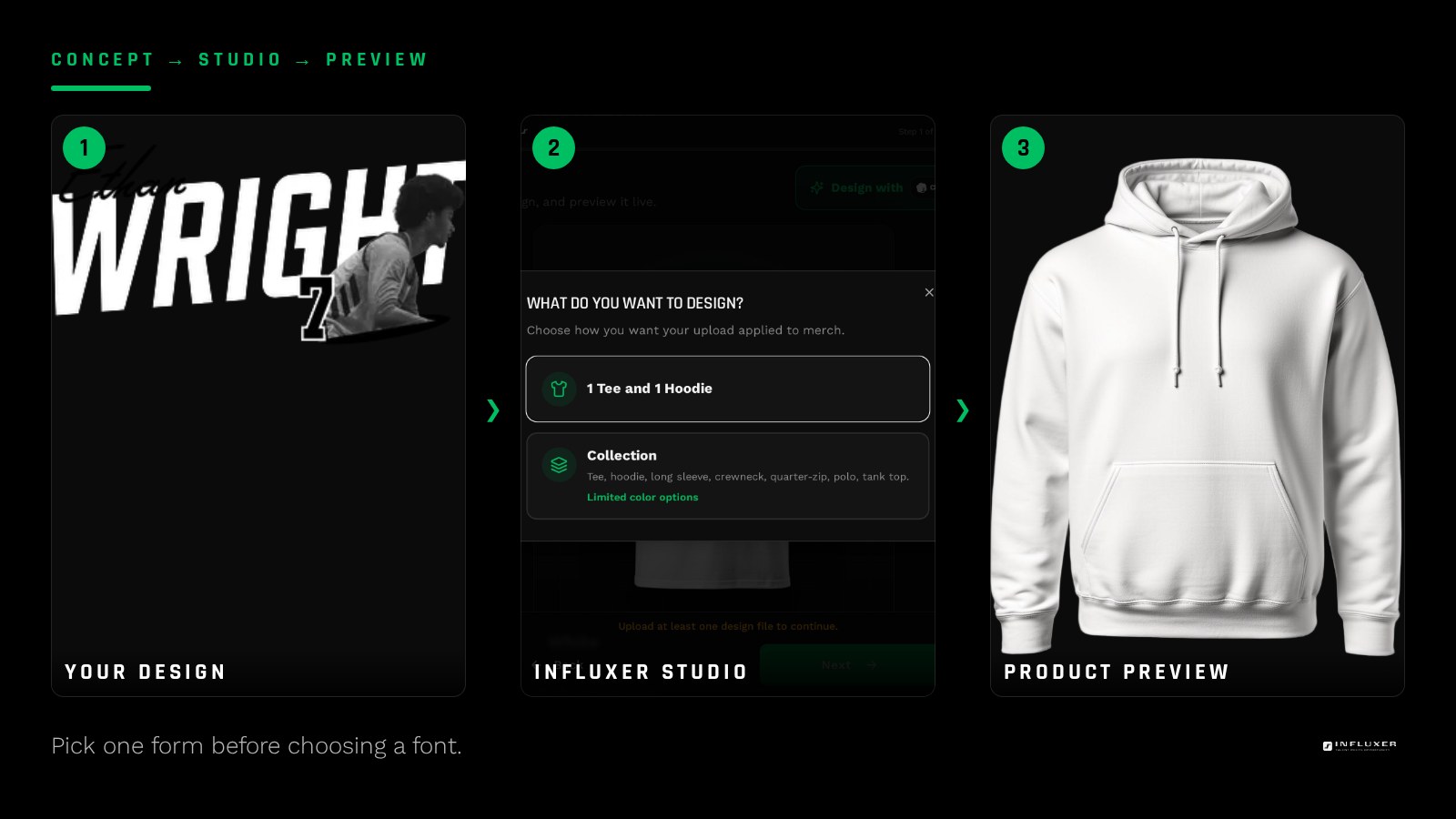
A wordmark is the lowest-risk choice if your name or nickname is short and distinct. It relies entirely on typography, so the font decision does almost all the work. A monogram suits athletes who want something that can stand alone as a small mark on a sleeve or hat, separate from a full wordmark on the chest. A number mark works when the number is already part of how people refer to you, more than the name is.
Do not try to combine all three into one busy logo. A wordmark plus a monogram plus a number crammed into one graphic reads as noise at printed size, even if each piece looks fine alone. Choose the one form that matches how you are actually known, and save the others for secondary placements like a sleeve or a hood.
- Wordmark: best when your name reads clean in 6-10 letters.
- Monogram: best when you want a compact mark that works small.
- Number mark: best when the number is your identity, not just a jersey detail.
- Combination mark: only once you have a monogram or symbol that already works alone.
Build for legibility at distance, not at zoom
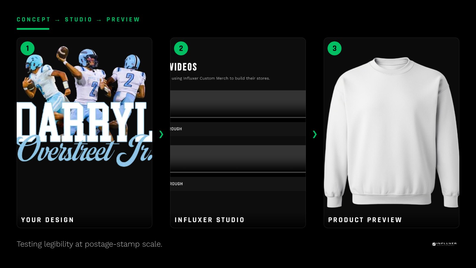
A logo you built at 400 percent zoom on a screen is not the logo people will see. Merch gets read from ten to twenty feet away, in a gym or a parking lot, often for under a second. Test your draft by shrinking it to the size of a postage stamp on your screen. If you cannot tell what it says, it will not read on a shirt either.
The fix is almost always fewer strokes and more space. Drop unnecessary flourishes, tighten unrelated details, and give the mark room to breathe instead of filling the whole canvas. A mark that looks slightly plain at full size usually reads as clean and confident at distance, which is the trade you want.
Choose weight and contrast on purpose
Thin, elegant strokes look great in a portfolio and disappear on a shirt. Screen printing and DTF both lose fine detail once ink meets fabric texture, so a hairline serif that looks crisp on your monitor can blur into the garment weave at print size. Favor medium to bold weights for anything under about four inches tall.
Contrast against the garment matters as much as the mark itself. A charcoal logo on a Pepper tee has almost no separation and will look like a smudge from a few feet away. Design your logo in solid black or white first, then confirm it against your actual planned garment color before you commit to a final palette.
Keep it to one strong idea
The best personal athlete logos usually communicate one thing clearly: a name, an initial pairing, or a number, executed well. Trying to encode your position, your hometown, your motto, and your number into a single mark almost always produces something busy and forgettable.
If you have several ideas you like, that is fine, but build them as a small family rather than jamming them together. A primary mark for the chest, a simplified version for a sleeve or hat, and maybe a number-only version for a smaller accessory print. Each piece stays legible because it is not trying to do everything at once.
Sketch flat before you touch color or effects
Build your first pass in solid black on a white background, with no gradients, drop shadows, or outer glows. Effects like these often do not survive the file conversion into print-ready art, and they hide weak spots in your actual shape. If the mark looks strong in flat black, it will hold up under almost any print method.
Once the flat version reads well, you can decide whether it earns a second color. Most personal logos do not need one. A one-color mark is cheaper to reproduce cleanly across different garment colors and gives you more flexibility to flip it to white for dark shirts without redrawing anything.
Test it on the actual garment before you decide
A flat logo on a white canvas and the same logo on a heathered tee are two different experiences. Upload your draft into the Influxer studio and preview it on the garment and color you actually plan to order. This is the fastest way to catch a mark that is technically fine but visually weak against a specific fabric color.
Look at it at the size it will actually print, not zoomed in. If your studio preview lets you compare a chest placement against a smaller sleeve placement, check both, since a mark built for one scale does not always survive shrinking to the other without adjustment.
Know the line you should not cross
A personal logo should be built from elements you own outright: your own name, your own number, your own initials, and fonts or graphics with a commercial license. Do not lift a school crest, a professional team mark, or someone else's illustration into your design, even as inspiration for a "close enough" redraw.
You can still echo the feel of a program you are part of by choosing similar colors and a similar athletic weight of type, without touching its protected marks. That keeps your logo genuinely yours and avoids a review delay when you go to print it.
Before you finalize your logo
- Pick one form: wordmark, monogram, number mark, or combination mark.
- Build the first draft in flat black with no effects or gradients.
- Shrink it on screen to postage-stamp size and confirm it still reads.
- Choose a stroke weight that survives print, not just screen viewing.
- Check contrast against your actual planned garment color, not just white.
- Build a simplified secondary version for smaller placements like a sleeve.
- Preview the final file on a real garment mockup before ordering.
- Confirm every element is yours to use: your name, your number, licensed fonts.
Frequently asked questions
Do I need a designer to build a personal athlete logo?
No. A wordmark or a simple monogram built in a free tool with a solid font can look sharp if you keep it to one idea and test it at print size. The biggest gains come from restraint and legibility checks, not professional software.
Should my logo include my number and my name?
Usually not in one mark. Build a primary logo around whichever is more central to your identity, then create a simplified number-only version as a secondary piece for smaller placements like a sleeve or hat.
What file should I upload once my logo is done?
A PNG with a transparent background works for most raster logos, exported at a high resolution for your intended print size. If you built it in vector software, an SVG or PDF with text converted to outlines gives you the cleanest scaling.
Can I use my school colors in my personal logo?
Yes, color is not protected the way a crest or wordmark is. You can build a logo in your program colors as long as you are not reproducing the school’s actual logo, mascot artwork, or wordmark.
Upload your logo — Bring your finished logo into the studio and preview it on a real garment.
See font and color guides — Short videos on building and placing a personal mark before you order.