Bring your own
Jersey Number Logo Ideas That Still Read From 20 Feet Away
A breakdown of number-based logo styles that hold up at merch scale, with the specific design choices that make a number read clean from across a room.
By Influxer · Published 2026-08-16 · Updated 2026-08-16 · 5 min read
A number is one of the strongest personal marks an athlete can build, because it is already unambiguous. Nobody has to guess what it means the way they might with an abstract symbol. The problem is that most number treatments people try either look like a plain jersey font, which reads as generic, or get so stylized they stop being legible.
The goal is a number that looks intentional as a standalone graphic, not like it was cropped out of a jersey template. That means picking a construction style, deciding how much you decorate it, and testing it small before you commit.
This piece walks through the number styles that actually work as merch logos, plus the handful of technical choices, stroke weight, counters, spacing, that separate a number that reads clean from one that blurs into a smudge once it is printed on fabric.
Four number styles worth trying
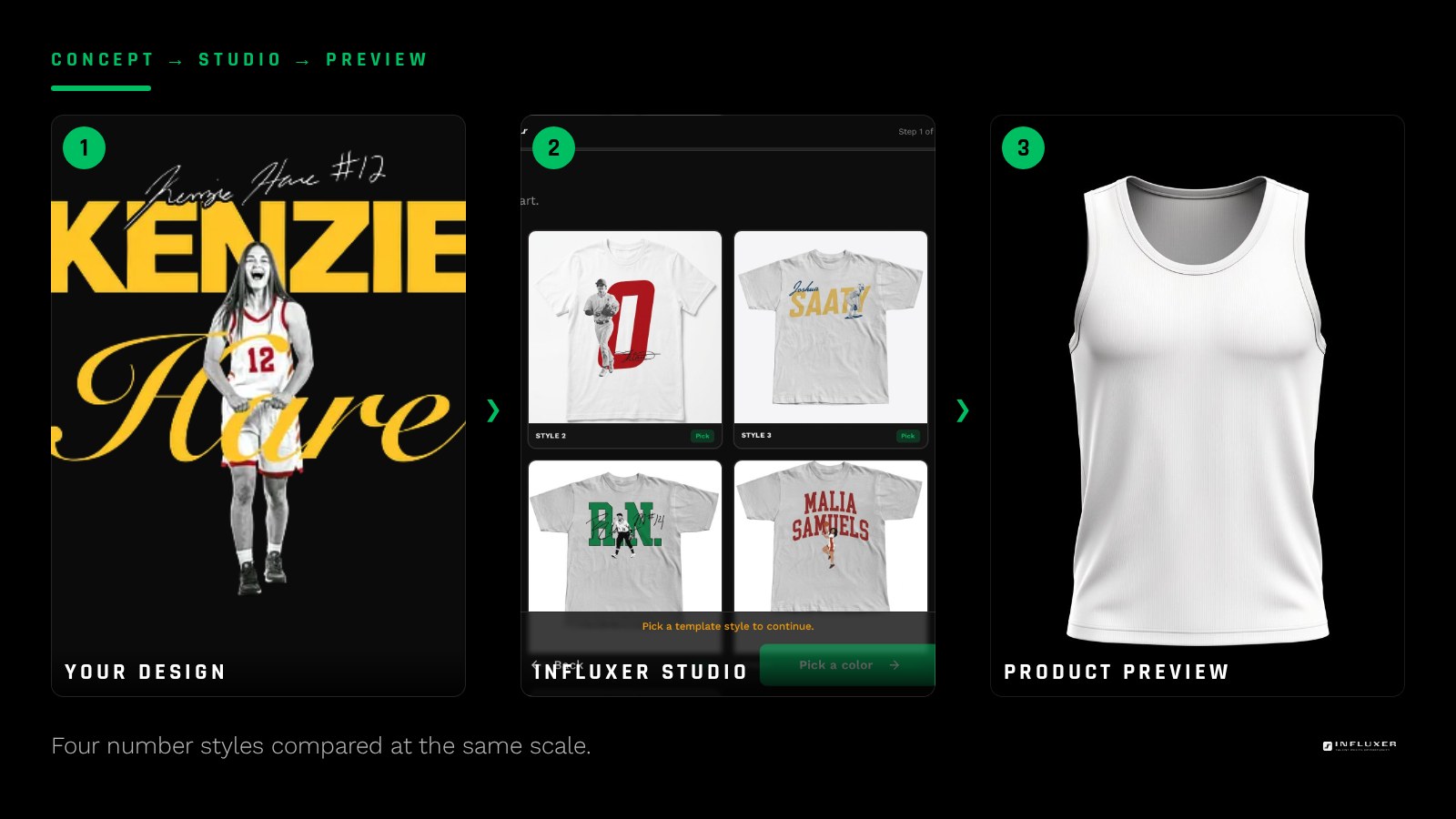
A solid block number is the safest starting point. Thick, geometric digits with no serifs read clearly at almost any size and survive one-color printing without losing detail. This is the style to default to if you are not sure what else to try.
An outlined number, where only the stroke is filled and the inside is open, reads as more modern but needs a heavier stroke than you think. A thin outline that looks sharp on screen tends to disappear once it hits fabric, so keep the stroke at least as thick as the counters inside the digit.
A split or two-tone number, where the digit is divided into two color blocks, adds visual interest but only works with genuinely high contrast between the two colors and a clean, simple split, not a jagged or diagonal one that muddies the shape.
- Solid block: safest, most legible, works one-color.
- Outlined: modern look, needs a thick stroke to survive print.
- Split two-tone: needs strong contrast and a simple, clean divide.
- Number plus initial: pairs the digit with one letter for a compact combination mark.
Watch the counters, not just the outline
The counters are the enclosed or partially enclosed spaces inside a digit, like the loop in a 6 or the two bowls in an 8. These are the first thing to fill in or disappear at small print sizes, long before the overall outline of the number becomes unreadable.
If you are designing a 6, 8, 9, or 0, check the counter size specifically at the scale you plan to print. A general rule: keep the gap inside any counter at least as wide as the stroke around it. If the stroke is thicker than the open space it encloses, that space will likely fill in with ink and the digit will read as a blob at distance.
Pairing a number with an initial or wordmark
A number does not have to stand alone. Pairing it with a single initial, stacked above or beside the digit, gives you a compact combination mark that still reads fast. Keep the initial visually secondary, smaller or lighter in weight, so the eye lands on the number first.
If you are pairing a number with a full nickname or wordmark, put them in two clearly separate zones rather than interlocking them. A number stacked cleanly above a name reads in the order you want; a number woven through the letters of a name usually just becomes harder to parse.
Decide how much decoration is too much
Adding a drop shadow, a chrome gradient, or a jagged distressed edge can make a number look more dynamic in a design file, but most of that detail gets lost the moment it goes to print, especially at chest-print size. Effects that rely on subtle gradients rarely survive translation into flat printable color.
If you want texture, add it through a single controlled element, like a consistent angled slant on the digit or one accent line through it, rather than layering multiple effects. One deliberate choice reads as a style. Several competing effects read as noise.
Build for both a large chest print and a small sleeve mark
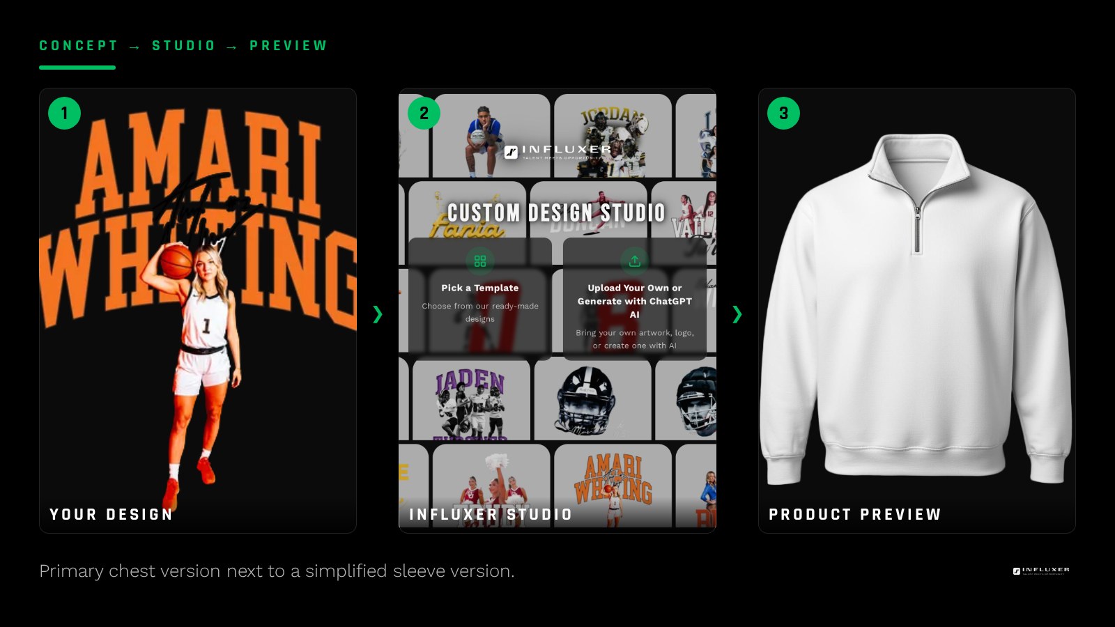
Most athletes end up wanting their number in more than one place: a large version as the primary chest graphic and a smaller version on a sleeve or hat. Design the smaller version separately rather than just shrinking the large one. Details that read fine at chest size, like a thin outline or a small accent mark, often need to be simplified or removed entirely for a mark under two inches tall.
Keep both versions in the same file set so you are not redrawing the number every time you want a new placement. A primary and a simplified secondary version, built once, will cover most of what you need across a whole merch drop.
Check contrast against the garment before you commit
A number rendered in dark grey or navy can look strong on a white canvas and then nearly vanish on a Blue Spruce or Pepper garment. Before finalizing your color choice, drop the number onto the actual garment color you are planning to order and view it at a normal distance, not zoomed in.
The Influxer studio previews your uploaded artwork on the real garment mockup, which makes this check fast. If the number loses definition against your chosen color, either switch to a higher-contrast color for the number itself or flip the whole mark to a single solid white or black version instead of trying to match the team palette exactly.
Before you finalize a number logo
- Pick one number style: solid block, outline, split two-tone, or number plus initial.
- Check that counters inside 6, 8, 9, or 0 are at least as wide as the surrounding stroke.
- Limit decoration to one deliberate choice instead of stacking multiple effects.
- Build a separate, simplified version for small placements like a sleeve.
- Test the number shrunk down to sleeve or hat size to confirm it still reads.
- Check contrast against your actual garment color, not just a white canvas.
- Export as a transparent PNG or vector file before uploading.
Frequently asked questions
What is the safest number style if I am not sure what to choose?
A solid block number with no outline or gradient is the safest choice. It reads clearly at nearly any print size and holds up well even in a single ink color, which gives you the most flexibility across garment colors.
Can I add a symbol behind my number, like a star or shield?
You can, but treat the symbol as a background element that stays lighter or smaller than the number itself. If the symbol competes with the digit for attention, the whole mark reads slower and loses the clarity that made a number-based logo worth building in the first place.
Should my number match my team jersey font exactly?
It does not need to. A custom-built number that reflects your own style will usually read better as a personal logo than a direct copy of a jersey font, and it avoids any question about reproducing a team-specific typeface.
How big should my number be for a chest print?
A single or double-digit number as the primary chest graphic typically looks strongest in the 8 to 11 inch range, similar to a standard chest logo size. Preview it on the actual garment mockup to judge whether it feels balanced at that size before ordering.
Upload your number design — See your number logo on a real garment mockup before you order.
Browse studio tutorials — Short walkthroughs of placement and sizing inside the studio.