Bring your own
Choosing Fonts for Athlete Merch: A Practical Shortlist
A working shortlist of font categories for athlete merch, with the weight and spacing rules that decide whether type actually survives printing.
By Influxer · Published 2026-08-16 · Updated 2026-08-16 · 5 min read
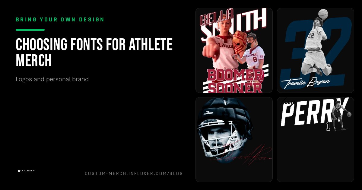
Choosing a font for merch is not really about taste, it is about a handful of technical constraints that decide whether type survives being printed on fabric and read from a distance. Two fonts that look nearly identical on screen can behave very differently once one has thinner strokes than the other.
Instead of scrolling through hundreds of font options, it helps to think in categories: what job does this font need to do, chest wordmark, small detail text, a number, and then pick from the two or three categories that fit that job well. Most athlete merch only ever needs one or two fonts total.
This guide breaks down the font categories that consistently work for athlete merch, the weight and spacing checks that matter more than the specific typeface name, and how to confirm your choice actually holds up once it is on a garment in the Influxer studio.
Four font categories that do the heavy lifting
Bold condensed sans fonts are the workhorse of athletic merch. Tight letter spacing and a heavy weight let you fit a full name or word into a compact chest width while staying legible from a distance. If you only pick one category, this is the safe default.
Slab serifs, letters with thick, blocky serifs rather than thin decorative ones, add a more established, varsity feel without sacrificing legibility, since the serifs in this category are as thick as the main strokes.
Script fonts work well for a signature feel or a softer nickname, but only at larger sizes with generous spacing. Scripts lose their connecting strokes fast when shrunk down, so reserve them for a primary chest graphic rather than a small sleeve mark.
Collegiate block fonts, the rounded, extra-bold style associated with varsity lettering, work well for numbers and short wordmarks and print cleanly even in a single color.
- Bold condensed sans: safest default for names and short words.
- Slab serif: varsity feel, still legible at small sizes.
- Script: reserve for larger primary graphics, not small details.
- Collegiate block: strong for numbers and short wordmarks.
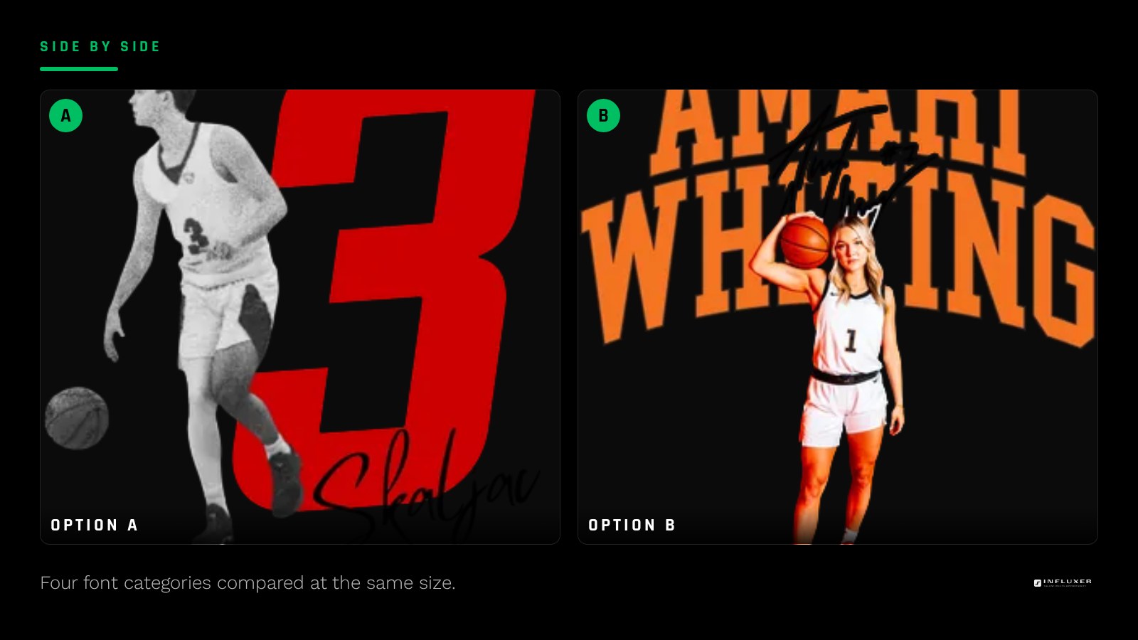
Weight matters more than style
A thin or regular weight of almost any typeface will look weaker on fabric than it does on screen, because print softens fine detail in a way a monitor does not. As a working rule, avoid anything below a medium weight for text under about three inches tall, and lean toward bold or extra-bold for anything meant to be read at a distance of ten feet or more.
If a font family offers multiple weights, default to the second-heaviest option rather than the heaviest or the middle. The heaviest weight sometimes closes up counters and thin gaps between letters, while the second-heaviest usually keeps both boldness and legibility.
Spacing and kerning checks
Default letter spacing in most design tools is tuned for reading paragraphs on screen, not for a short bold word on a shirt. Bold condensed fonts especially need slightly tightened tracking so the letters read as one connected word instead of individual blocks with visible gaps.
Check specific letter pairs that commonly look awkward at default spacing: capital A next to V, or a capital T next to a lowercase letter. These pairs often need manual kerning adjustment even after you have set an overall tracking value.
Limit yourself to one or two fonts total
Mixing more than two typefaces on one piece of merch almost always looks unplanned. Pick one primary font for your main wordmark or name, and if you need a secondary font for smaller supporting text, choose one from a clearly different category, for example a bold condensed sans paired with a simple serif for a subtitle, rather than two similar sans fonts that look like a mismatch rather than a deliberate pairing.
Outline your text before exporting
If you are designing in vector software, convert your text to outlines before exporting the final file. This locks in the exact letterforms so nothing shifts or substitutes if the file is opened somewhere without that specific font installed, and it is standard practice for any print-ready vector file.
For raster files built in a tool like Canva or Photoshop, this is not necessary since the text is already flattened into pixels once exported as a PNG, but double check that the export happened at full resolution rather than a smaller preview size.
Test the font at real print size before deciding
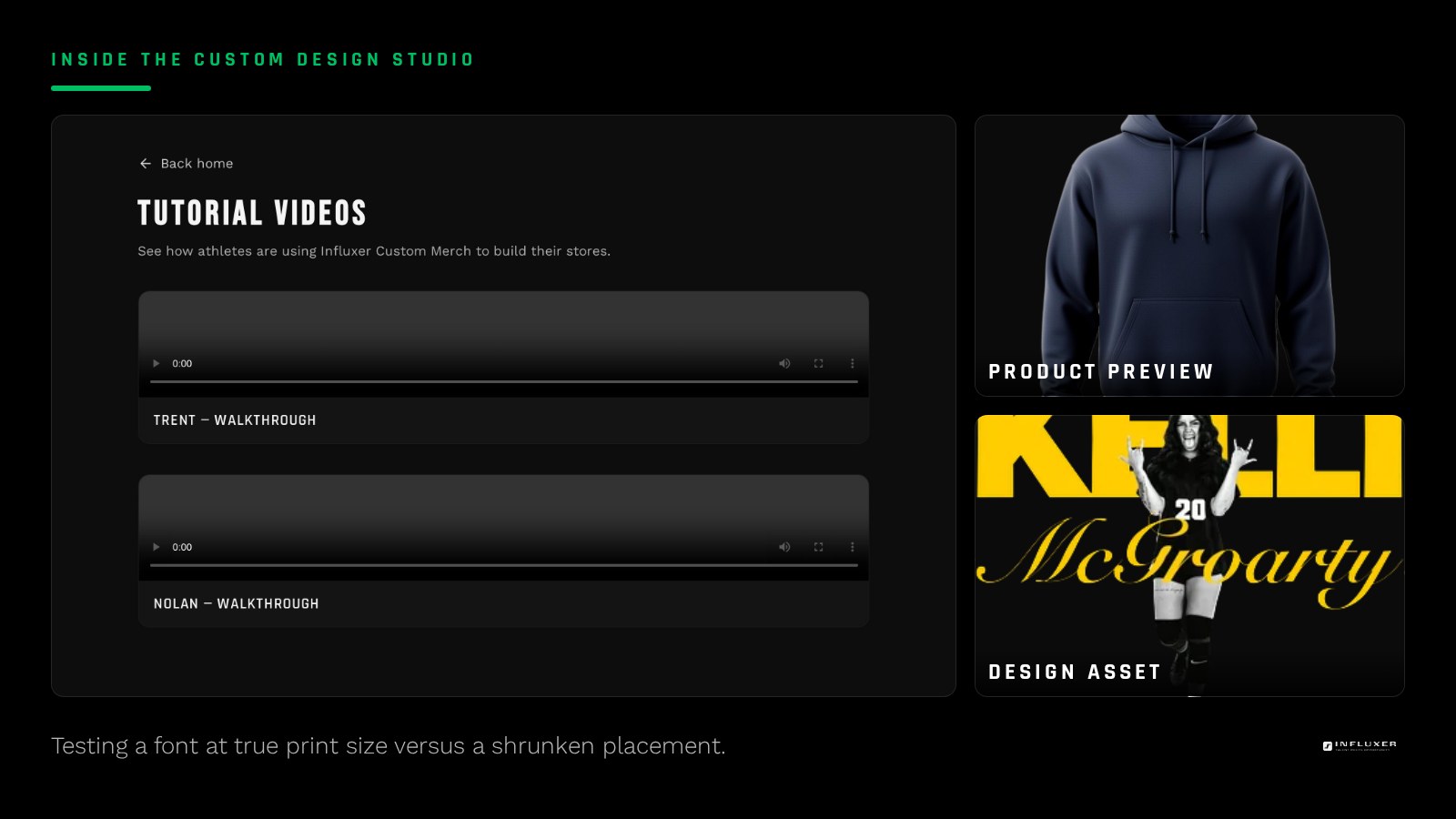
A font that looks great at a large working size in your design file can behave very differently once scaled down to an actual four-inch sleeve print or shrunk to fit a crowded chest layout. Before finalizing, view your text at the literal dimensions it will print at, not a zoomed-in canvas view.
Upload the design into the Influxer studio and preview it on the garment. This is the fastest real-world check: if letters blur together or thin strokes disappear on the mockup, go back and either increase the weight or simplify the font choice before you commit to an order.
Before you commit to a font
- Pick one category that fits the job: condensed sans, slab serif, script, or collegiate block.
- Default to the second-heaviest weight in the font family, not the thinnest.
- Tighten letter spacing manually rather than relying on default tracking.
- Check awkward letter pairs like AV or T-next-to-lowercase for kerning issues.
- Limit the whole design to one or two typefaces total.
- Outline text in vector files before exporting.
- Preview the text at true print size on a real garment mockup.
Frequently asked questions
Is a free font good enough for merch printing?
Yes, as long as you have the right to use it commercially and it holds up at print size. Many free fonts print perfectly well; the license and the weight matter more than whether you paid for the typeface.
Can I use a script font for a jersey number?
It is not the strongest choice. Numbers usually need to read instantly at a glance, and script fonts add connecting strokes and flourishes that slow that recognition down. A block or condensed sans works better for numbers specifically.
How do I know if a font is too thin for print?
Zoom your design to the actual print size and look at the thinnest strokes in the letterforms. If any stroke looks like it is only a couple of pixels wide at that size, it is likely too thin and will blur or disappear once printed on fabric.
Should my chest text and sleeve text use the same font?
Using the same font across placements keeps the merch feeling cohesive, but you may need to adjust the weight for the smaller placement so it stays legible, since a weight that works at chest size can look too light shrunk down to sleeve size.
Upload your design — Preview your font choice on a real garment before you order.
Watch a placement tutorial — Short videos on sizing text correctly for print.