Bring your own
Nickname Merch: Turning What Fans Call You Into a Design
A design approach for turning a nickname fans already call you into a wordmark that looks intentional, not just typed text on a shirt.
By Influxer · Published 2026-08-16 · Updated 2026-08-16 · 5 min read
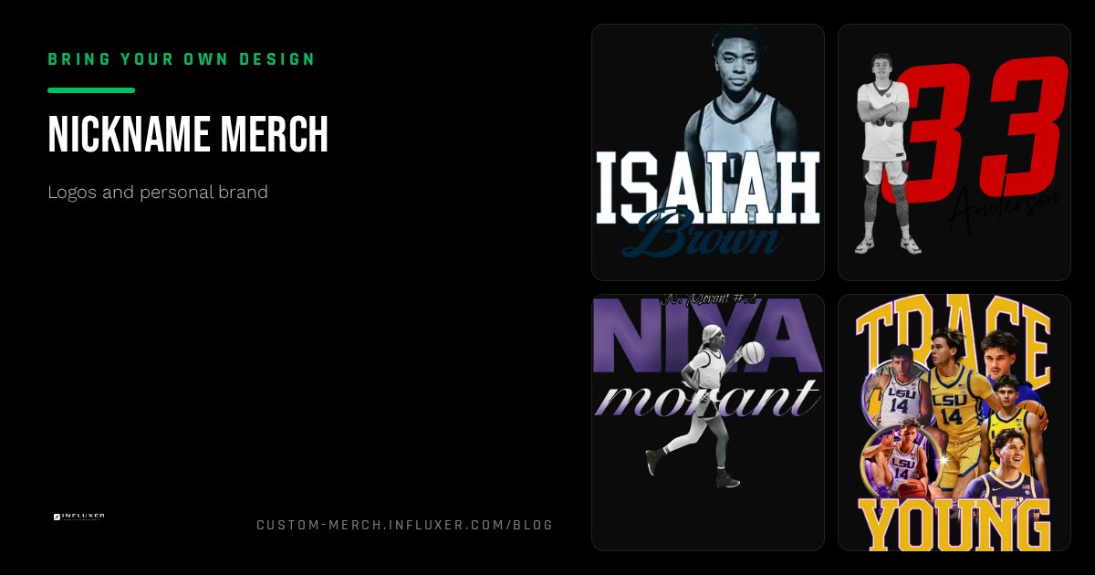
If people already call you something, that nickname is doing brand work for you before you have designed anything. The mistake most people make is treating the nickname as a caption, typing it in a default font across the chest, instead of treating it as a wordmark that deserves the same care as any logo.
A nickname carries more personality risk than a plain name or number because it usually has a specific tone: playful, aggressive, regional, or a reference only your circle understands. The design needs to match that tone, or the shirt reads as mismatched even if the word itself is great.
This piece covers how to pick a layout and type treatment that fits your nickname’s tone, how to avoid the most common nickname-shirt mistakes, and how to check the result on a real garment before you commit to it.
Treat the nickname as a wordmark, not a caption
A wordmark is type designed to function as a logo: consistent spacing, a deliberate weight, and no reliance on quotation marks or extra framing to signal that it is a name. If your nickname currently sits in quotes with a generic sans font, drop the quotes and choose a typeface with real character before it goes anywhere near a shirt.
Once you commit to a treatment, keep it consistent across every placement, chest, sleeve, back, so the nickname reads as your established mark rather than a new typeface choice on every product.
Match the type style to the tone of the name
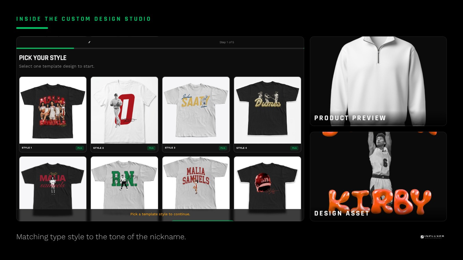
A short, punchy nickname usually wants a bold, condensed, all-caps treatment that feels confident and fast to read. A softer or more personal nickname can support a script or a mixed-case treatment with more breathing room. The mismatch to avoid is a delicate, thin script on an aggressive nickname, or a heavy block font on a nickname meant to feel playful.
Read the nickname out loud and notice its rhythm. A hard, single-syllable nickname tends to pair with tight, bold letterforms. A longer, flowing nickname often reads better with slightly more open spacing and a less blocky weight.
Avoid the three most common nickname-shirt mistakes
The first mistake is over-decorating: adding a banner, stars, and a slogan around a nickname that would have looked strong on its own. Let a genuinely good wordmark be the whole design rather than burying it in extra graphics.
The second is inconsistent capitalization or spacing choices scattered across different products, which makes the nickname look like it was retyped each time rather than treated as an established mark. The third is using a default system font straight out of a basic text tool, which reads as unfinished no matter how good the nickname itself is.
- Do not surround a strong wordmark with unnecessary extra graphics.
- Keep capitalization and spacing identical across every product.
- Choose a real typeface with character, not a plain system default.
Decide whether the nickname stands alone or pairs with your name
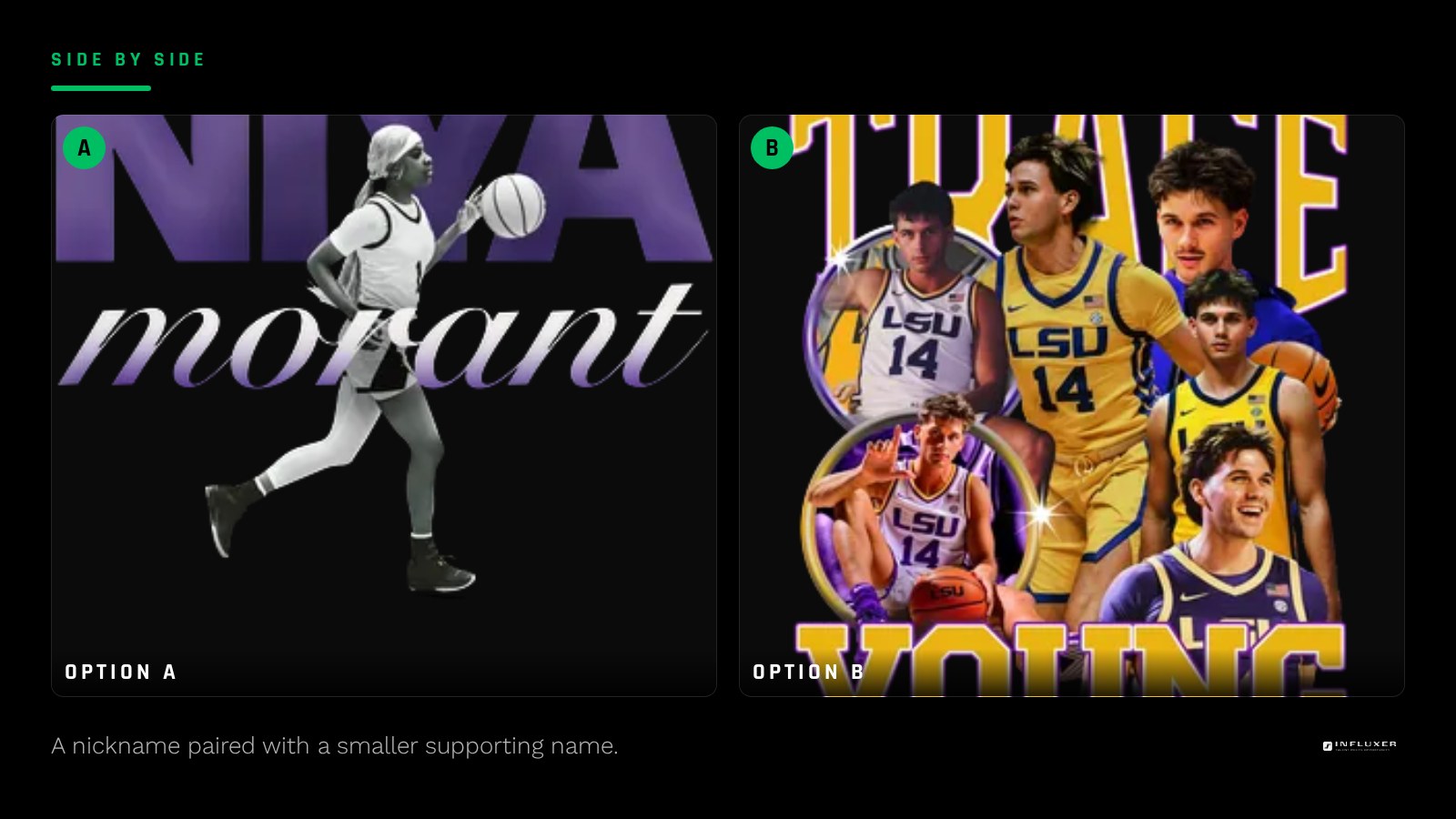
Some nicknames work as a complete standalone design. Others benefit from a small supporting element, your last name or number in a smaller weight beneath or beside it, so someone unfamiliar with the nickname still connects it to you specifically.
If you pair the two, keep a clear size hierarchy: the nickname should be visibly the dominant element, with your name or number reading as a smaller detail underneath, not competing for the same visual weight.
Consider how the nickname reads without context
A nickname that makes total sense to teammates and family can read as confusing or even mean something unintended to a stranger. Before finalizing the design, say the word or phrase to someone outside your immediate circle and see what they assume it means. This is not about changing the nickname, it is about deciding whether the design needs a small supporting detail, like your number or last initial, to anchor it for people who do not already know the story.
Check size and legibility before you order
Longer nicknames or phrases need more careful sizing than a short name or number does. A nickname that is a full phrase rather than a single word may need to wrap across two lines or use a slightly condensed letterform to fit a chest print width without shrinking below a legible size.
Upload the wordmark into the Influxer studio and preview it directly on the garment. Check it at the actual chest width you plan to print, since a phrase that fits comfortably in a wide design file can end up cramped once it is scaled to a real print area.
Keep the file clean for printing
Once you land on a layout, export the text as outlined vector shapes if you built it in a vector tool, or as a high-resolution transparent PNG if you built it as a flat graphic. Outlining text prevents any font substitution issues if the file moves between tools, and a clean transparent background keeps the wordmark from arriving with an unwanted box around it on a colored garment.
Before you finalize a nickname design
- Drop quotation marks and default fonts; treat the nickname as a real wordmark.
- Match the type weight and style to the tone of the nickname.
- Remove unnecessary extra graphics if the wordmark is already strong alone.
- Keep capitalization and spacing identical across every product placement.
- Decide whether the nickname needs a supporting name or number underneath.
- Check how the nickname reads to someone outside your immediate circle.
- Preview the final sizing on the actual chest print width in the studio.
Frequently asked questions
Should I put my nickname in quotation marks on the shirt?
Generally no. Quotation marks were useful in text to indicate "this is what people call me," but on a shirt the nickname is the design itself, and quotes usually just add visual clutter around a wordmark that should stand on its own.
What if my nickname is a full phrase rather than one word?
Treat it the same as a wordmark, but pay closer attention to line breaks and width. Consider whether it reads better on two lines or in a slightly condensed font so it does not shrink too small to fit one line at a legible size.
Can I combine my nickname with my jersey number?
Yes, as a supporting element in a smaller size beneath or beside the nickname, not as an equal-weight partner. Keep a clear size hierarchy so the eye lands on the nickname first.
What font style works best for an aggressive or bold nickname?
A heavy, condensed, all-caps sans or slab font usually matches an aggressive tone well. Avoid thin scripts or delicate serifs for that kind of nickname, since the softness of the letterforms will undercut the tone of the word itself.
Upload your nickname design — Preview your wordmark on a real garment before you order.
See placement tutorials — Short videos covering wordmark sizing and chest placement.