Bring your own
How to Carry Your Instagram Look Onto Merch
A practical way to pull the colors, type, and tone you already use on Instagram into merch that reads as an extension of your existing feed.
By Influxer · Published 2026-08-16 · Updated 2026-08-16 · 5 min read
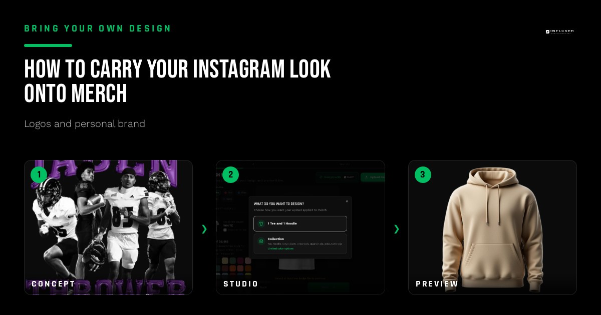
If you have posted consistently for a while, you have probably already built a visual identity without formally calling it one: a color you gravitate toward in your grid, a font you use in story graphics, a tone in your captions. Merch is a chance to take that existing identity off the screen and onto something physical, but only if you actually extract and use it deliberately, rather than designing something new from scratch that has nothing to do with your feed.
The mistake to avoid is treating merch as a totally separate creative project. If a follower who knows your Instagram sees your shirt and it feels like it came from someone else’s account, you have lost the main advantage of already having an audience that recognizes your look.
This guide walks through pulling a real palette and type direction from your existing content, translating a look built for a screen into something that works on fabric, and where an Instagram aesthetic needs to be simplified rather than copied directly.
Audit your own feed before designing anything
Scroll through your last twenty or thirty posts and story highlights and actually note what repeats: a specific color that shows up often, a font you default to in graphics, a mood, minimal and clean versus bold and loud. This is your existing brand whether or not you have written it down anywhere.
Write down two or three colors and one or two fonts that genuinely represent your current content, not colors you wish you used more. The goal is continuity with what already exists, not an aspirational rebrand disguised as merch.
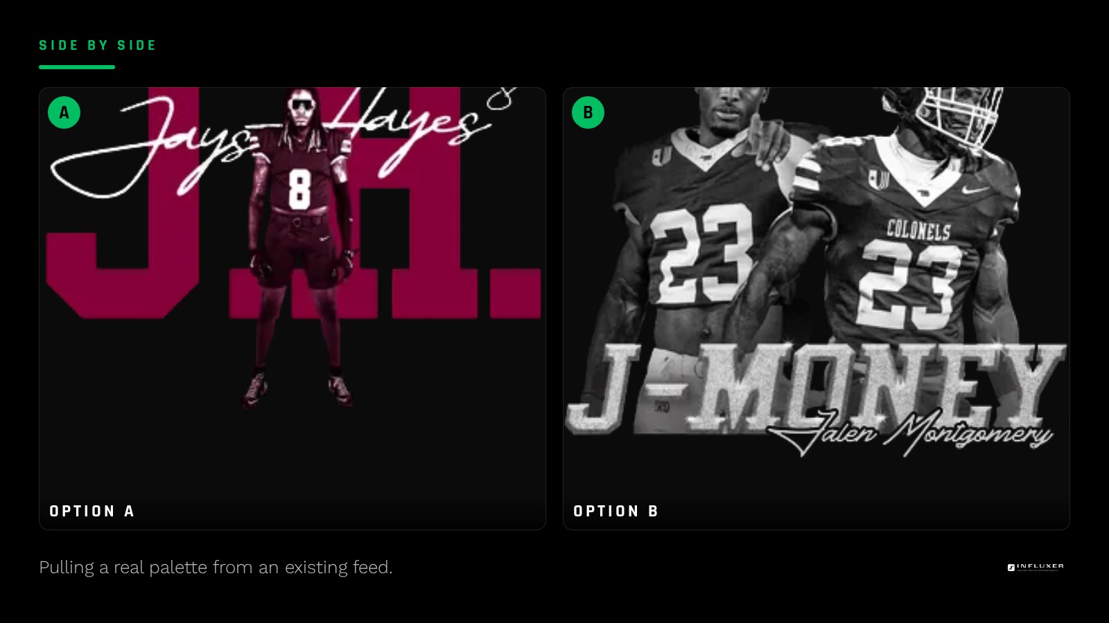
Translate a screen palette into a print palette
Colors that work in a digital feed, especially bright, saturated, backlit colors, do not always translate directly to fabric, which reflects rather than emits light and reads more muted. If your feed leans on a specific bright accent color, plan to use it as a strong accent on merch rather than expecting it to look identical to how it appears on a phone screen.
Pick one color from your feed to serve as the anchor for your merch palette, then build a simple two or three color set around it following the same contrast principles that apply to any merch design: dark and light pairing, one accent used sparingly.
Carry over type, not just color
If you consistently use a specific font in story graphics or captions, that typeface is doing real brand recognition work, arguably more than any single color choice. Reusing that same font, or a close match if it is not licensed for print, on your merch wordmark creates an instant visual link to content people already associate with you.
If you have never been consistent with type on Instagram, this is a good moment to establish one. Pick a font for your merch that you can then also start using in your graphics going forward, so the two reinforce each other from this point on.
Simplify what a feed can hold but a shirt cannot
An Instagram grid can hold nuance: a subtle color grade, a specific photo style, layered graphic elements across multiple posts. A single shirt design has to communicate in one glance, from a distance, with a lot less visual real estate. Take the core idea of your aesthetic, minimal, bold, playful, and express it through fewer, bolder choices rather than trying to replicate the full complexity of a curated grid.
If your feed aesthetic depends heavily on photography and editing style, do not try to force a literal photo onto merch expecting the same feel. Instead, pull the color and mood from that photography into a simpler graphic or wordmark treatment that can survive being printed at a fixed size.
Keep merch and content working together
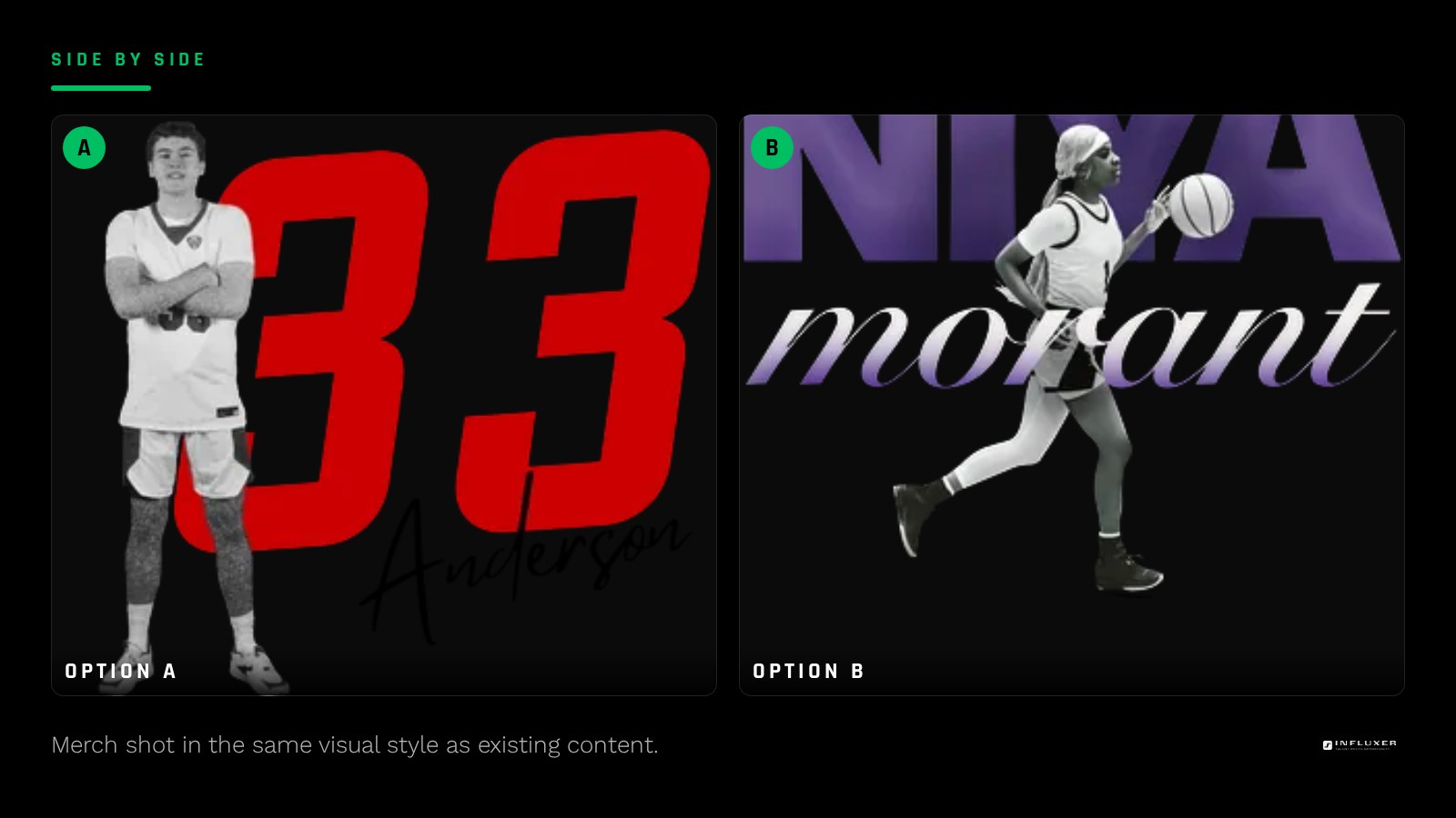
Once you have merch that reflects your existing look, use it to reinforce that identity rather than treating it as a one-off product. Wearing it in the same kind of content you already post, and photographing it with the same visual style as your other posts, keeps the merch feeling like a natural extension of the feed rather than a separate side project.
This consistency also makes any future merch easier to design, since you are refining an established look rather than reinventing your identity for every new product.
Preview it the way your audience will actually see it
Before finalizing, preview your merch design on a real garment mockup in the Influxer studio and imagine it as a photo in your own feed style. If it looks like it belongs next to your other posts, the translation worked. If it looks like a stock graphic slapped on a shirt, go back to your feed audit and pull a more specific, more personal detail into the design.
Before you finalize Instagram-inspired merch
- Review your last twenty to thirty posts and note repeating colors and fonts.
- Pick one real color from your feed as the merch palette anchor.
- Build a two or three color palette around that anchor with real contrast.
- Reuse a font you already use in your graphics, or pick one to start using consistently.
- Simplify a complex feed aesthetic into fewer, bolder choices for the shirt.
- Preview the design on a real garment mockup and compare it against your feed style.
- Plan to feature the merch in content shot in your existing visual style.
Frequently asked questions
What if my Instagram does not have a consistent look yet?
That is a fine starting point too. Use the merch design process to establish a color and type direction, then start applying that same direction to future posts and graphics so the two build on each other going forward.
Can I put my Instagram handle directly on the shirt?
You can, but treat it as a smaller supporting element rather than the main design, similar to how you would treat a supporting name alongside a nickname. The visual identity, colors and type, carries more of the recognition than the handle text itself.
How do I handle a feed that relies heavily on photography?
Pull the color palette and overall mood from your photography into a simpler graphic treatment, rather than trying to print an actual photo, which rarely reproduces with the same feel on fabric as it has on a backlit screen.
Should my merch colors match my feed exactly?
Close is more realistic than exact, since screen colors and garment colors behave differently. Aim for the same overall feeling and relationship between colors rather than an exact digital color match.
Upload your design — Preview your Instagram-inspired look on a real garment.
See the studio in action — Short videos covering color and placement decisions.