Bring your own
One-Color vs Full-Color Designs: What Changes on the Shirt
A practical comparison of one-color and full-color designs, covering how each behaves on fabric, what file prep changes, and how to decide which fits your art.
By Influxer · Published 2026-08-16 · Updated 2026-08-16 · 5 min read
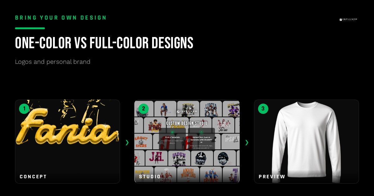
The choice between a one-color and a full-color design is usually framed as a budget question, but the more important difference is visual. A one-color design has to rely entirely on shape, contrast, and negative space to communicate, since there is no color variation to lean on. A full-color design can use color to separate elements, but it also introduces more places for something to go wrong once it hits fabric.
Neither approach is automatically better. A simple wordmark or number often looks stronger and more confident in one solid color than it does dressed up with extra hues. A detailed illustration or a design with photographic elements usually needs the range that full color provides to read correctly at all.
This guide breaks down what actually changes between the two approaches: how the artwork needs to be built, what happens to fine detail, and how to decide which one fits the specific design you already have.
What "one color" actually means for a file
A true one-color design uses a single solid color for every printed element, with the garment color itself acting as the background or a second implied color. There is no gradient, no shading, and no secondary hue anywhere in the artwork. Building a one-color file means converting everything, even elements that started as full color, into flat shapes in a single tone.
This is a good discipline exercise even if you eventually go full color: build the one-color version of your design first. If it reads clearly and looks intentional as a single flat color, you know the underlying shapes and composition are strong before you add any color complexity on top.
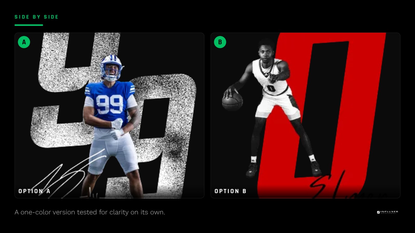
What you gain with one color
A one-color design is more forgiving across different garment colors, since you are really only choosing one ink color against one fabric color at a time, rather than managing several color relationships simultaneously. A design that works as a single dark color on a light shirt also often flips cleanly to a single white or light color on a dark shirt, giving you an easy path to multiple garment colorways.
Fine detail also tends to hold up better relative to expectations in one color, because you are not asking multiple thin color layers to align perfectly. A single well-built shape has one edge to get right, not several.
- Easier to flip between light and dark garments.
- Fewer alignment issues since there is only one shape layer.
- Forces stronger composition since there is nowhere to hide with color.
What you gain with full color
Full color lets you separate elements visually without relying purely on outline or spacing. A logo with a distinct symbol and a distinct wordmark can use two different colors to help the eye parse them as separate pieces instantly, something a one-color version has to achieve through shape and layout alone.
Full color is also the only realistic option for photographic or gradient-heavy artwork, illustrations with shading, or designs that specifically depend on a color transition as part of the concept. Trying to force this kind of art into one flat color usually loses the entire point of the design.
What breaks when you add color without a plan
The most common full-color mistake is adding colors reactively, one more here, one more there, until a design that started with a clear two-color idea ends up with five or six colors that do not relate to each other. Every additional color should be a deliberate decision, not a default because a design tool made it easy to change something.
Fine text and thin outlines are also more fragile in full color, since two adjacent colors that are supposed to align exactly can shift slightly in production, creating a visible gap or overlap called misregistration. Thicker shapes and bolder text tolerate this far better than thin, precise linework.
A simple way to decide
If your design is primarily type, a number, or a simple symbol, start by building the one-color version and only add a second or third color if it genuinely improves clarity, not just visual interest. If your design includes an illustration with depth, shading, or photographic elements, full color is likely necessary, but keep the total color count as low as the concept allows.
A useful test: cover half your screen and look at just the one-color version of your design. If it still clearly communicates the idea, one color may be all you need. If it looks incomplete or confusing without color cues, that is a sign the design genuinely depends on color to function.
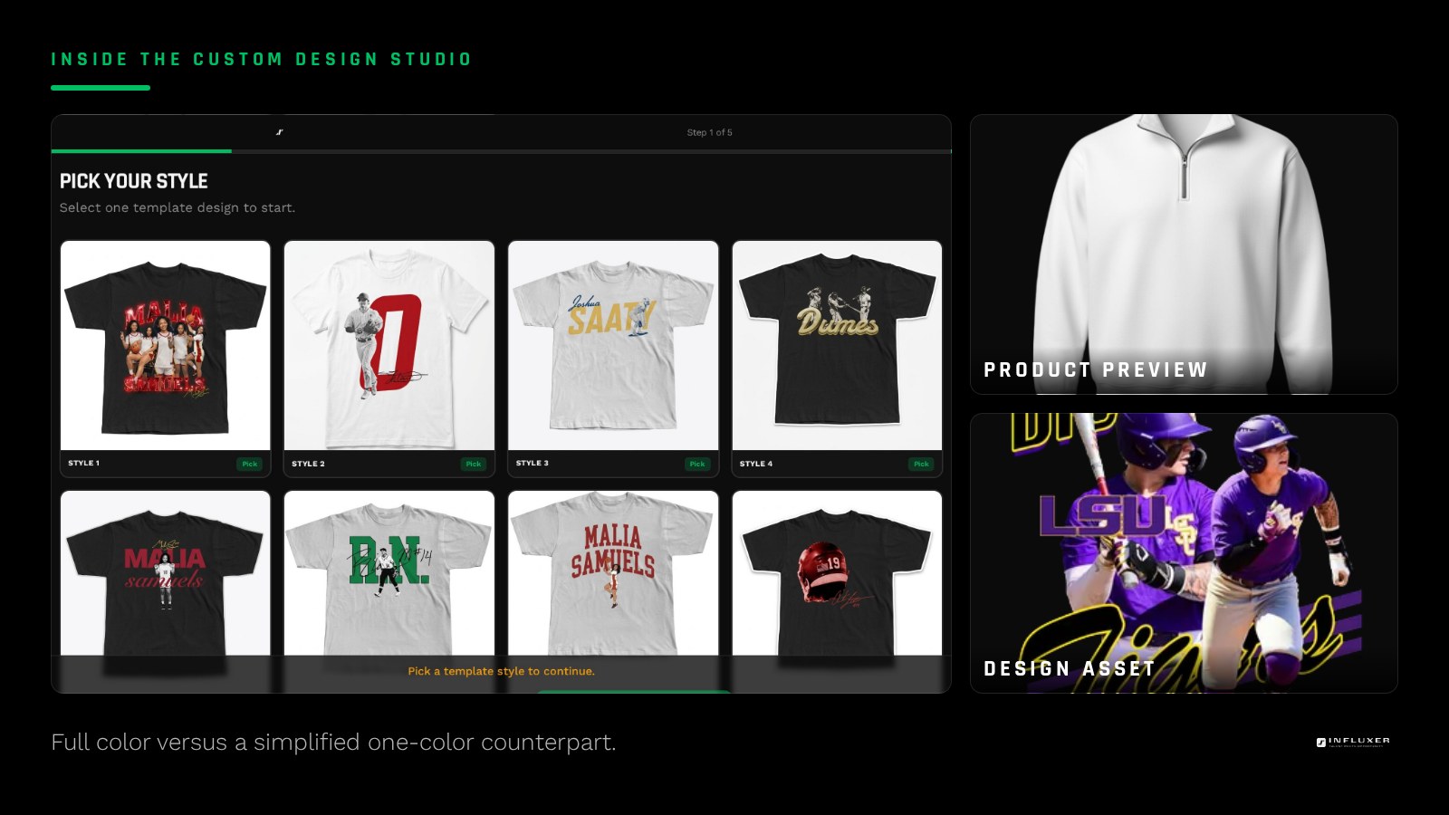
Check both versions on a real garment before deciding
Because color behaves differently on fabric than on a screen, upload both a one-color and a full-color version of your design into the Influxer studio and preview each on the actual garment and color you are considering. Looking at them side by side on a real mockup, rather than in an abstract design file, usually makes the right choice obvious faster than debating it in the abstract.
Before you choose a color approach
- Build a one-color version of your design first, even if you plan to add color.
- Confirm the one-color version still communicates the idea clearly on its own.
- Add color only where it genuinely separates elements or serves the concept.
- Keep thin outlines and small text as bold as possible if using multiple colors.
- Count your total colors and question any color you cannot justify.
- Preview both a one-color and full-color version on the real garment.
- Pick the version that reads clearest at actual print size, not the busier one.
Frequently asked questions
Is a one-color design cheaper than full color?
Fewer colors generally means simpler production, but the more important reason to consider one color is design discipline: it forces clarity and gives you an easy path to multiple garment colorways using the same file.
Can a full-color design be simplified without losing its idea?
Often, yes. Try isolating the two or three colors doing the most communicative work and testing whether the design still reads without the rest. Many designs that feel like they need four or five colors hold up fine with two.
Does one color mean the design has to be plain?
No. A one-color design can still use bold shapes, strong typography, and clever negative space to feel dynamic. Plainness comes from a lack of thoughtful composition, not from a limited color count.
What garment color works best behind a one-color design?
Whatever creates the strongest contrast with your chosen ink color. A dark ink color like black or navy needs a light garment, and a light ink color like white or Ivory needs a dark garment; preview both directions before committing.
Upload your design — Preview both a one-color and full-color version on a real garment.
Compare templates — See how ready-made layouts handle one-color versus full-color art.