Bring your own
Athlete Monogram Design: Turning Initials Into a Mark
A guide to building a monogram from your initials that reads as a designed mark instead of two letters typed next to each other.
By Influxer · Published 2026-08-16 · Updated 2026-08-16 · 5 min read
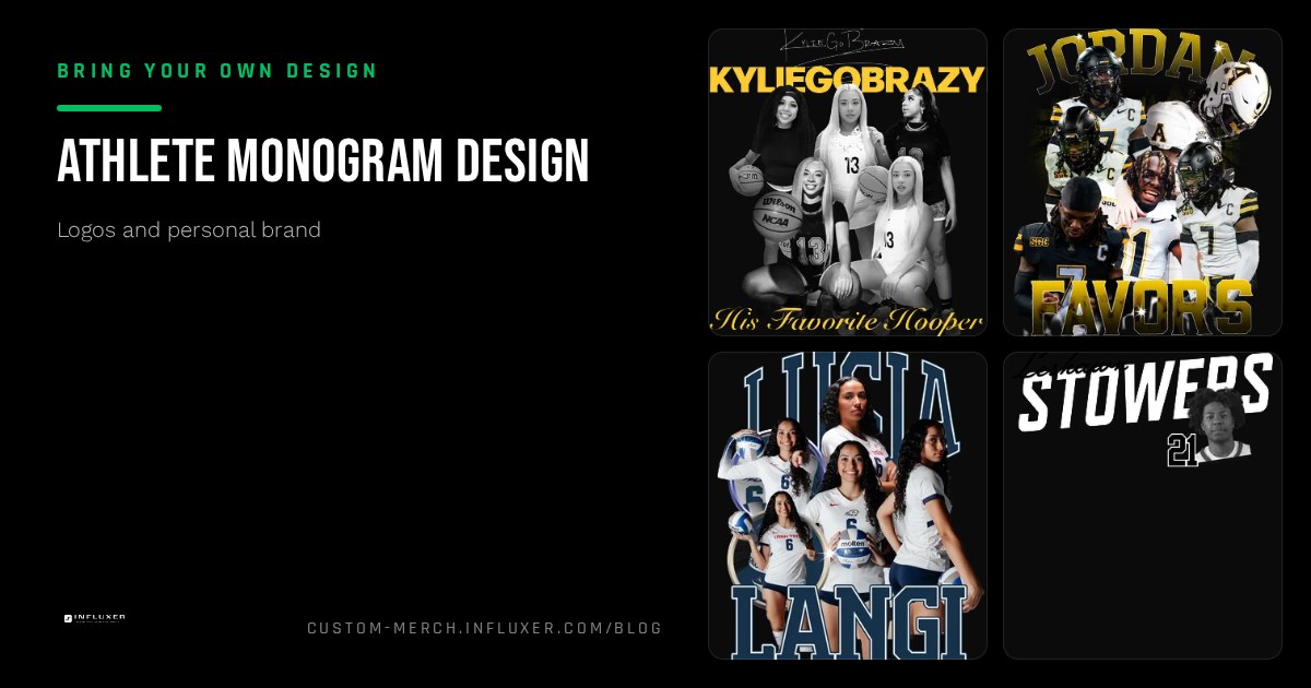
A monogram sounds simple, take your initials, pick a font, done, but the difference between a mark that looks designed and one that looks like a typed abbreviation comes down to a handful of decisions most people skip. Letter spacing, weight balance between the letters, and how they relate to each other in the layout do most of the work.
Athletes gravitate toward monograms because they are compact. A two or three letter mark works on a sleeve, a hat, or a hangtag in a way a full wordmark cannot. But that same compactness means every flaw shows up immediately: uneven spacing or mismatched weight is much more obvious in two letters than in a full word.
This guide covers the two main monogram structures, the weight and spacing fixes that make initials look intentional, and how to check the result before you commit it to a garment in the Influxer studio.
Interlocking versus stacked versus side by side
An interlocking monogram overlaps two letters so they share visual space, like a classic athletic letter mark. This style looks the most crafted but is also the hardest to get right without real type skill, since the letters need to share weight and rhythm or the overlap looks accidental.
A stacked monogram places letters on top of each other, often with the initials centered and aligned by width rather than by baseline. This works well for three initials and reads clean at small sizes because each letter keeps its own full shape.
A side-by-side monogram, two or three letters set in a row with tight, even spacing, is the most forgiving structure to build yourself. It relies on consistent spacing and a single strong weight rather than any custom letter shaping, which makes it the easiest starting point.
- Interlocking: most crafted look, hardest to execute well.
- Stacked: works well for three initials, clean at small sizes.
- Side by side: most forgiving, relies on spacing and weight consistency.
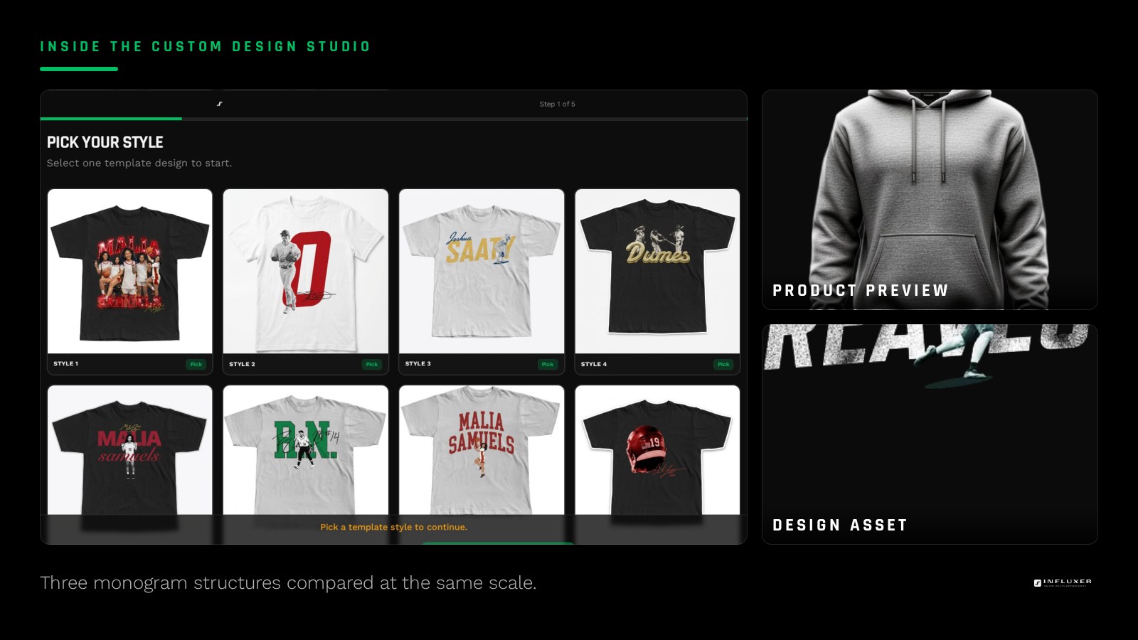
Balance the weight between letters
Different letters have different visual weight even at the same font size. A round letter like O or C needs to sit slightly larger than a straight letter like I or L to look optically the same size, because straight edges read as bigger than curved ones at equal height. If your monogram pairs a round letter with a straight one and they look uneven, this optical mismatch is usually why.
The fix does not require custom lettering skill. Nudge the round letter up in size by a small percentage, five to ten percent is usually enough, until the two letters look balanced to your eye rather than measuring identically on a ruler.
Spacing matters more than the font choice
A cheap-looking monogram is almost always a spacing problem, not a font problem. Default spacing between two capital letters is usually too loose for a tight mark and too tight for a more open, spaced-out mark, so you need to make a deliberate choice rather than accept the default.
For a compact athletic monogram, tighten the spacing until the letters feel connected as one unit, close enough that your eye reads them together rather than as two separate characters with a gap. For a more open, modern feel, add space evenly between all letters rather than leaving one gap tighter than the rest.
Pick a typeface built for monograms
Not every font works as a monogram. Script and heavily decorative fonts tend to fight each other when two letters sit close together, since their flourishes were designed assuming space around a full word. A geometric sans or a clean athletic block font gives you predictable, simple shapes that combine cleanly no matter which two or three letters you are using.
If you want some personality, add it through weight or a single consistent detail, like a small serif or a slight slant, applied to both letters equally. Avoid mixing two different typefaces in the same monogram; it almost always reads as unplanned.
Test the monogram at the size it will actually print
Monograms often get designed at a large working size and then shrunk down for the actual product, at which point tight interlocking details or thin connecting strokes can merge into an unreadable blob. Check your file at the true intended print size, whether that is a four-inch sleeve mark or an eight-inch chest mark, before finalizing it.
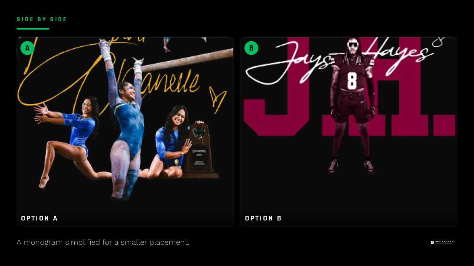
If you plan to use the monogram at more than one size, for example large on a chest and small on a hat, build two versions rather than one file scaled two ways. The small version usually needs simplified spacing or a slightly heavier weight to hold up.
Preview it on the garment before you decide
A monogram that looks sharp on a white background can lose its shape once it sits on a heathered or colored garment. Upload your draft into the Influxer studio and preview it directly on the tee or hoodie color you are considering, since fabric texture and color both affect how cleanly the letterforms read.
If the mark loses definition, try a bolder weight or a higher-contrast garment color before redesigning the whole monogram. Often the letters are fine and the only real issue is not enough contrast against the shirt.
Before you finalize your monogram
- Pick a structure: interlocking, stacked, or side by side.
- Balance the optical size of round letters against straight ones.
- Set spacing deliberately rather than accepting default kerning.
- Use one typeface throughout, not a mix of styles.
- Check the file at the true print size, not a zoomed-in working size.
- Build a simplified secondary version if you need a smaller placement.
- Preview against your actual garment color before finalizing.
Frequently asked questions
How many initials should I use in a monogram?
Two initials are the simplest to design cleanly and read fastest. Three can work well in a stacked layout, but avoid three initials side by side unless you have real spacing control, since it gets crowded quickly at small sizes.
Can I use a script font for my monogram?
You can, but script fonts need more space around each letter to keep their flourishes legible, so they generally work better as a single larger letter than as two interlocking initials at a small size.
Does a monogram need to match my main logo?
It helps if they share a typeface family or weight, so they read as part of the same personal brand, but the monogram does not need to be a literal extraction from your main logo. It can be its own simplified mark.
What file size should I use for a small sleeve monogram?
Export at a high resolution regardless of the final print size, then let the studio scale it down for placement. Starting from a smaller low-resolution file limits how sharp the mark looks even at a modest sleeve size.
Upload your monogram — Preview your initials mark on a real garment before you order.
Watch design tutorials — Short videos on placement and sizing for smaller marks like monograms.