Help me choose
Keeping Merch Designs Consistent Over Time
How to keep multiple merch drops feeling like one identity instead of a series of unrelated one-off shirts.
By Influxer · Published 2026-08-16 · Updated 2026-08-16 · 4 min read
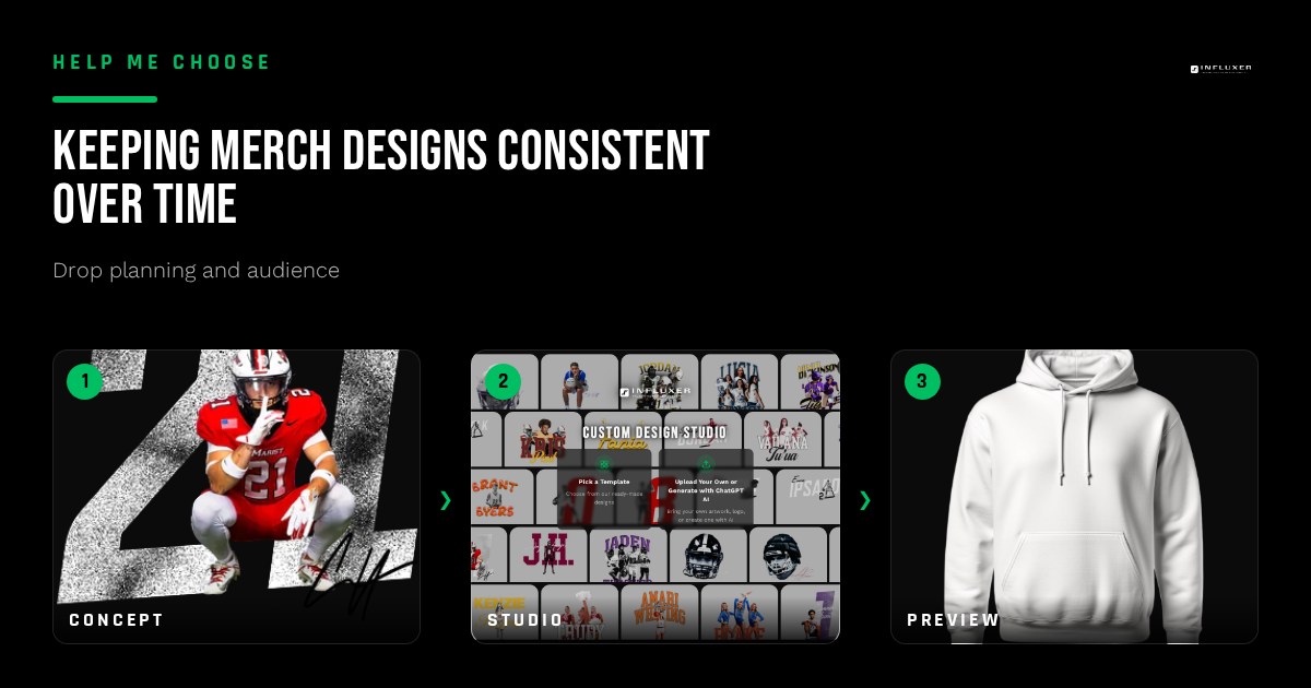
A single merch drop can look great on its own and still fail to build anything lasting if the next one looks nothing like it. Fans who liked your first design should be able to recognize your second one as belonging to the same person, without needing your name printed anywhere on it.
Consistency does not mean repeating the exact same design over and over. It means making a few deliberate choices once — fonts, colors, a signature mark — and returning to them across different drops so a pattern builds up over time.
This is a practical way to think about what to keep the same and what you are free to change every time you build something new in the Influxer studio.
Pick a font pairing and stick with it
Choose one or two fonts early, a primary for names or wordmarks and a secondary for supporting text, and reuse that pairing across future designs. A different, unrelated font on every drop makes each one look like it came from a different person.
This does not mean every design uses identical layout. A bold condensed font for a wordmark and a simple sans-serif for a smaller detail line is a pairing you can apply across many different design concepts without them looking repetitive.
Anchor your color story
Pick two or three colors that represent you, whether pulled from your school colors, your own preference, or a specific garment color that has worked well before, and use that palette as your default rather than choosing colors fresh every time.
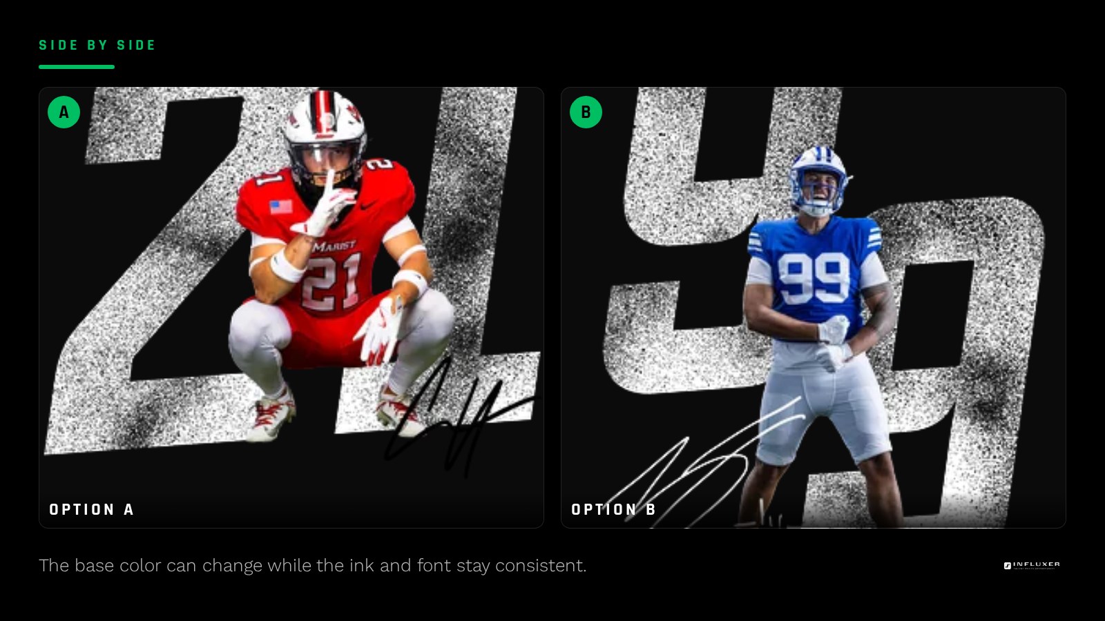
A consistent color story does not mean every shirt is identical. It means a Blue Jean tee with navy ink and an Ivory tee with the same navy ink both clearly belong to the same identity, even though the base color changed.
Build one signature mark you can reuse
A single small mark, your number treated a specific way, a monogram from your initials, or a simplified wordmark, can act like a logo across everything you make. Once it exists, you can drop it into a corner of a design, use it as the whole design, or pair it with something bigger.
This is one of the fastest ways to make a brand-new design instantly recognizable as yours, since a fan does not need to read anything to know whose merch it is.
Decide what is allowed to change
Not everything needs to stay fixed. Garment type, seasonal color options, and the specific graphic idea behind each drop can vary freely, as long as the fonts, core colors, and signature mark stay recognizable underneath.
Think of it like a template you fill in differently each time, rather than a rule that every design must look nearly identical. The consistent elements are the frame; the specific idea for each drop is what goes inside it.
Keep a simple reference for yourself
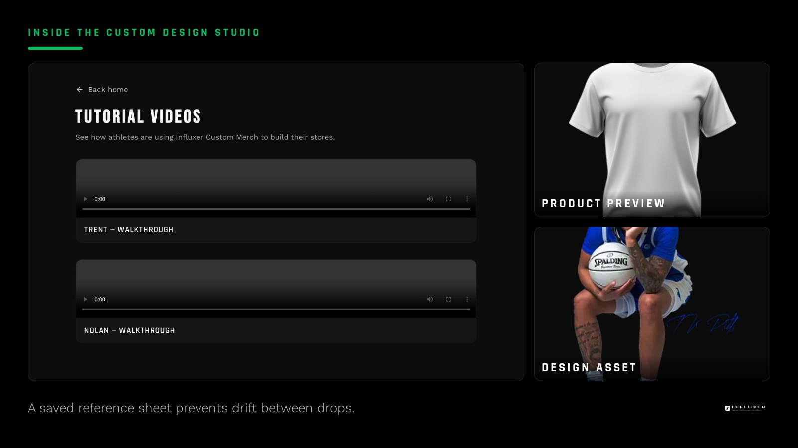
Save your font choices, color names, and a copy of your signature mark somewhere you can pull up quickly the next time you start a new design. This sounds obvious, but it is the step most people skip, and it is why designs drift over a few drops without anyone noticing until it is already inconsistent.
A simple note with hex codes or color names, plus the font names, takes a few minutes to set up and saves real time and guesswork on every future design.
Review past drops before starting a new one
Before building a new design, look back at your last one or two drops and ask whether the new concept still feels like the same person made it. This quick check catches drift before it becomes a real design instead of after a drop is already open.
If a new idea genuinely calls for breaking from the established look, that is a real choice you can make deliberately. The goal is intentional change, not accidental inconsistency.
Let consistency build gradually, not perfectly
Your first drop will not have a fully worked-out identity, and that is normal. Consistency tends to emerge over two or three drops as you notice what worked and start repeating it on purpose. Treat early drops as the start of a pattern rather than expecting the pattern to exist from day one.
Keeping your identity consistent
- Choose one or two fonts and reuse that pairing across future designs.
- Anchor a two or three color palette you return to as your default.
- Build one signature mark, like a treated number or monogram, you can reuse.
- Decide which elements are free to change: garment, season, and specific graphic idea.
- Save your fonts, colors, and signature mark somewhere easy to reference next time.
- Review your last drop or two before starting a new design to check for drift.
Frequently asked questions
Does consistent merch mean every design has to look the same?
No. It means keeping a few core elements, like fonts, colors, and a signature mark, consistent while the specific graphic idea and garment can change from drop to drop.
What should I do first if my past drops already look inconsistent?
Pick the elements from your best-performing or favorite past design and treat those as your starting point going forward. You do not need to fix past drops, just build future ones around a clearer pattern.
How many colors should my palette include?
Two or three core colors is usually enough to feel consistent without becoming restrictive. More than that tends to dilute the identity rather than strengthen it.
Is it okay to break from my usual look for a special drop?
Yes, as long as it is a deliberate choice rather than something that happens by accident every time. A one-off departure for a specific occasion can work well precisely because it stands out from your usual pattern.
Start your next design — Build on your established fonts, colors, and marks in the studio.
Upload your own artwork — Bring your existing signature mark into a new design.