Design it for me
Golf and Tennis Merch Designs With a Cleaner Look
Design ideas for golf and tennis merch that favor a cleaner, more restrained look than most team sport templates.
By Influxer · Published 2026-08-16 · Updated 2026-08-16 · 5 min read
Golf and tennis merch usually reads best when it does less, not more. Both sports have a visual culture built on small chest marks, restrained color pairings, and clean typography rather than big, loud graphics, and templates built for football or basketball rarely translate well without changes.
If you are starting from a ready-made design, the ideas below help you pick and adjust templates so the finished shirt looks like it belongs on a course or court instead of looking like a repurposed team-sport layout.
Favor a small chest mark over a full-front graphic
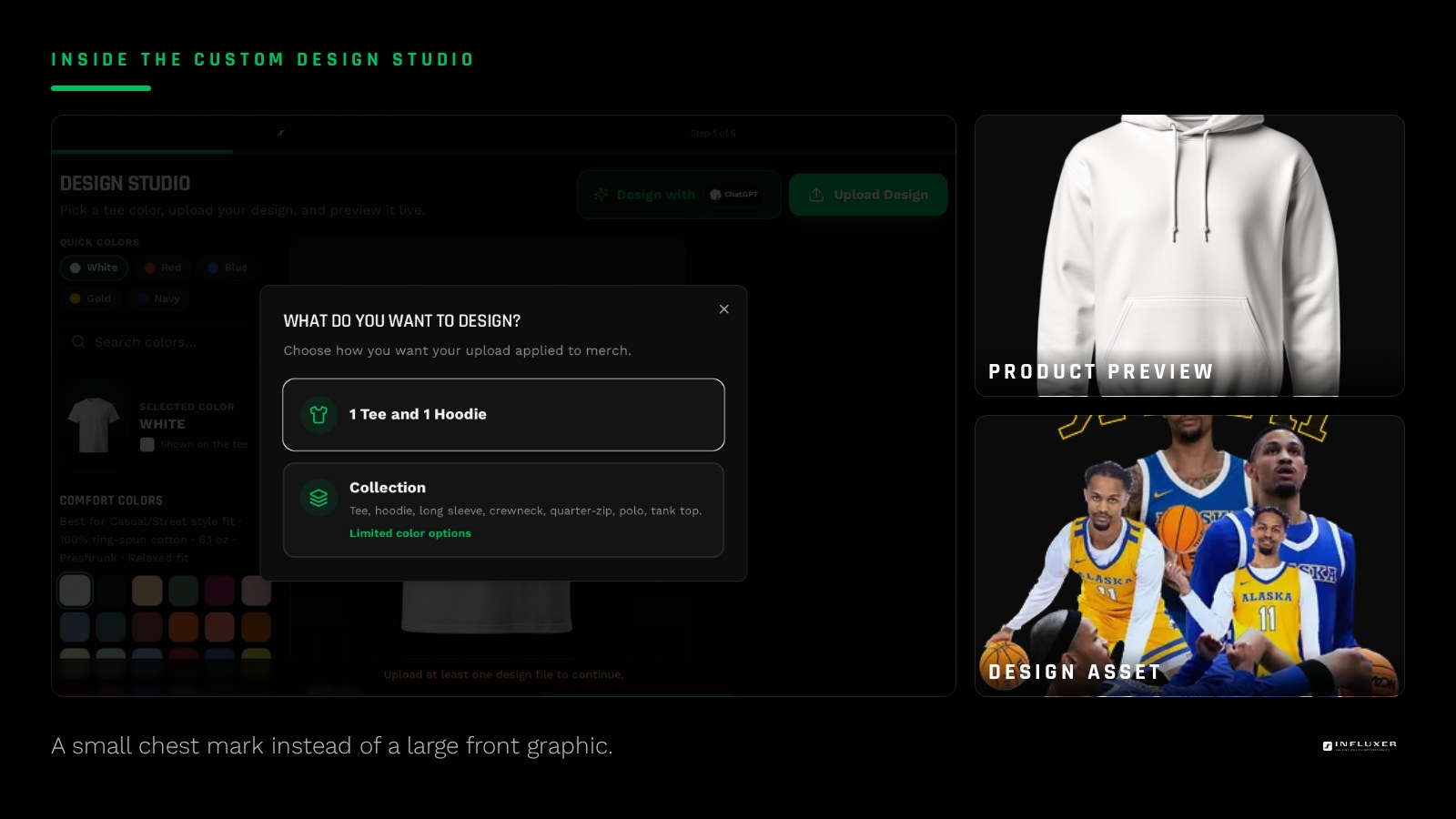
Golf and tennis apparel culture leans toward a small mark on the left chest, similar to a polo emblem, rather than a large full-front design. A template with a compact monogram, initials, or a small icon positioned at chest height reads more authentically than a template built for a large centered graphic.
If the template you like defaults to a large chest print, consider scaling it down and repositioning it to the smaller, off-center placement typical of this category before you finalize it.
Initials and monograms do a lot of work
A two- or three-letter monogram is one of the most durable design choices for golf and tennis merch because it does not depend on a season, a number, or a specific event. A template built around initials in a clean serif or condensed sans typically outperforms one built around a full name spelled out.
If you want a monogram-style layout, keep it to your initials plus, at most, one small supporting detail like a thin line or a single small icon. Adding more than that starts to work against the clean look the category is known for.
- Two or three initials in a clean, simple typeface.
- One optional small supporting detail, not several.
- Chest-height, left-aligned placement rather than large and centered.
Color pairings that read clean
Neutral shirt colors like White, Ivory, or Sandstone paired with a single ink color keep the look restrained, which suits this category. A single bold ink color like Blue Jean or Sage against White gives just enough personality without turning the shirt into a statement piece.
If you want a bolder shirt color, a personality pick like Yam or Watermelon still works, but keep the ink to a single color rather than a multi-color graphic so the shirt does not compete with itself.
Golf-specific ideas
A small flag-and-pin icon, a hole number, or a course-style typography treatment (a serif wordmark echoing a scoreboard font) are the kinds of details that fit golf merch without overcomplicating it. Keep any icon secondary to a monogram or name rather than the main event.
Tennis-specific ideas
Tennis merch benefits from clean typography and a restrained color block, sometimes just a single stripe or underline beneath a name or initials, echoing the simple striping found on classic tennis apparel. Avoid racket or ball icons as the main graphic; they tend to read as generic clip art rather than personal branding.
Where to add the hoodie version
If you are adding the SS4500 hoodie to the same drop, keep the same small chest placement rather than scaling the design up to fill the hoodie front. A small, consistent mark across tee and hoodie reads as a cohesive personal brand; a design that grows dramatically between the two garments looks like two different products.
The hoodie's heavier fabric can also slightly change how a thin ink line reads compared to the tee, so preview the hoodie mockup separately rather than assuming the tee version will translate exactly. A stroke that looks crisp on a lighter tee can look slightly softer on the SS4500's heavier weave, which is a reason to keep linework simple rather than overly fine in the first place.
Typography choices that fit the category
A condensed sans or a simple serif tends to fit golf and tennis merch better than a bold block font built for team sports. The goal is text that reads as a personal mark rather than a jersey number treatment, so avoid heavy outlines, drop shadows, or the kind of stacked lettering common on football and basketball templates.
If your template offers a font choice, pick one that would look at home on a scoreboard or a country club sign rather than one built for a stadium jumbotron. That single choice does more to set the tone of the design than almost any other decision in this style.
Keep the design usable for more than one season
Because golf and tennis merch built around initials or a monogram does not reference a specific year or event, it stays wearable well beyond the season it was ordered for. If you want a design with real longevity, resist the urge to add a date or tournament name directly into the main mark; save that detail for a smaller secondary line if you want it at all.
Golf and tennis merch design checklist
- Choose a small chest mark over a large full-front graphic.
- Build around initials or a monogram for a design with longevity.
- Limit supporting details to one small element, not several.
- Pair a neutral shirt color with a single bold ink color.
- Skip racket, ball, or generic clip-art icons as the main graphic.
- Keep the hoodie version at the same small scale as the tee.
- Preview the final placement at chest height before ordering.
Frequently asked questions
Why do golf and tennis shirts usually avoid big graphics?
The visual culture in both sports favors a small chest mark similar to a polo emblem rather than a large centered graphic, so a restrained design reads more authentic to the category.
Is a monogram a good choice for golf or tennis merch?
Yes. A two- or three-letter monogram does not depend on a season or event, so it stays wearable much longer than a design tied to a specific date or tournament.
What shirt colors work best for this style?
Neutral colors like White, Ivory, or Sandstone paired with a single bold ink color keep the clean look this category is known for. A bolder shirt color can work too as long as the ink stays to one color.
Should the hoodie version be a bigger design than the tee?
No, keep the same small chest placement across both garments. Scaling the design up on the hoodie makes the two pieces feel unrelated rather than part of one identity.
Start with a golf or tennis template — Pick a clean, chest-mark layout and add your initials.
Compare paths first — Not sure if a template fits? Get pointed to the right start.