Design it for me
Soccer Merch Design Ideas for the Template Path
Soccer-specific design ideas that work well from a ready-made template, from number-forward layouts to position callouts.
By Influxer · Published 2026-08-16 · Updated 2026-08-16 · 4 min read
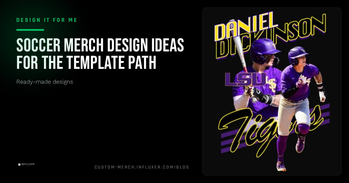
Soccer merch has a few habits that carry over from the kit itself: a number that matters, a crest-style mark, and a lot of negative space used well. If you are starting from a ready-made template, the fastest way to a design that looks like it belongs on the pitch is to lean into those habits instead of fighting them.
None of the ideas below require starting from a blank canvas. They are ways to fill in a template so the finished shirt reads like soccer merch and not a generic sport tee with a ball icon slapped on it.
Lead with the number, not the ball
A soccer kit number is already a strong, recognizable mark on its own. Templates that put a large number front and center, with a small last name arched above or below it, tend to look more authentic than templates that lead with a generic soccer ball graphic. Save the ball icon for a secondary detail, if you use it at all.
If your number has always been tied to a specific position, like a 10 for an attacking midfielder or a 1 for a keeper, that context is worth stating in a small line of text rather than assuming everyone reading the shirt already knows it.
- Large number as the dominant element, name secondary.
- Position or role as a small supporting line, not the headline.
- Save ball or cleat icons for a corner detail, not the center.
Club and country layouts
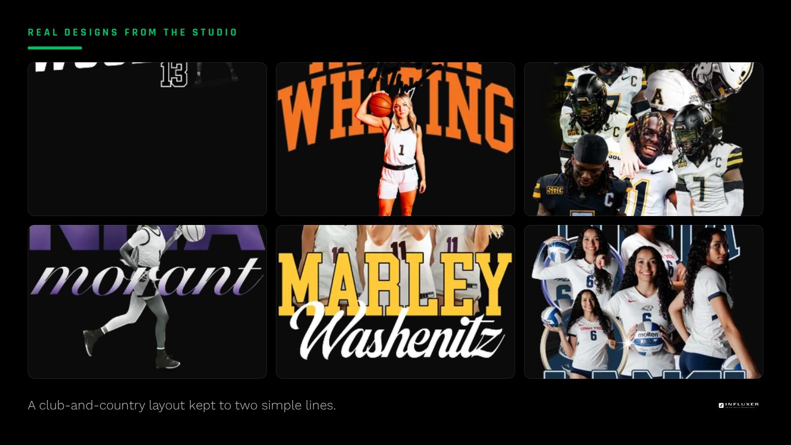
A layout built around club and country references works well for players who split their identity between a school or club team and a national or regional program. A template with two stacked lines, one for the team name and one for a personal identifier, handles this cleanly without needing separate designs for each.
Keep this layout simple: two lines of text and a number is usually enough. Adding a third or fourth element to a crest-style layout tends to crowd the chest print area fast.
Position-specific design choices
Keepers, defenders, midfielders, and forwards each have a slightly different relationship with the number on their back, and a template that lets you swap in a position label alongside the number gives the shirt more personality than a number alone. "GK" under a keeper number, or a midfielder's number paired with a small compass or arrows motif representing distance covered, are both simple additions that read as intentional rather than generic.
Color choices that suit a soccer shirt
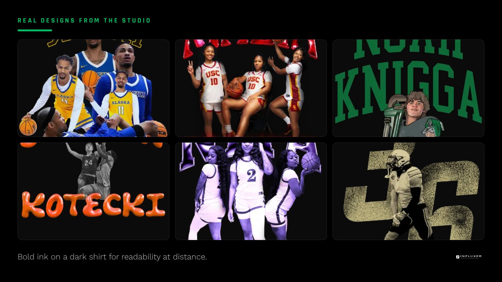
Soccer merch tends to favor bold, saturated color pairings more than some other sports, echoing kit colors. A dark shirt like True Navy or Black with a bright ink color reads clean at distance, and a bright shirt color like Watermelon or Flo Blue can work well for a fan tee meant to stand out rather than blend in.
If you are ordering both a tee and the SS4500 hoodie for the same player or team, preview the design on both before finalizing, since a number-forward layout that sits centered on a tee sometimes needs to shift up slightly on the hoodie to clear the kangaroo pocket.
Fan tees versus player tees
A player tee usually centers on that one athlete: their number, name, and position. A fan tee, meant for parents, siblings, or supporters, works better with a team name or crest-style mark and no individual number at all, so any fan can wear it regardless of which player they follow.
If you are planning both, pick a template family that offers a matching layout for each version so the two shirts feel like they belong to the same drop rather than two unrelated designs.
Keeping it wearable past the season
A number and name combination has a longer wearable life than a design tied to a specific season, tournament name, or one-off date. If you want a shirt people reach for well after the season ends, favor the number-and-name version and save a season-specific graphic for a separate, secondary shirt.
Soccer merch design checklist
- Make the number the dominant visual element, not a ball icon.
- Keep club-and-country layouts to two lines of text plus a number.
- Add a position label only if it adds real information.
- Preview bold ink on a dark shirt color for distance readability.
- Check hoodie placement separately if ordering both garments.
- Decide whether you need a separate fan-tee version without a number.
- Favor name-and-number over a season-specific graphic for longevity.
Frequently asked questions
Should a soccer shirt include a ball graphic?
It can, but as a small secondary detail rather than the main focus. A number-and-name layout reads as more personal and holds up better over time than a generic ball icon.
What is a good template layout for a fan tee versus a player tee?
A player tee should lead with the number and name; a fan tee works better with a team name or crest-style mark and no individual number, so it fits any supporter.
Do soccer merch colors need to match the actual kit colors?
Not necessarily, but pairing a bold ink with a dark or bright shirt color often reads more like authentic soccer merch than a muted, low-contrast pairing.
Can the same template work for both a tee and a hoodie?
Often yes, but check the hoodie version separately since a layout centered low on a tee sometimes needs to move up to clear the SS4500 pocket seam.
Start with a soccer template — Pick a ready-made layout and drop in your number, name, and position.
See how templates work — Watch a walkthrough of the ready-made design path.