Bring your own
Is Your Design Print-Ready? A 10-Point Check Before You Upload
Ten checks you can run in a few minutes to confirm your artwork will print sharp on apparel instead of soft, boxed-in, or cropped.
By Influxer · Published 2026-08-16 · Updated 2026-08-16 · 6 min read
Almost every artwork problem that shows up on a finished shirt was visible in the file long before anyone printed it. Soft edges, a white rectangle behind a logo, text that disappears against a dark garment: each traces back to an export setting or a canvas decision, not to the printer. You can catch all of them yourself in a few minutes, without design training or special software.
Work through the ten checks below in order. If everything passes, your file is ready for the upload path in the Influxer Custom Design Studio, where you can place it on a real garment mockup and see the result before anything moves forward.
1. Export at real print dimensions, not screen dimensions
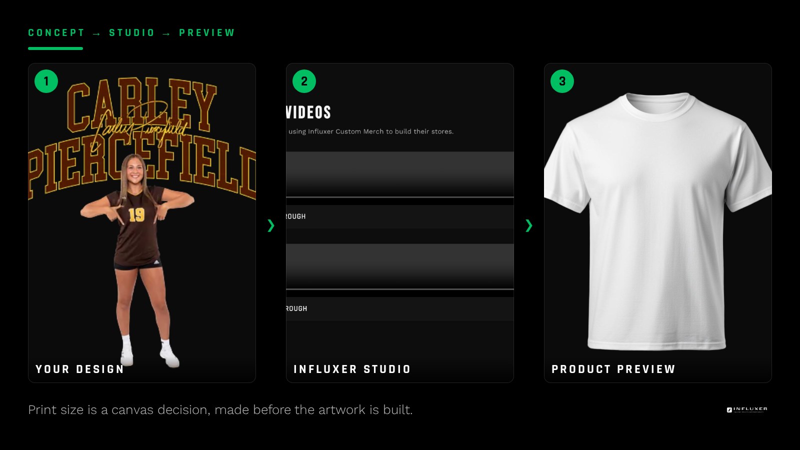
The first check is about the canvas, because nothing downstream can fix it. A design meant to fill an adult chest print needs roughly 11 to 12 inches of width. If your file was built on a 1080 by 1080 pixel social canvas, it holds about 90 pixels per inch when stretched to that width, and that softness is permanent.
Set your document in inches before you design: 12 by 14 inches is a safe full-front working size, and 4 by 4 inches covers most left-chest marks. If the artwork already exists at a smaller size, rebuild the elements at the larger canvas instead of scaling the flattened export up.
- Full front: about 12 in wide by 14 in tall.
- Left chest: about 3.5 to 4 in wide.
- Back print: about 12 in wide.
- Hood or sleeve hits: about 2 to 3 in wide.
2. Confirm effective resolution, not the number in the export dialog
A file can say 300 DPI and still print soft if a low-resolution element was scaled up inside it. What matters is the pixel count of the actual artwork at final size. Multiply your print width in inches by 300 and compare it to the pixel width of the export: 12 inches at 300 DPI means roughly 3,600 pixels across.
Between 150 and 300 effective DPI, most apparel graphics still look acceptable because fabric texture hides a small amount of softness. Below about 150, thin strokes and small text start to look fuzzy at arm-length viewing distance, which is exactly how people look at a shirt.
3. Pick the file type that matches the artwork
For artwork with photographs, gradients, textures, or hand-drawn shading, export a PNG with transparency at the largest size your tool allows. For artwork made only of type and clean shapes, a vector export such as SVG, PDF, or EPS is better, because it can be scaled to any print size without losing an edge.
Keep an eye on file size too. A 12 by 14 inch transparent PNG at high resolution normally lands between about 2 MB and 15 MB; if yours is far larger, an embedded photo is almost certainly bigger than the print area needs and can be downscaled to 300 DPI at its placed size with no visible difference.
Avoid JPG for apparel uploads. JPG cannot store transparency, so it always brings a solid rectangle with it, and its compression adds faint blocky noise around high-contrast edges, which is precisely where lettering lives.
- Photos or textures: PNG at maximum size, transparency on.
- Type and shapes only: SVG, PDF, or EPS.
- Never JPG for an upload that needs a clean background.
4. Verify transparency against a black background
Turning on the transparent background toggle is not the same as confirming it worked. Nested elements imported from other sources can carry their own baked-in white box, and some tools flatten transparency when a particular effect is applied.
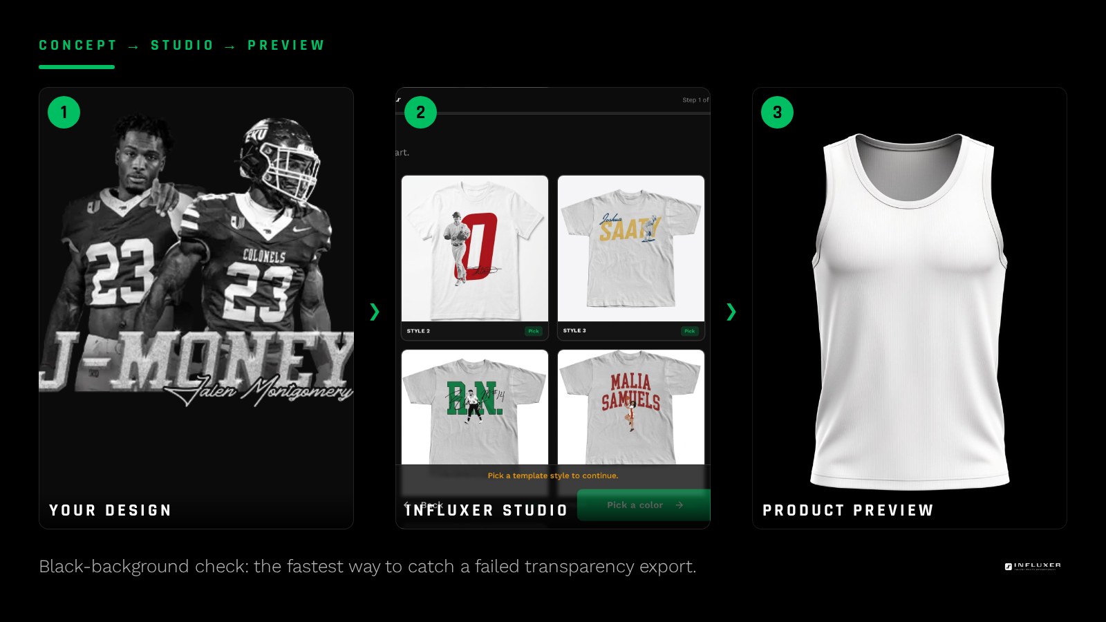
Open the export and place it over a solid black square in any image editor, or drop it into a document with a dark background. A light halo around letters, a visible rectangle, or a faint gray edge all mean the file needs another pass. On a black or navy garment, every one of those artifacts prints.
5. Check contrast against the garment colors you plan to sell
Artwork is judged on a white screen and worn on colored fabric. A dark navy wordmark that reads beautifully on your monitor turns into a low-contrast smudge on a black tee, and a cream design vanishes on a natural or sand garment.
Preview your design against the actual colors in your drop. If a color pairing does not hold up, the usual fix is an alternate version of the same artwork with an inverted or outlined treatment, rather than dropping the garment color you wanted.
6. Trim empty space and keep the design centered
Extra transparent margin changes how the design sits inside a print area, because placement tools work from the boundary of the image, not from where your eye finds the artwork. A design that looks centered in your editor can sit low or off-center once uploaded.
Crop the canvas tight to the visible artwork, keeping only spacing that belongs to the design itself.
7. Look closely at edges, strokes, and small type
Zoom to 100 percent and inspect the thinnest parts of the design. Strokes below roughly one point at final print size, tiny registered symbols, and fine outlines are the first details to break down on fabric, especially on textured garments.
Look for leftover artifacts too: a stray anchor point, a one-pixel line from a cropped element, or the gray fringe left by an automatic background remover.
8. Confirm you have the right to use every element
Fonts, stock graphics, and clip art carry license terms, and marks belonging to a school, league, or brand require permission from their owner. Whether a design using them can be produced depends on the applicable marks and the program the merch runs under.
Designs built from your own name, number, nickname, initials, or original artwork are the simplest path. If you are unsure about a specific element, note it during the review step rather than leaving it to be discovered later.
Running the check inside the studio
Once your file passes all ten checks, go into the upload path in the studio. Choose the simple upload option for a single design on one product, or the collection option to carry one design across multiple garments and colors.
The studio places your artwork inside the real print area on a garment mockup, which is the fastest sanity test of everything above. If you have to enlarge the file noticeably to fill the chest area, revisit checks one and two. If a pale outline appears around the artwork on a dark garment, revisit check four. When the mockup looks right, you can submit and the design moves into review before it is taken live.
The 10-point print-ready check
- Canvas set in inches at real print size before designing.
- Effective resolution of at least 150 DPI, ideally 300, at final size.
- PNG with transparency for photo or texture art; vector for type and shapes.
- Transparency verified against a solid black background.
- Contrast checked against every garment color in the drop.
- Canvas cropped tight to the visible artwork.
- Thin strokes and small type inspected at 100 percent zoom.
- Usage rights confirmed for fonts, graphics, and any third-party marks.
Frequently asked questions
What DPI do I actually need for a shirt design?
Aim for 300 DPI at the final print size, which is about 3,600 pixels across for a 12-inch print. Between 150 and 300 usually still looks good on fabric, and below 150 fine details begin to look soft at normal viewing distance.
Can I upload a JPG?
It is not a good choice. JPG has no transparency, so it carries a solid rectangle behind your artwork, and its compression leaves faint noise around lettering. Export a PNG with transparency instead, or a vector file if the design is only type and shapes.
How do I know if my transparent background really worked?
Place the exported file over solid black. Any visible rectangle, halo, or gray fringe means transparency did not fully apply, usually because an imported element had its own opaque background.
Can I include my school logo?
School, league, and brand marks belong to their owners, so whether they can be used depends on the applicable marks and the program the merch runs under. Designs based on your own name, number, nickname, or original artwork avoid that question entirely.
Upload your print-ready file — Drop your artwork into the studio and see it inside a real garment print area.
Not sure which path fits? — Compare uploading your own artwork with starting from a ready-made design.